Chart position — tracked daily by LaunchShots
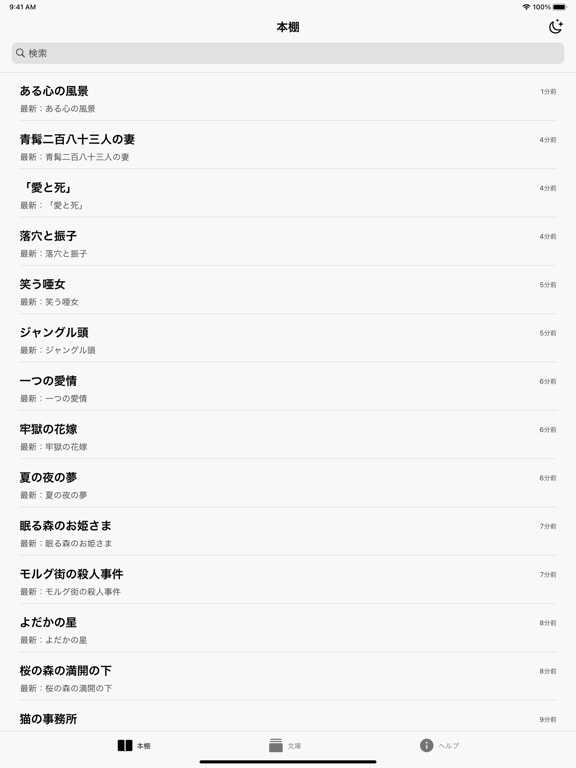
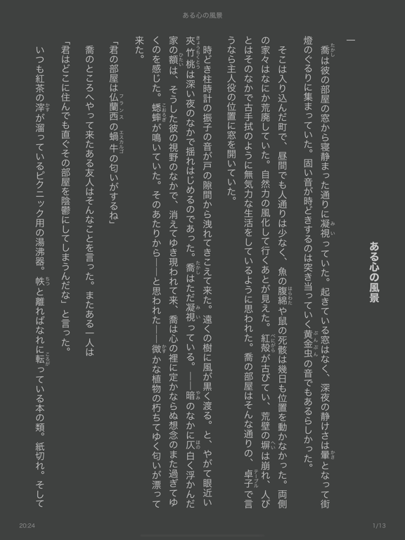
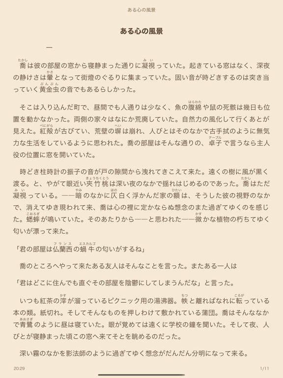
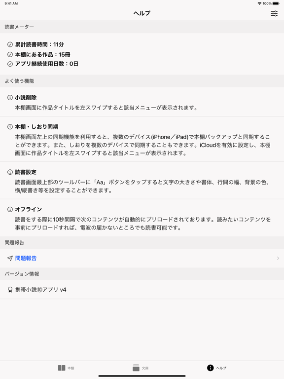
Screenshot style breakdown
Sampled from 5 of 携帯小説⑩ - 最強の電子書籍リーダー's App Store screenshots — background, accent and theme, measured by LaunchShots (not something Apple publishes).
#FCF4F4 bg
#DDD6D6
#644C34 accent
#111111 text
Screenshots
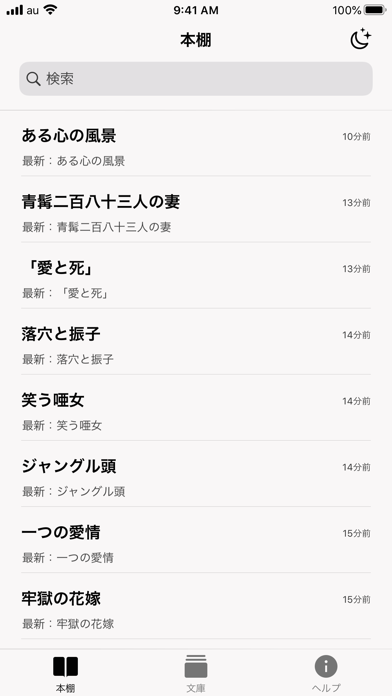
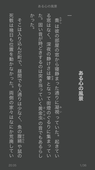
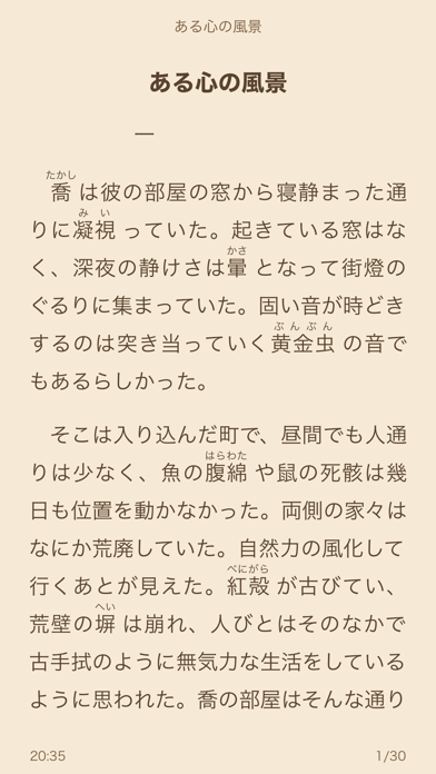

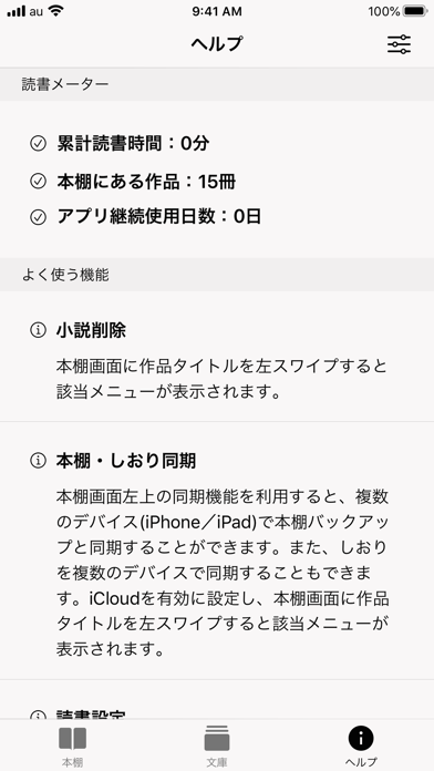
iPad screenshots

Icon palette
About this app
【2012年からの人気携帯小説リーダー】 【9割以上のユーザーが5つ星最高評価】 特徴: ・まとめて読む 人気小説・電子文庫をまとめてイッキ読み! ・どこでも使える リアルタイムプリロード機能により、電波が届かない場所でもOK! ・目に優しい配色 複数のテーマ(背景、色、文字サイズ)を選択できる! ・簡単につながる しおりを複数のデバイス(iPad, iPhone)で同期可能! 本アプリはスマホ端末で電子小説を快適に読むため、複雑なデータのリアルタイム処理、言語解析、最良のユーザ体験構築などの技術的知見を結集して誕生したリーダーです。 本アプリは ・コピープロテクション等技術的保護手段の回避装置ではありません。 ・公衆送信ためのコンテンツの複製と再配信(例えば、各サイトのデータを自設サーバに蓄積し、再配布の行為)等一切行いません。(但し、ユーザ一人一人が私的使用のため、コンテンツ解析際にデータ複製(ダウンロード)を行うことがあります。) ・原則として、解析前と解析後の小説作品を同一性保持すること。 コンテンツ配信停止…
App details
What you can learn from 携帯小説⑩ - 最強の電子書籍リーダー
Every shipping app on the App Store has gone through the same decisions you're working through right now: which screenshot goes first, what caption sits over it, which device frame to show, what color the background should be. The 10 screenshots above are 携帯小説⑩ - 最強の電子書籍リーダー's answers to those questions — they're public, they're real, and they made it through Apple's review.
What the numbers say: 携帯小説⑩ - 最強の電子書籍リーダー runs a mixed light-and-dark set where the background shifts from screenshot to screenshot (first shot #FCF4F4) — each image has to stand on its own, so the captions carry more of the story. The accent colour we picked up, #644C34, is the one to reuse for badges, arrows and highlighted words if you borrow this look. Hit Use this style to open the editor with these exact colours and drop your own screenshot in.
Notice the first screenshot in particular. It's the one users see in search results and on the product page, and it's where most apps spend their best caption and tightest design. Look at the proportion of background to phone, where the text sits, what one thing the image is trying to communicate.
Want to see how other Book apps approach the same problem? Browse more Book apps in the showcase.
Take what works into your own screenshots
Open LaunchShots and design your App Store & Google Play screenshots — pick a device frame, drop captions, ship in minutes. Free, in your browser.
Open the screenshot editor →Apps with a similar look
Closest background + accent colours among the listings we've analysed — useful when you want to see the same palette handled by a different team.