Screenshot style breakdown
Sampled from 6 of Fandomera's App Store screenshots — background, accent and theme, measured by LaunchShots (not something Apple publishes).
#CC3C84 bg
#D35795
#0C244C accent
#FFFFFF text
Screenshots




Icon palette
About this app
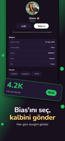
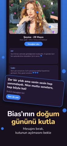
Fandomera, Türkiye'nin ilk tr-pop topluluğu. Sevdiğin grupları takip et, fandomunla aynı yerde buluş, kimseye açıklamak zorunda kalmadan konuş. FANDOMUNLA PAYLAŞ Gönderi paylaş, alıntıla, yorumla. Fotoğraf ve GIF ekle. Etiketlerle konuya katıl, keşfette yeni fandomlar bul. BIAS'INI SEÇ Favori artistlerini seç, akışın onlara göre şekillensin. Her gruptan bir bias seçebilirsin. DOĞUM GÜNÜ KUTULARI Sevdiğin artistlerin doğum günleri için mesajını bırak, kutunun açılmasını bekle. Gün gelince hep birlikte açılıyor. QUIZ VE LİDERLİK Tr pop dünyasını ne kadar tanıyorsun? Quizleri çöz, puanını topla, liderlik tablosunda yerini al. Diğer hayranlarla yarış. HABERLER VE ETKİNLİKLER Konser tarihleri, çıkış günleri, fandom etkinlikleri. Kaçırmamak için bildirim al. DOĞRULANMIŞ HESAPLAR Artistlerin resmî hesapları da Fandomera'da. Paylaşımlarını akışında görüp, altına yorum yazabilirsin. GÜVEN…
App details
What you can learn from Fandomera
Every shipping app on the App Store has gone through the same decisions you're working through right now: which screenshot goes first, what caption sits over it, which device frame to show, what color the background should be. The 6 screenshots above are Fandomera's answers to those questions — they're public, they're real, and they made it through Apple's review.
What the numbers say: Fandomera runs a dark set where the background shifts from screenshot to screenshot (first shot #CC3C84) — each image has to stand on its own, so the captions carry more of the story. The accent colour we picked up, #0C244C, is the one to reuse for badges, arrows and highlighted words if you borrow this look. Hit Use this style to open the editor with these exact colours and drop your own screenshot in.
Notice the first screenshot in particular. It's the one users see in search results and on the product page, and it's where most apps spend their best caption and tightest design. Look at the proportion of background to phone, where the text sits, what one thing the image is trying to communicate.
Want to see how other Social Networking apps approach the same problem? Browse more Social Networking apps in the showcase.
Take what works into your own screenshots
Open LaunchShots and design your App Store & Google Play screenshots — pick a device frame, drop captions, ship in minutes. Free, in your browser.
Open the screenshot editor →Apps with a similar look
Closest background + accent colours among the listings we've analysed — useful when you want to see the same palette handled by a different team.