Screenshot changes — detected by LaunchShots
Screenshot style breakdown
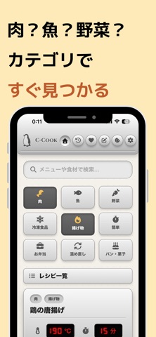
Sampled from 6 of C-Cook:ノンフライヤーの温度・時間設定管理アプリ's App Store screenshots — background, accent and theme, measured by LaunchShots (not something Apple publishes).
#FCECBC bg
#DDCFA5
#B45C2C accent
#111111 text
Reading the caption text from the screenshots in your browser…
Screenshots



Icon palette
About this app
ノンフライヤー調理の「温度と時間」に特化した専用アプリ 「鶏の唐揚げ、何度で何分だっけ?」 もう迷いません。C-Cookがすべて記録・管理します。 【こんな方におすすめ】 ・ノンフライヤーを買ったけど、温度と時間がわからない ・毎回ネットで調べるのが面倒 ・オーブンのレシピをノンフライヤーで作りたい ・自分なりのベスト設定を記録して残したい ・何をよく作っているか振り返りたい 【主な機能】 ▼ すぐ使える50種のプリセット 唐揚げ、フライドポテト、焼き鮭、ハンバーグ… よく作るメニューの温度・時間設定がすでに登録済み。 インストールしてすぐに使えます。 ▼ オーブン → ノンフライヤー 温度・時間変換 ネットで見つけたオーブンレシピの温度と時間を入力するだけ。 食材カテゴリに合わせた精密な変換係数で、 ノンフライヤーに最適な設定を自動計算します。 トースターからの変換にも対応。 ▼ 調理タイマー&通知 設定した時間でカウントダウン。 調理完了やシェイク(裏返し)のタイミングを通知でお知らせ。 バックグラウンドでも安心です。 ▼ …
App details
What you can learn from C-Cook:ノンフライヤーの温度・時間設定管理アプリ
Every shipping app on the App Store has gone through the same decisions you're working through right now: which screenshot goes first, what caption sits over it, which device frame to show, what color the background should be. The 8 screenshots above are C-Cook:ノンフライヤーの温度・時間設定管理アプリ's answers to those questions — they're public, they're real, and they made it through Apple's review.
What the numbers say: C-Cook:ノンフライヤーの温度・時間設定管理アプリ runs a light set with one background colour (#FCECBC) carried across every screenshot — the listing reads as a single poster when the shots sit side by side in search results. The accent colour we picked up, #B45C2C, is the one to reuse for badges, arrows and highlighted words if you borrow this look. Hit Use this style to open the editor with these exact colours and drop your own screenshot in.
Notice the first screenshot in particular. It's the one users see in search results and on the product page, and it's where most apps spend their best caption and tightest design. Look at the proportion of background to phone, where the text sits, what one thing the image is trying to communicate.
Want to see how other Food & Drink apps approach the same problem? Browse more Food & Drink apps in the showcase.
Take what works into your own screenshots
Open LaunchShots and design your App Store & Google Play screenshots — pick a device frame, drop captions, ship in minutes. Free, in your browser.
Open the screenshot editor →Apps with a similar look
Closest background + accent colours among the listings we've analysed — useful when you want to see the same palette handled by a different team.