Chart position — tracked daily by LaunchShots
Screenshot style breakdown
Sampled from 6 of المحطة التقنية's App Store screenshots — background, accent and theme, measured by LaunchShots (not something Apple publishes).
#FCFCFC bg
#DDDDDD
#146434 accent
#111111 text
Reading the caption text from the screenshots in your browser…
Screenshots




Icon palette
About this app
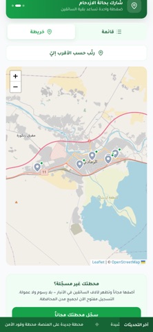
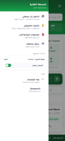
المحطة التقنية — منصة وقود الأنبار تطبيق مجاني يوفّر عليك الوقت والوقود. بدل أن تدور بين المحطات وتقف في طوابير قد تنتهي بلا فائدة، اعرف قبل أن تتحرك. • ما الذي يتوفر الآن شاهد المحطات التي أعلنت توفر البانزين العادي والمحسن، والكاز، والغاز، و LPG، والنفط الأبيض — محدَّثة لحظياً من أصحاب المحطات أنفسهم. • أقرب محطة إليك رتّب المحطات حسب قربها من موقعك، أو تصفّحها على الخريطة، وافتح الطريق بـ Waze أو خرائط Google. • الازدحام لكل منتج الطابور قد يكون على البانزين المحسن طويلاً وعلى العادي خالياً. يعرض التطبيق حالة كل منتج على حدة، من سائقين زاروا المحطة فعلاً. • تنبيه فور وصول الوقود اختر محطاتك المفضلة، ويصلك إشعار لحظة إعلانها توفر الوقود. • كل مدن الأنبار الرمادي، الفلوجة، هيت، حديثة، عانة، راوة، القائم، الرطبة، الحبانية، الخالدية، عامرية الفلوجة، الكرمة، البغدادي، الحقلانية، بروانة، النخيب. • لأصحاب المحطات سجّل محطتك مجاناً، وحدّث توفر المنتجات بضغطة واحدة، وأعلن إغلاقاً مؤقتا…
App details
What you can learn from المحطة التقنية
Every shipping app on the App Store has gone through the same decisions you're working through right now: which screenshot goes first, what caption sits over it, which device frame to show, what color the background should be. The 6 screenshots above are المحطة التقنية's answers to those questions — they're public, they're real, and they made it through Apple's review.
What the numbers say: المحطة التقنية runs a light set with one background colour (#FCFCFC) carried across every screenshot — the listing reads as a single poster when the shots sit side by side in search results. The accent colour we picked up, #146434, is the one to reuse for badges, arrows and highlighted words if you borrow this look. Hit Use this style to open the editor with these exact colours and drop your own screenshot in.
Notice the first screenshot in particular. It's the one users see in search results and on the product page, and it's where most apps spend their best caption and tightest design. Look at the proportion of background to phone, where the text sits, what one thing the image is trying to communicate.
Want to see how other Navigation apps approach the same problem? Browse more Navigation apps in the showcase.
Take what works into your own screenshots
Open LaunchShots and design your App Store & Google Play screenshots — pick a device frame, drop captions, ship in minutes. Free, in your browser.
Open the screenshot editor →Apps with a similar look
Closest background + accent colours among the listings we've analysed — useful when you want to see the same palette handled by a different team.