Chart position — tracked daily by LaunchShots
Screenshot style breakdown
Sampled from 6 of LiteraDent's App Store screenshots — background, accent and theme, measured by LaunchShots (not something Apple publishes).
#ECF4F4 bg
#CFD6D6
#04845C accent
#111111 text
Reading the caption text from the screenshots in your browser…
Screenshots


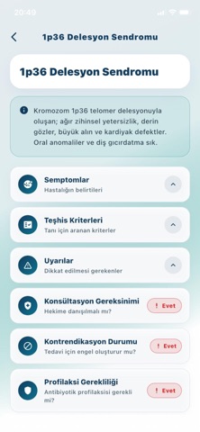


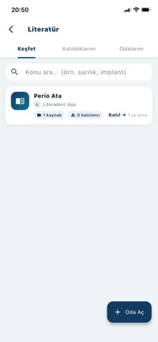
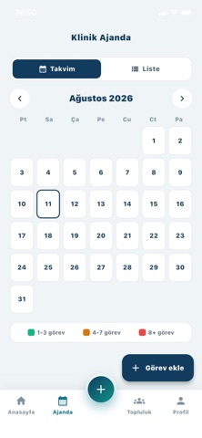
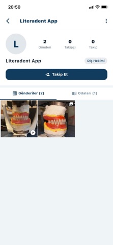
Icon palette
About this app
LiteraDent, diş hekimleri ve diş hekimliği öğrencileri için hazırlanmış mesleki bir bilgi ve paylaşım platformudur. KLİNİK BİLGİ REHBERİ Sistemik ve dental hastalıklar, ilaç tabloları ve tedavi yöntemleri için referans içeriği. Her başlık, dayandığı akademik kaynakçayla birlikte sunulur. AKADEMİK ARAMA Europe PMC üzerinden canlı makale araması. Bulduğunuz çalışmaların künyesini kaydedin, orijinal kaynağa tek dokunuşla ulaşın. Makale metinleri uygulamada barındırılmaz; kaynağa yönlendirilirsiniz. MESLEKTAŞ AĞI Ön moderasyondan geçen, reklamsız bir mesleki akış. Vaka tartışın, komplikasyon paylaşın, meslektaşınıza soru sorun. Her gönderide yorumları kimlerin yazabileceğine siz karar verirsiniz. LİTERATÜR ODALARI Konu bazlı çalışma odaları açın, kaynak paylaşın, tartışın. Odanıza kimlerin katılabileceğini siz belirlersiniz. AI ASİSTAN Diş hekimliği literatürü ve genel mesleki bilgi so…
App details
What you can learn from LiteraDent
Every shipping app on the App Store has gone through the same decisions you're working through right now: which screenshot goes first, what caption sits over it, which device frame to show, what color the background should be. The 9 screenshots above are LiteraDent's answers to those questions — they're public, they're real, and they made it through Apple's review.
What the numbers say: LiteraDent runs a light set with one background colour (#ECF4F4) carried across every screenshot — the listing reads as a single poster when the shots sit side by side in search results. The accent colour we picked up, #04845C, is the one to reuse for badges, arrows and highlighted words if you borrow this look. Hit Use this style to open the editor with these exact colours and drop your own screenshot in.
Notice the first screenshot in particular. It's the one users see in search results and on the product page, and it's where most apps spend their best caption and tightest design. Look at the proportion of background to phone, where the text sits, what one thing the image is trying to communicate.
Want to see how other Education apps approach the same problem? Browse more Education apps in the showcase.
Take what works into your own screenshots
Open LaunchShots and design your App Store & Google Play screenshots — pick a device frame, drop captions, ship in minutes. Free, in your browser.
Open the screenshot editor →Apps with a similar look
Closest background + accent colours among the listings we've analysed — useful when you want to see the same palette handled by a different team.