Chart position — tracked daily by LaunchShots
Screenshot style breakdown
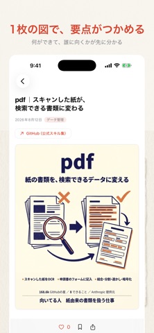
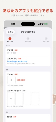
Sampled from 4 of 驚き屋's App Store screenshots — background, accent and theme, measured by LaunchShots (not something Apple publishes).
#F4F4EC bg
#D6D6CF
#DC4434 accent
#111111 text
Screenshots


Icon palette
About this app
Claude まわりの情報は、X や GitHub に散らばっていて追いきれません。 驚き屋は、その断片を1か所に集めて、必要なところだけ読めるようにするアプリです。 ■ 何が置いてあるか ・スキル … Anthropic 公式のスキルを1つずつ解説 ・プラグイン … 何ができて、どんなときに使うか ・MCP … 外部サービスとつなぐための仕組み ・アプリ … 個人開発者が作ったアプリの紹介 どれも公式のドキュメントや配布元を実際に読み込んだうえで、 「何ができるか」だけでなく「どんなときに向くか」「向かないか」まで書いています。 ■ ほしい話題だけを選べる 記事には8つのタグが付いています。 基本・導入/デザイン/セキュリティ/データ管理/ 自動化/SEO・文章/開発効率/MCP・連携 画面いちばん上の色帯を横に振るだけで切り替わります。 タグごとに色が決まっているので、いま何を見ているかが読まずに分かります。 ■ 図解つきで、要点だけ 長い英語のドキュメントを、図と表を交えた日本語の記事にしています。 見出しから目次が自動で作られるので、必要な節…
App details
What you can learn from 驚き屋
Every shipping app on the App Store has gone through the same decisions you're working through right now: which screenshot goes first, what caption sits over it, which device frame to show, what color the background should be. The 4 screenshots above are 驚き屋's answers to those questions — they're public, they're real, and they made it through Apple's review.
What the numbers say: 驚き屋 runs a light set with one background colour (#F4F4EC) carried across every screenshot — the listing reads as a single poster when the shots sit side by side in search results. The accent colour we picked up, #DC4434, is the one to reuse for badges, arrows and highlighted words if you borrow this look. Hit Use this style to open the editor with these exact colours and drop your own screenshot in.
Notice the first screenshot in particular. It's the one users see in search results and on the product page, and it's where most apps spend their best caption and tightest design. Look at the proportion of background to phone, where the text sits, what one thing the image is trying to communicate.
Want to see how other Developer Tools apps approach the same problem? Browse more Developer Tools apps in the showcase.
Take what works into your own screenshots
Open LaunchShots and design your App Store & Google Play screenshots — pick a device frame, drop captions, ship in minutes. Free, in your browser.
Open the screenshot editor →Apps with a similar look
Closest background + accent colours among the listings we've analysed — useful when you want to see the same palette handled by a different team.