Screenshot changes — detected by LaunchShots
Screenshot style breakdown
Sampled from 5 of 拼完我服你 - 钻石画拼拼乐 消除达人's App Store screenshots — background, accent and theme, measured by LaunchShots (not something Apple publishes).
#B4B4F4 bg
#9E9ED6
#6C54AC accent
#111111 text
Reading the caption text from the screenshots in your browser…
Screenshots
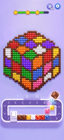
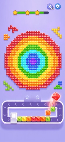

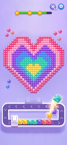
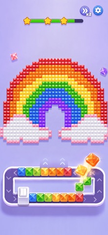
iPad screenshots


Icon palette
About this app
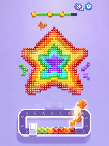
一颗颗缤纷宝石,正在等待你的巧妙安排! 在这里,你需要观察宝石的颜色与分布,找到相连的同色宝石,将它们依次送入环形轨道。随着宝石在轨道中流转,相同颜色会逐步填入上方的图案,一点点揭开隐藏其中的完整画面。 玩法简单,但想顺利完成可没那么容易。 轨道中的空位有限,每一次选择都会影响后续的操作。先处理哪种颜色?哪些宝石需要暂时保留?如何避免轨道被提前占满?随着颜色越来越丰富、宝石排列越来越复杂,你需要仔细观察,合理规划每一步。 不同颜色依次进入环形轨道,观察轨道剩余空间,安排正确的收集顺序。简单操作背后,还有不少值得思考的小策略。每完成一组颜色,宝石都会自动填入对应区域。从简单的小图案到更加丰富的像素画,随着关卡推进,完整图案会一点点呈现在眼前。 更多颜色、更复杂的排列、更有限的轨道空间,都将带来全新的解题方式。有时候正确的宝石就在眼前,但选择顺序不同,也可能带来完全不同的结果。 仔细观察,找到属于你的最佳解法。不断挑战新的颜色组合,解锁更多精美作品,看看下一幅图案会是什么。 不妨来挑战一下,…
App details
What you can learn from 拼完我服你 - 钻石画拼拼乐 消除达人
Every shipping app on the App Store has gone through the same decisions you're working through right now: which screenshot goes first, what caption sits over it, which device frame to show, what color the background should be. The 10 screenshots above are 拼完我服你 - 钻石画拼拼乐 消除达人's answers to those questions — they're public, they're real, and they made it through Apple's review.
What the numbers say: 拼完我服你 - 钻石画拼拼乐 消除达人 runs a light set with one background colour (#B4B4F4) carried across every screenshot — the listing reads as a single poster when the shots sit side by side in search results. The accent colour we picked up, #6C54AC, is the one to reuse for badges, arrows and highlighted words if you borrow this look. Hit Use this style to open the editor with these exact colours and drop your own screenshot in.
Notice the first screenshot in particular. It's the one users see in search results and on the product page, and it's where most apps spend their best caption and tightest design. Look at the proportion of background to phone, where the text sits, what one thing the image is trying to communicate.
Want to see how other Games apps approach the same problem? Browse more Games apps in the showcase.
Take what works into your own screenshots
Open LaunchShots and design your App Store & Google Play screenshots — pick a device frame, drop captions, ship in minutes. Free, in your browser.
Open the screenshot editor →Apps with a similar look
Closest background + accent colours among the listings we've analysed — useful when you want to see the same palette handled by a different team.