Chart position — tracked daily by LaunchShots
Screenshot style breakdown
Sampled from 6 of Ассистент тренера's App Store screenshots — background, accent and theme, measured by LaunchShots (not something Apple publishes).
#FCFCFC bg
#DDDDDD
#047434 accent
#111111 text
Screenshots


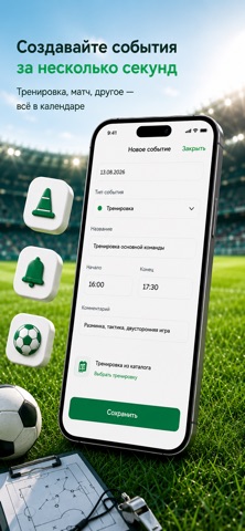
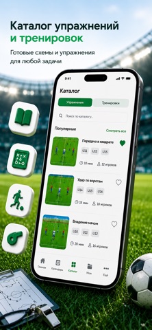

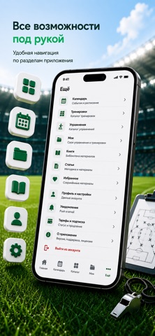


iPad screenshots


Icon palette
About this app
Ассистент тренера — мобильный помощник футбольного тренера. Каталог упражнений и тренировок, календарь, свои материалы, книги и статьи собраны в одном приложении. Хватит искать идеи по вкладкам и чатам. Открываете нужное упражнение, собираете тренировку, ставите её в расписание и проводите занятие по готовому плану. ЧТО В ПРИЛОЖЕНИИ Каталог упражнений Готовые упражнения от практикующих тренеров. Поиск и фильтры помогают быстро найти материал под задачу: фаза игры, малые игры, стандарты, комбинации. Каталог тренировок Готовые занятия, которые можно разобрать, сохранить в избранное и адаптировать под свою команду. Календарь Расписание тренировок и событий в одном месте. Напоминания приходят в приложение и на почту. Мои материалы Собирайте свои упражнения и тренировки: берите основу из каталога или создавайте с нуля. Книги и статьи Футбольная библиотека и методические материалы — ч…
App details
What you can learn from Ассистент тренера
Every shipping app on the App Store has gone through the same decisions you're working through right now: which screenshot goes first, what caption sits over it, which device frame to show, what color the background should be. The 11 screenshots above are Ассистент тренера's answers to those questions — they're public, they're real, and they made it through Apple's review.
What the numbers say: Ассистент тренера runs a mixed light-and-dark set where the background shifts from screenshot to screenshot (first shot #FCFCFC) — each image has to stand on its own, so the captions carry more of the story. The accent colour we picked up, #047434, is the one to reuse for badges, arrows and highlighted words if you borrow this look. Hit Use this style to open the editor with these exact colours and drop your own screenshot in.
Notice the first screenshot in particular. It's the one users see in search results and on the product page, and it's where most apps spend their best caption and tightest design. Look at the proportion of background to phone, where the text sits, what one thing the image is trying to communicate.
Want to see how other Sports apps approach the same problem? Browse more Sports apps in the showcase.
Take what works into your own screenshots
Open LaunchShots and design your App Store & Google Play screenshots — pick a device frame, drop captions, ship in minutes. Free, in your browser.
Open the screenshot editor →Apps with a similar look
Closest background + accent colours among the listings we've analysed — useful when you want to see the same palette handled by a different team.