Chart position — tracked daily by LaunchShots
Screenshot style breakdown
Sampled from 5 of クロノマップ's App Store screenshots — background, accent and theme, measured by LaunchShots (not something Apple publishes).
#F4F4EC bg
#D6D6CF
#7C5C44 accent
#111111 text
Reading the caption text from the screenshots in your browser…
Screenshots


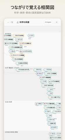
iPad screenshots


Icon palette
About this app
クロノマップは、一枚の世界地図と一本のタイムラインで人類史をたどる学習アプリです。時間を動かすと勢力図が塗り替わり、出来事がその場所に浮かび上がります。「イスラームが広がっていたとき、中国では、日本では何が起きていたのか」——それがひと目で分かります。 ■ 動く勢力図 紀元前3万年から現代まで、時代ごとの歴史地図69時点を収録。再生ボタンで時間が流れ、国境がアニメーションで移り変わります。時間軸は線形と対数を切り替えられ、3万年の全体も一目で見わたせます。 ■ 2,794の出来事と人物、すべて解説つき どの項目にも解説があり、重要な出来事には長文の詳説も。「きっかけ・前提」と「その後の流れ」がリンクでつながっているので、一つ調べると芋づる式に理解が広がります。解説は約9,300項目・366万字。 ■ 52本の語りつき物語 ローマ千年、モンゴル、大航海、応仁の乱、幕末、哲学史、お金の歴史、美術の物語(全16巻・584作品)など。ナレーションに合わせて地図がその土地へ飛び、進軍ルートが伸び、勢力図が塗り替わります。音声読み上げ…
App details
What you can learn from クロノマップ
Every shipping app on the App Store has gone through the same decisions you're working through right now: which screenshot goes first, what caption sits over it, which device frame to show, what color the background should be. The 10 screenshots above are クロノマップ's answers to those questions — they're public, they're real, and they made it through Apple's review.
What the numbers say: クロノマップ runs a light set with one background colour (#F4F4EC) carried across every screenshot — the listing reads as a single poster when the shots sit side by side in search results. The accent colour we picked up, #7C5C44, is the one to reuse for badges, arrows and highlighted words if you borrow this look. Hit Use this style to open the editor with these exact colours and drop your own screenshot in.
Notice the first screenshot in particular. It's the one users see in search results and on the product page, and it's where most apps spend their best caption and tightest design. Look at the proportion of background to phone, where the text sits, what one thing the image is trying to communicate.
Want to see how other Education apps approach the same problem? Browse more Education apps in the showcase.
Take what works into your own screenshots
Open LaunchShots and design your App Store & Google Play screenshots — pick a device frame, drop captions, ship in minutes. Free, in your browser.
Open the screenshot editor →Apps with a similar look
Closest background + accent colours among the listings we've analysed — useful when you want to see the same palette handled by a different team.