Chart position — tracked daily by LaunchShots
Screenshot changes — detected by LaunchShots
Screenshot style breakdown
Sampled from 6 of Спорта's App Store screenshots — background, accent and theme, measured by LaunchShots (not something Apple publishes).
#5C2C8C bg
#72499C
#1C3CCC accent
#FFFFFF text
Screenshots


iPad screenshots

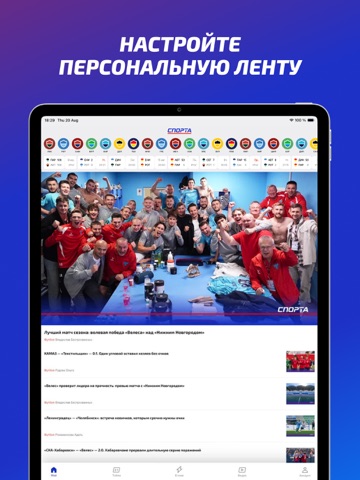


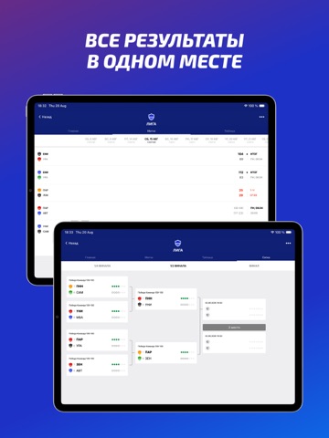
Icon palette
About this app
Cпорта. Прогнозы, обзоры, хайлайты. Новости спорта, где подача решает Переживайте спорт ярче с приложением "Спорта". Читайте новости и обзоры, узнавайте статистику и прогнозы, смотрите хайлайты с лучшими моментами и получайте результаты в реальном времени. Настройте приложение под себя: выберите любимые команды и лиги и получайте новости о том, что интересно именно вам. Без лишнего шума и жёлтой прессы. Открывайте новых героев вместе с авторскими обзорами матчей. Мы говорим о спорте на понятном языке и помогаем увидеть больше, чем финальный счет. Читайте игру еще до стартового свистка. Аналитика и прогнозы помогут разобраться в раскладе сил, оценить форму команд и узнать, чего ждать от предстоящего матча. Смотрите видеообзоры и хайлайты голевых моментов, чтобы за несколько минут пережить главные секунды игры и понять картину матча. Следите за результатами в режиме реального времен…
App details
What you can learn from Спорта
Every shipping app on the App Store has gone through the same decisions you're working through right now: which screenshot goes first, what caption sits over it, which device frame to show, what color the background should be. The 11 screenshots above are Спорта's answers to those questions — they're public, they're real, and they made it through Apple's review.
What the numbers say: Спорта runs a mixed light-and-dark set where the background shifts from screenshot to screenshot (first shot #5C2C8C) — each image has to stand on its own, so the captions carry more of the story. The accent colour we picked up, #1C3CCC, is the one to reuse for badges, arrows and highlighted words if you borrow this look. Hit Use this style to open the editor with these exact colours and drop your own screenshot in.
Notice the first screenshot in particular. It's the one users see in search results and on the product page, and it's where most apps spend their best caption and tightest design. Look at the proportion of background to phone, where the text sits, what one thing the image is trying to communicate.
Want to see how other Sports apps approach the same problem? Browse more Sports apps in the showcase.
Take what works into your own screenshots
Open LaunchShots and design your App Store & Google Play screenshots — pick a device frame, drop captions, ship in minutes. Free, in your browser.
Open the screenshot editor →Apps with a similar look
Closest background + accent colours among the listings we've analysed — useful when you want to see the same palette handled by a different team.