Chart position — tracked daily by LaunchShots
Screenshot style breakdown
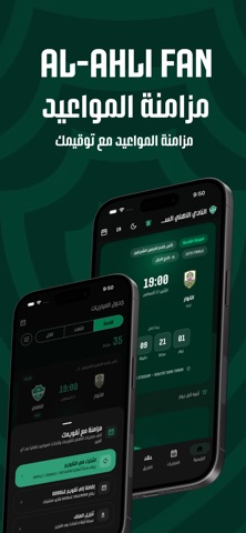
Sampled from 4 of ALAHLI FAN's App Store screenshots — background, accent and theme, measured by LaunchShots (not something Apple publishes).
#042C24 bg
#274942
#549484 accent
#FFFFFF text
Screenshots



Icon palette
About this app
تطبيق يجمع كل ما يتابعه مشجّع الأهلي في مكان واحد: موعد المباراة القادمة، وترتيب الدوري، وقائمة الفريق، وأهازيج المدرجات. المباراة القادمة عدّ تنازلي حيّ حتى صافرة البداية، مع البطولة والدور والملعب وما إذا كانت المباراة على أرضنا أو خارجها. التوقيت كما ينشره النادي تماماً، لا محوّلاً حسب موقعك. جدول المباريات القادمة والنتائج وكل الموسم، مع تصفية بالبحث والبطولة والأرض. ولكل مباراة صفحتها: التذاكر، وإضافتها إلى تقويمك، وموقع الملعب على الخريطة، ومشاركتها كصورة أو نص. تنبيه قبل المباراة اختر متى يصلك التنبيه — من ربع ساعة إلى يوم كامل — واكتب ملاحظتك الخاصة لتظهر داخل التنبيه نفسه. التنبيهات تُجدول على جهازك وتعمل بلا اتصال. الترتيب جدول الدوري كاملاً وصفّ الأهلي مميّز دائماً، مع تفصيل كل فريق: الفوز والتعادل والخسارة والأهداف وسجلّ آخر المباريات. الفريق قائمة اللاعبين مجمّعة بخطوط اللعب، ولكل لاعب رقمه وجنسيته وإحصاءاته. رابطة المشجعين نشيد النادي يظهر سطراً بعد سطر، وأرشيف الأها…
App details
What you can learn from ALAHLI FAN
Every shipping app on the App Store has gone through the same decisions you're working through right now: which screenshot goes first, what caption sits over it, which device frame to show, what color the background should be. The 4 screenshots above are ALAHLI FAN's answers to those questions — they're public, they're real, and they made it through Apple's review.
What the numbers say: ALAHLI FAN runs a dark set with one background colour (#042C24) carried across every screenshot — the listing reads as a single poster when the shots sit side by side in search results. The accent colour we picked up, #549484, is the one to reuse for badges, arrows and highlighted words if you borrow this look. Hit Use this style to open the editor with these exact colours and drop your own screenshot in.
Notice the first screenshot in particular. It's the one users see in search results and on the product page, and it's where most apps spend their best caption and tightest design. Look at the proportion of background to phone, where the text sits, what one thing the image is trying to communicate.
Want to see how other Sports apps approach the same problem? Browse more Sports apps in the showcase.
Take what works into your own screenshots
Open LaunchShots and design your App Store & Google Play screenshots — pick a device frame, drop captions, ship in minutes. Free, in your browser.
Open the screenshot editor →Apps with a similar look
Closest background + accent colours among the listings we've analysed — useful when you want to see the same palette handled by a different team.