Chart position — tracked daily by LaunchShots
Screenshot style breakdown
Sampled from 6 of وريد للتبرع بالدم's App Store screenshots — background, accent and theme, measured by LaunchShots (not something Apple publishes).
#FCFCFC bg
#DDDDDD
#DC2424 accent
#111111 text
Reading the caption text from the screenshots in your browser…
Screenshots


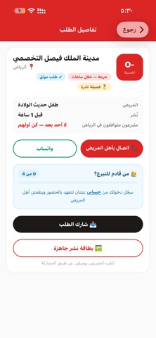
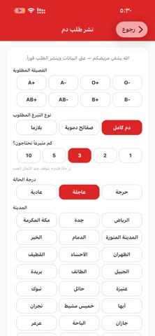
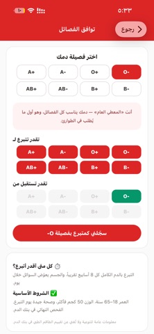

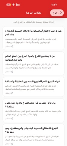

Icon palette
About this app
وريد منصة مجتمعية تطوعية تربط المحتاجين لنقل الدم بمتبرعين قريبين منهم في مدن المملكة، مجاناً وبدون وسيط. طلبات دم عاجلة تصفح الطلبات النشطة حسب مدينتك وفصيلتك، وتواصل مباشرة مع أهل المريض بالاتصال أو الواتساب. حدّد نوع التبرع المطلوب (دم كامل، صفائح، بلازما) وعدد المتبرعين. زر "أنا قادم" تعهّد بالحضور فيطمئن أهل المريض ويعرفون كم متبرعاً في الطريق، والطلب يُغلق تلقائياً عند اكتمال العدد. إشعارات ذكية تصلك أنت فقط سجّل فصيلتك ومدينتك، ويصلك تنبيه فوري إذا نزل طلب قريب منك وفصيلتك تقدر تساعده. الفصائل النادرة تصلها الطلبات من كل المدن. لا رسائل تسويقية إطلاقاً. وضع متاح أو غير متاح مسافر أو متعب؟ أوقف الإشعارات مؤقتاً بضغطة، وأعِدها متى ما جهزت. شهادة تبرع رقمية وإهداء الأجر سجّل كل تبرع، واحصل على شهادة قابلة للمشاركة، وأهدِ ثواب تبرعك لشخص عزيز. فرق التبرع ورفيق مريض أنشئ فريق عائلتك أو جهتك بعدّاد جماعي، أو انضم لدائرة متبرعين ثابتة لمريض يحتاج نقلاً دورياً. شاراتك وأهليتك اجمع…
App details
What you can learn from وريد للتبرع بالدم
Every shipping app on the App Store has gone through the same decisions you're working through right now: which screenshot goes first, what caption sits over it, which device frame to show, what color the background should be. The 8 screenshots above are وريد للتبرع بالدم's answers to those questions — they're public, they're real, and they made it through Apple's review.
What the numbers say: وريد للتبرع بالدم runs a light set with one background colour (#FCFCFC) carried across every screenshot — the listing reads as a single poster when the shots sit side by side in search results. The accent colour we picked up, #DC2424, is the one to reuse for badges, arrows and highlighted words if you borrow this look. Hit Use this style to open the editor with these exact colours and drop your own screenshot in.
Notice the first screenshot in particular. It's the one users see in search results and on the product page, and it's where most apps spend their best caption and tightest design. Look at the proportion of background to phone, where the text sits, what one thing the image is trying to communicate.
Want to see how other Medical apps approach the same problem? Browse more Medical apps in the showcase.
Take what works into your own screenshots
Open LaunchShots and design your App Store & Google Play screenshots — pick a device frame, drop captions, ship in minutes. Free, in your browser.
Open the screenshot editor →Apps with a similar look
Closest background + accent colours among the listings we've analysed — useful when you want to see the same palette handled by a different team.