Chart position — tracked daily by LaunchShots
Screenshot style breakdown
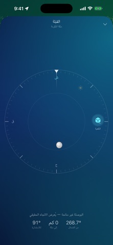
Sampled from 6 of ثناء · أوقات الصلاة's App Store screenshots — background, accent and theme, measured by LaunchShots (not something Apple publishes).
#147C54 bg
#348E6B
#84FCBC accent
#FFFFFF text
Screenshots



Icon palette
About this app
تطبيق ثناء لمواقيت الصلاة. أُهدي هذا التطبيق إلى أمي ثناء، وباسمها سُمّي. مجاني بالكامل. دقيق. ولا يجمع عنك أي بيانات. • بلا ثمن، ولا اشتراك، ولا إعلانات. • لا يطلب حساباً، ولا يتتبعك، ولا يرفع أي شيء إلى الإنترنت. كل ما تراه على الشاشة يُحسب على جهازك أنت. • يعمل دون اتصال بالإنترنت في أي مكان في العالم. يعمل من أول لحظة، دون أي إعداد: • يحدد موقعك تلقائياً، ويختار طريقة الحساب المعمول بها في بلدك — أم القرى في السعودية، ودبي في الإمارات، والهيئة المصرية في مصر، وغيرها. • إن سافرت، يلاحظ التطبيق انتقالك ويحدّث المواقيت والمنطقة الزمنية بنفسه. • أو اختر مدينتك يدوياً من قائمة تضم أكثر من مئة مدينة، دون حاجة إلى الإنترنت. المواقيت: • الفجر، الشروق، الظهر، العصر، المغرب، العشاء، والقيام (الثلث الأخير من الليل). • أربع عشرة طريقة حساب، ومذهبا العصر، وقواعد خطوط العرض العالية، وضبط دقيق بالدقائق لكل وقت، وتعديل التاريخ الهجري. • أدر جهازك أفقياً لترى جدول الأسبوع أو الشهر أو رم…
App details
What you can learn from ثناء · أوقات الصلاة
Every shipping app on the App Store has gone through the same decisions you're working through right now: which screenshot goes first, what caption sits over it, which device frame to show, what color the background should be. The 6 screenshots above are ثناء · أوقات الصلاة's answers to those questions — they're public, they're real, and they made it through Apple's review.
What the numbers say: ثناء · أوقات الصلاة runs a dark set where the background shifts from screenshot to screenshot (first shot #147C54) — each image has to stand on its own, so the captions carry more of the story. The accent colour we picked up, #84FCBC, is the one to reuse for badges, arrows and highlighted words if you borrow this look. Hit Use this style to open the editor with these exact colours and drop your own screenshot in.
Notice the first screenshot in particular. It's the one users see in search results and on the product page, and it's where most apps spend their best caption and tightest design. Look at the proportion of background to phone, where the text sits, what one thing the image is trying to communicate.
Want to see how other Reference apps approach the same problem? Browse more Reference apps in the showcase.
Take what works into your own screenshots
Open LaunchShots and design your App Store & Google Play screenshots — pick a device frame, drop captions, ship in minutes. Free, in your browser.
Open the screenshot editor →Apps with a similar look
Closest background + accent colours among the listings we've analysed — useful when you want to see the same palette handled by a different team.