Chart position — tracked daily by LaunchShots
Screenshot changes — detected by LaunchShots
Screenshot style breakdown
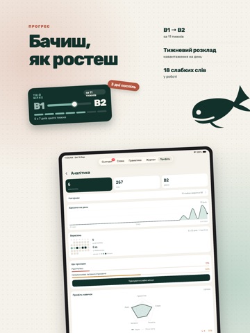
Sampled from 6 of Wally: Англійська мова's App Store screenshots — background, accent and theme, measured by LaunchShots (not something Apple publishes).
#14342C bg
#345049
#4C7C6C accent
#FFFFFF text
Screenshots
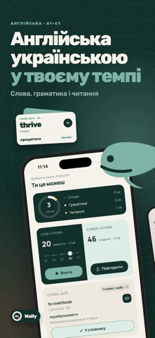

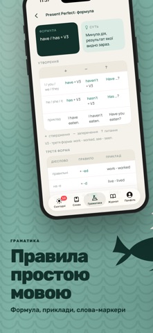
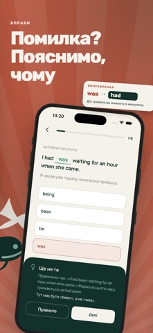
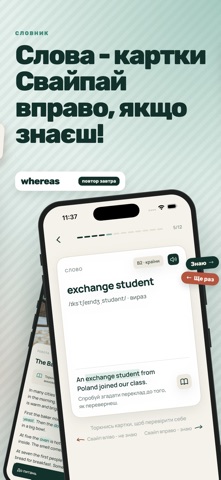

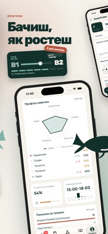

iPad screenshots
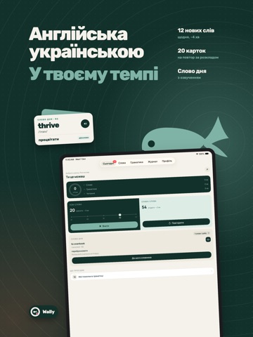

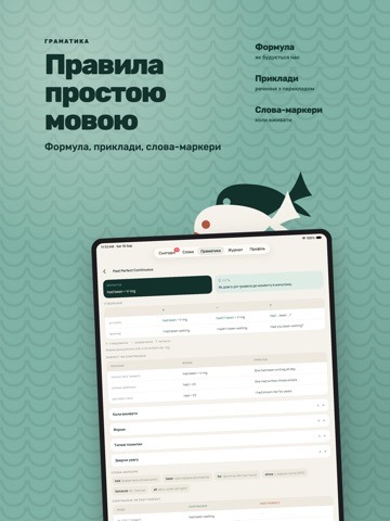


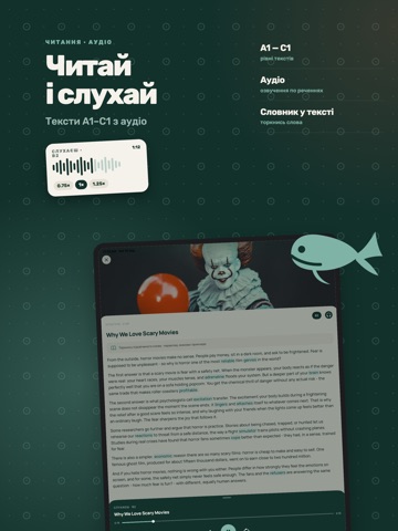

Icon palette
About this app
Wally - це англійська невеликими уроками по декілька хвилин на день. Українською, з поясненням кожної помилки Короткий тест визначає твій рівень за шкалою CEFR і будує план: що вчити сьогодні, що повернеться на повтор завтра ДЕНЬ У WALLY - ТРИ КРОКИ - правило простою мовою: формула, приклади, слова-маркери; - вправи: заповни пропуск, збери речення, з'єднай пари, аудіювання, знайди помилку; - картки слів, які повертаються саме тоді, коли ти майже їх забув. ЧИТАННЯ І АУДІО - короткі тексти, підібрані за рівнем - від A1 до C1; - озвучення: слухай текст повністю або окремими реченнями, зі сповільненням; - питання на розуміння після кожного тексту; - незнайоме слово з тексту одним дотиком іде у твій словник і в повторення. СЛОВА І ТЕМИ - набори за темами: мистецтво, їжа, музика, література, технології, бізнес, подорожі, наука; - набори за рівнем: A1-A2, B1-B2, C1; - слова дня, вивчай нез…
App details
What you can learn from Wally: Англійська мова
Every shipping app on the App Store has gone through the same decisions you're working through right now: which screenshot goes first, what caption sits over it, which device frame to show, what color the background should be. The 16 screenshots above are Wally: Англійська мова's answers to those questions — they're public, they're real, and they made it through Apple's review.
What the numbers say: Wally: Англійська мова runs a mixed light-and-dark set where the background shifts from screenshot to screenshot (first shot #14342C) — each image has to stand on its own, so the captions carry more of the story. The accent colour we picked up, #4C7C6C, is the one to reuse for badges, arrows and highlighted words if you borrow this look. Hit Use this style to open the editor with these exact colours and drop your own screenshot in.
Notice the first screenshot in particular. It's the one users see in search results and on the product page, and it's where most apps spend their best caption and tightest design. Look at the proportion of background to phone, where the text sits, what one thing the image is trying to communicate.
Want to see how other Education apps approach the same problem? Browse more Education apps in the showcase.
Take what works into your own screenshots
Open LaunchShots and design your App Store & Google Play screenshots — pick a device frame, drop captions, ship in minutes. Free, in your browser.
Open the screenshot editor →Apps with a similar look
Closest background + accent colours among the listings we've analysed — useful when you want to see the same palette handled by a different team.