Screenshot style breakdown
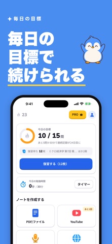
Sampled from 6 of Pendy(ペンディ)'s App Store screenshots — background, accent and theme, measured by LaunchShots (not something Apple publishes).
#4C8CF4 bg
#659CF5
#E4D47C accent
#FFFFFF text
Screenshots


Icon palette
About this app
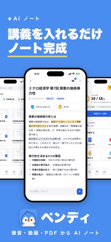
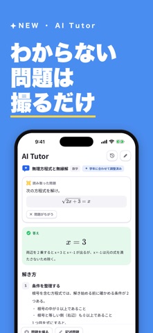
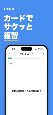
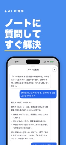
Pendy(ペンディ)– 講義を入れるだけで、ノートが完成する。 大学の講義は、90分でも情報量は膨大。 録音した音声も、配られたPDFも、見つけた動画も、そのまま溜めているだけでは点数になりません。 ペンディは、それらを「入れるだけ」で使えるノートに変える、大学生のためのAI学習アプリです。 ◆ 主な機能 ① 講義を入れるだけでノートに 録音・PDF・Webページ・YouTube・テキストを取り込むと、AIが要点を整理したノートを自動で作成します。 ② 待たなくていい 生成はバックグラウンドで進みます。アプリを閉じても止まりません。 できあがると通知でお知らせします。 ③ フラッシュカードと小テストを自動生成 ノートの内容から暗記カードと確認テストをAIが作成。 試験前に、覚えるべきところだけを回せます。 ④ ノートに直接質問できるAIチャット 「この式の意味は?」と聞けば、そのノートの内容をもとに答えます。 教科書を開き直す必要はありません。 ⑤ 大学・学部でつながるコミュニティ 同じ大学・学部・資格・ジャンルの公開ノー…
App details
What you can learn from Pendy(ペンディ)
Every shipping app on the App Store has gone through the same decisions you're working through right now: which screenshot goes first, what caption sits over it, which device frame to show, what color the background should be. The 7 screenshots above are Pendy(ペンディ)'s answers to those questions — they're public, they're real, and they made it through Apple's review.
What the numbers say: Pendy(ペンディ) runs a dark set with one background colour (#4C8CF4) carried across every screenshot — the listing reads as a single poster when the shots sit side by side in search results. The accent colour we picked up, #E4D47C, is the one to reuse for badges, arrows and highlighted words if you borrow this look. Hit Use this style to open the editor with these exact colours and drop your own screenshot in.
Notice the first screenshot in particular. It's the one users see in search results and on the product page, and it's where most apps spend their best caption and tightest design. Look at the proportion of background to phone, where the text sits, what one thing the image is trying to communicate.
Want to see how other Education apps approach the same problem? Browse more Education apps in the showcase.
Take what works into your own screenshots
Open LaunchShots and design your App Store & Google Play screenshots — pick a device frame, drop captions, ship in minutes. Free, in your browser.
Open the screenshot editor →Apps with a similar look
Closest background + accent colours among the listings we've analysed — useful when you want to see the same palette handled by a different team.