Chart position — tracked daily by LaunchShots
Screenshot style breakdown
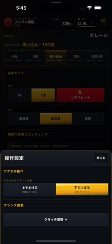
Sampled from 5 of ブンブン伝説's App Store screenshots — background, accent and theme, measured by LaunchShots (not something Apple publishes).
#0C0C0C bg
#2E2E2E
#2C4C84 accent
#FFFFFF text
Reading the caption text from the screenshots in your browser…
Screenshots



Icon palette
About this app
アクセルを回し、クラッチを合わせて、エンジン音でリズムを刻もう。 『ブンブン伝説』は、単車のアクセルとクラッチを操るサウンドゲームです。回転を上げる、落とす、つなぐ。両手のタイミングで音の表情が変わります。 ■ 自分に合った操作で遊ぶ 画面をタップする操作、指を滑らせるスライド操作、端末の傾きを使う操作に対応。操作設定を調整しながら、自分のリズムを見つけられます。 ■ 車体と音を選ぶ 車体や音の組み合わせを選んで、自分好みのスタイルで遊べます。 ■ コールを練習する お手本の基本練習リズムを聞きながら、アクセルとクラッチで自分のタイミングを試せます。自由に音を刻むこともできます。 ■ 登録なしで遊べる アカウント登録やログインは不要です。通常プレイの進行や利用統計は運営へ送信されず、進行と設定はこの端末に自動保存されます。広告やアクセス解析もありません。 ■ 記録をファイルで守る ゲーム内の「記録を守る」から、名前・進行・対応する設定をバックアップファイルとして保存し、あとから読み戻せます。読み戻す前…
App details
What you can learn from ブンブン伝説
Every shipping app on the App Store has gone through the same decisions you're working through right now: which screenshot goes first, what caption sits over it, which device frame to show, what color the background should be. The 5 screenshots above are ブンブン伝説's answers to those questions — they're public, they're real, and they made it through Apple's review.
What the numbers say: ブンブン伝説 runs a dark set with one background colour (#0C0C0C) carried across every screenshot — the listing reads as a single poster when the shots sit side by side in search results. The accent colour we picked up, #2C4C84, is the one to reuse for badges, arrows and highlighted words if you borrow this look. Hit Use this style to open the editor with these exact colours and drop your own screenshot in.
Notice the first screenshot in particular. It's the one users see in search results and on the product page, and it's where most apps spend their best caption and tightest design. Look at the proportion of background to phone, where the text sits, what one thing the image is trying to communicate.
Want to see how other Games apps approach the same problem? Browse more Games apps in the showcase.
Take what works into your own screenshots
Open LaunchShots and design your App Store & Google Play screenshots — pick a device frame, drop captions, ship in minutes. Free, in your browser.
Open the screenshot editor →Apps with a similar look
Closest background + accent colours among the listings we've analysed — useful when you want to see the same palette handled by a different team.