Chart position — tracked daily by LaunchShots
Screenshot style breakdown
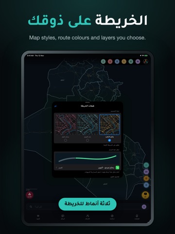
Sampled from 6 of دهليز Dahliz's App Store screenshots — background, accent and theme, measured by LaunchShots (not something Apple publishes).
#040C0C bg
#272E2E
#2CC4B4 accent
#FFFFFF text
Screenshots


iPad screenshots


Icon palette
About this app
دهليز Dahliz يساعدك على استكشاف العراق والبحث عن الأماكن وحساب طرق القيادة والمشي. تتضمن النسخة خريطة العراق وبيانات الأماكن وحزمة المسارات للعمل دون إنترنت، وتحتاج التحديثات وحالة الطرق والميزات الاجتماعية إلى اتصال. اختر وجهتك بالكتابة أو بالإحداثيات، واحفظ أماكنك المفضلة. أثناء الرحلة يعرض التطبيق المسار وتنبيهات الطريق، ويمكنه متابعة الموقع والتنبيهات في الخلفية وفق الأذونات التي تمنحها. تبدأ خدمة الرحلة باختيارك وتتوقف عند إنهائها. بالحساب تستطيع إضافة الأصدقاء وتبادل الرسائل والمساهمة ببلاغات الطريق والأماكن. مشاركة الظهور على الخريطة اختيارية، وتوجد أدوات حظر وتبليغ وحذف حساب. تختفي دورة المحادثة بعد 24 ساعة من أول رسالة فيها. التحية الصوتية المخصصة اختيارية؛ تبقى التحية العامة متاحة عند رفض إرسال النص إلى مزوّد الصوت. ميزة طلب المساعدة تربط السائقين القريبين بحسب آخر موقع مسموح. هي مساعدة مجتمعية وليست اتصالًا رسميًا بالإسعاف أو الشرطة، ولا تضمن وصول المساعدة. بيانات الطرق وا…
App details
What you can learn from دهليز Dahliz
Every shipping app on the App Store has gone through the same decisions you're working through right now: which screenshot goes first, what caption sits over it, which device frame to show, what color the background should be. The 11 screenshots above are دهليز Dahliz's answers to those questions — they're public, they're real, and they made it through Apple's review.
What the numbers say: دهليز Dahliz runs a dark set with one background colour (#040C0C) carried across every screenshot — the listing reads as a single poster when the shots sit side by side in search results. The accent colour we picked up, #2CC4B4, is the one to reuse for badges, arrows and highlighted words if you borrow this look. Hit Use this style to open the editor with these exact colours and drop your own screenshot in.
Notice the first screenshot in particular. It's the one users see in search results and on the product page, and it's where most apps spend their best caption and tightest design. Look at the proportion of background to phone, where the text sits, what one thing the image is trying to communicate.
Want to see how other Navigation apps approach the same problem? Browse more Navigation apps in the showcase.
Take what works into your own screenshots
Open LaunchShots and design your App Store & Google Play screenshots — pick a device frame, drop captions, ship in minutes. Free, in your browser.
Open the screenshot editor →Apps with a similar look
Closest background + accent colours among the listings we've analysed — useful when you want to see the same palette handled by a different team.