Chart position — tracked daily by LaunchShots
Screenshot style breakdown
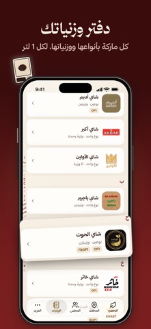
Sampled from 6 of خدرة: وزنيات الشاي's App Store screenshots — background, accent and theme, measured by LaunchShots (not something Apple publishes).
#3C0C0C bg
#572E2E
#D4A44C accent
#FFFFFF text
Screenshots




Icon palette
About this app
كل كيف وله شاي، وكل شاي وله خدرته. خدرة رفيقك في الشاي: تقولك كم شاي وكم سكر بالضبط لأي كمية ماي، تحسب لك وقت الخدرة، وتتعلم ذوقك مع كل مرة. وتكلمك بالإماراتي أو بالفصحى، أو بلهجتك الخليجية (تجريبي). التحضير اختار الماركة والنوع، حدد كمية الماي، وخذ الوزنية بالغرام. خطوة بخطوة للي يتعلم، ومؤقت يتحول فيه الغوري من ماي لين يطلع دم غزال. نذكّرك كل 5 دقايق، ولما يجهز الشاي يرن مثل المنبّه حتى لو الجوال صامت. الوزنيات دفتر وزنياتك: كل ماركة عندك، بأنواعها ووزنياتها، محفوظة لكل 1 لتر وتنحسب لأي كمية. بعد كل خدرة قيّم النتيجة (ثقيل، موزون، خفيف، حالي، مضبوط، مر) والوزنية تتعدل على ذوقك. المجلس شوف كيف يخدّر الناس كل ماركة، احفظ وزنياتهم عندك وجرّبها، وقيّم الأنواع بعد ما تخدّرها. الماركات والأنواع الجديدة تمر على المراجعة قبل لا تنشر، وتقدر تبلّغ عن أي شي وتحجب أي حد. المحلات محلات الشاي والترك والبوب أب والأكشاك والمشاريع المنزلية، والفعاليات، على الخريطة وفي قائمة، مرتبة حسب الأقرب لك. …
App details
What you can learn from خدرة: وزنيات الشاي
Every shipping app on the App Store has gone through the same decisions you're working through right now: which screenshot goes first, what caption sits over it, which device frame to show, what color the background should be. The 8 screenshots above are خدرة: وزنيات الشاي's answers to those questions — they're public, they're real, and they made it through Apple's review.
What the numbers say: خدرة: وزنيات الشاي runs a dark set with one background colour (#3C0C0C) carried across every screenshot — the listing reads as a single poster when the shots sit side by side in search results. The accent colour we picked up, #D4A44C, is the one to reuse for badges, arrows and highlighted words if you borrow this look. Hit Use this style to open the editor with these exact colours and drop your own screenshot in.
Notice the first screenshot in particular. It's the one users see in search results and on the product page, and it's where most apps spend their best caption and tightest design. Look at the proportion of background to phone, where the text sits, what one thing the image is trying to communicate.
Want to see how other Food & Drink apps approach the same problem? Browse more Food & Drink apps in the showcase.
Take what works into your own screenshots
Open LaunchShots and design your App Store & Google Play screenshots — pick a device frame, drop captions, ship in minutes. Free, in your browser.
Open the screenshot editor →Apps with a similar look
Closest background + accent colours among the listings we've analysed — useful when you want to see the same palette handled by a different team.