Chart position — tracked daily by LaunchShots
Screenshot style breakdown
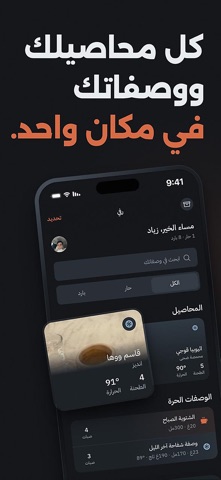
Sampled from 4 of مختص — رفيق قهوتك المختصة's App Store screenshots — background, accent and theme, measured by LaunchShots (not something Apple publishes).
#14141C bg
#34343B
#D46C44 accent
#FFFFFF text
Reading the caption text from the screenshots in your browser…
Screenshots


iPad screenshots


Icon palette
About this app
مختص يحفظ لك وصفة واحدة لكل محصول — وتضبطها كل يوم حتى تصير مثل ما تحب. ليش وصفة واحدة؟ لأن القهوة ما تُضبط من أول كوب. يجيك تحميص جديد، تجرّب، تطلع حامضة شوي، تعدّل درجة الطحن، وفي اليوم الثالث تصير مضبوطة. مختص يمسك هذي الوصفة ويخليها معك، فلا تبدأ من الصفر كل مرة. وش يسوي مختص: • رفّك — كل محصول بصورته ومحمصته وتاريخ تحميصه، ومعه وصفته. • وصفة حيّة — قهوة، ماء، حرارة، درجة طحن، وصبّات. تعدلها في أي لحظة وتبقى محفوظة. • عطنا رأيك ونضبطها — قول «حامضة» أو «مرّة»، ويقترح عليك تعديلاً بأرقام مطحنتك. • حار وبارد — بضغطة واحدة يحسب لك V60 المثلّج ويقسم الماء والثلج. • حاسبة النسبة — 1:15 جاهزة، وتغيرها كيف ما تبي. • طواحينك — أضف مطحنتك، وتصير الأرقام بأرقام مطحنتك أنت لا بأرقام غيرك. • وصفات حرة — وصفة بدون محصول، لها عنوان ووصف وصبّات. • شارك الوصفة برابط — يفتحه صاحبك ولو ما عنده التطبيق، وإذا عنده يضيفها لرفه، وتُترجم درجة الطحن إلى أرقام مطحنته هو. • عربي أولاً — التطبيق عربي بالكا…
App details
What you can learn from مختص — رفيق قهوتك المختصة
Every shipping app on the App Store has gone through the same decisions you're working through right now: which screenshot goes first, what caption sits over it, which device frame to show, what color the background should be. The 8 screenshots above are مختص — رفيق قهوتك المختصة's answers to those questions — they're public, they're real, and they made it through Apple's review.
What the numbers say: مختص — رفيق قهوتك المختصة runs a dark set with one background colour (#14141C) carried across every screenshot — the listing reads as a single poster when the shots sit side by side in search results. The accent colour we picked up, #D46C44, is the one to reuse for badges, arrows and highlighted words if you borrow this look. Hit Use this style to open the editor with these exact colours and drop your own screenshot in.
Notice the first screenshot in particular. It's the one users see in search results and on the product page, and it's where most apps spend their best caption and tightest design. Look at the proportion of background to phone, where the text sits, what one thing the image is trying to communicate.
Want to see how other Food & Drink apps approach the same problem? Browse more Food & Drink apps in the showcase.
Take what works into your own screenshots
Open LaunchShots and design your App Store & Google Play screenshots — pick a device frame, drop captions, ship in minutes. Free, in your browser.
Open the screenshot editor →Apps with a similar look
Closest background + accent colours among the listings we've analysed — useful when you want to see the same palette handled by a different team.