Chart position — tracked daily by LaunchShots
Screenshot changes — detected by LaunchShots
Screenshot style breakdown
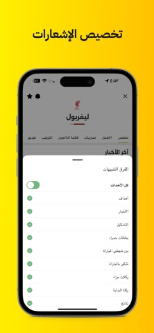
Sampled from 6 of Kooora's App Store screenshots — background, accent and theme, measured by LaunchShots (not something Apple publishes).
#FCC404 bg
#DDAC03
#645C04 accent
#111111 text
Screenshots


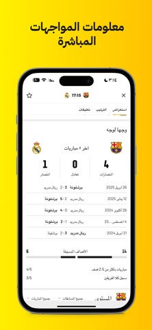
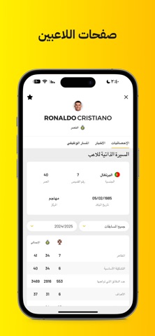
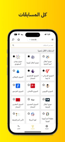
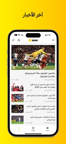
iPad screenshots


Icon palette
About this app
تطبيق كووورة الجديد أصبح متاحًا الآن! كووورة هو التجربة الأفضل لعشّاق كرة القدم. بفضل التصميم الجديد كليًا، والنتائج الفورية، والوصول الكامل إلى شبكة أخبارنا، سيُبقيك التطبيق على اطّلاع دائم. استمتع بإحصائيات شاملة، وتحليل فني لأداء الفرق، وبيانات المواجهات المباشرة لأهم البطولات العالمية. والأفضل من ذلك — التحديثات والإشعارات الشخصية التي تمنحك التحكم الكامل بفرقك المفضّلة. كووورة ينقلك إلى عالم كرة القدم، مقدمًا تجربة ديناميكية تحاكي أجواء يوم المباراة بكل تفاصيلها. الميزات الرئيسية: موجز المباريات المباشرة: تحديثات لحظية من أقوى البطولات في العالم الجداول والترتيب: وصول فوري إلى أحدث الجداول والترتيبات تابع فرقك المفضلة: خصّص تجربتك من خلال إشعارات خاصة بفرقك، ومبارياتك، وبطولاتك المفضلة إحصائيات موسّعة للمباريات: استعرض التشكيلات، والأحداث الرئيسية، والترتيب المباشر، والإحصائيات التفاعلية خلال المباراة تنبيهات فورية: إشعارات مخصصة لبداية المباريات، وتسجيل الأهداف، والتشكيلات،…
App details
What you can learn from Kooora
Every shipping app on the App Store has gone through the same decisions you're working through right now: which screenshot goes first, what caption sits over it, which device frame to show, what color the background should be. The 18 screenshots above are Kooora's answers to those questions — they're public, they're real, and they made it through Apple's review.
What the numbers say: Kooora runs a light set with one background colour (#FCC404) carried across every screenshot — the listing reads as a single poster when the shots sit side by side in search results. The accent colour we picked up, #645C04, is the one to reuse for badges, arrows and highlighted words if you borrow this look. Hit Use this style to open the editor with these exact colours and drop your own screenshot in.
Notice the first screenshot in particular. It's the one users see in search results and on the product page, and it's where most apps spend their best caption and tightest design. Look at the proportion of background to phone, where the text sits, what one thing the image is trying to communicate.
Want to see how other Sports apps approach the same problem? Browse more Sports apps in the showcase.
Take what works into your own screenshots
Open LaunchShots and design your App Store & Google Play screenshots — pick a device frame, drop captions, ship in minutes. Free, in your browser.
Open the screenshot editor →Apps with a similar look
Closest background + accent colours among the listings we've analysed — useful when you want to see the same palette handled by a different team.