Chart position — tracked daily by LaunchShots
Screenshot style breakdown
Sampled from 6 of 魚みっけ's App Store screenshots — background, accent and theme, measured by LaunchShots (not something Apple publishes).
#04ACF4 bg
#0397D6
#8CDCFC accent
#111111 text
Screenshots
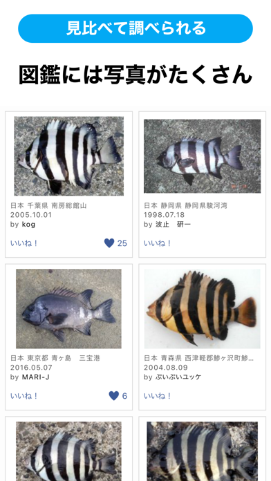

iPad screenshots
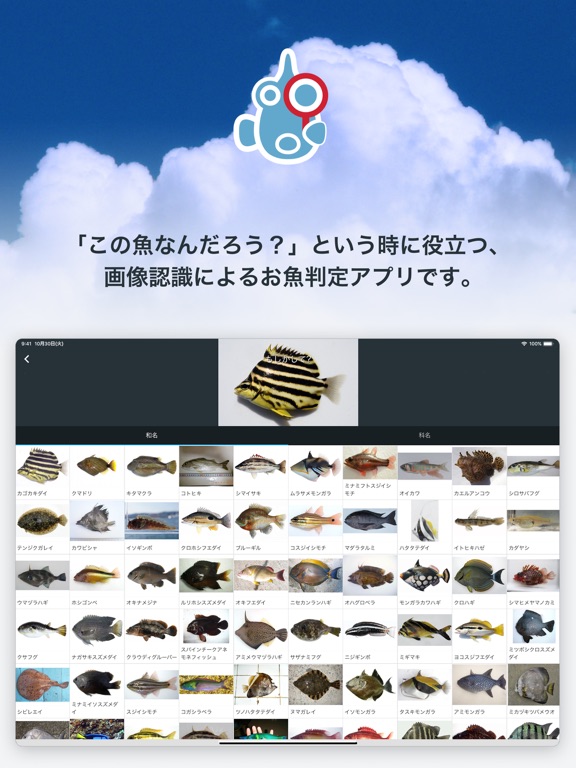
Icon palette
About this app
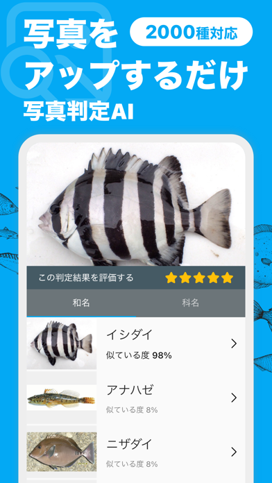
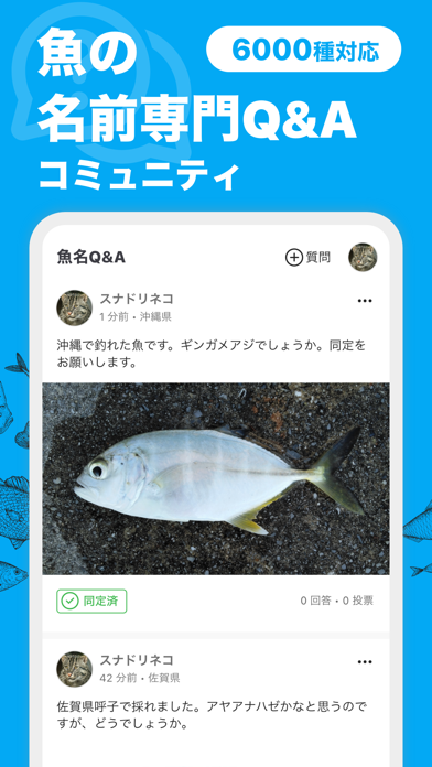
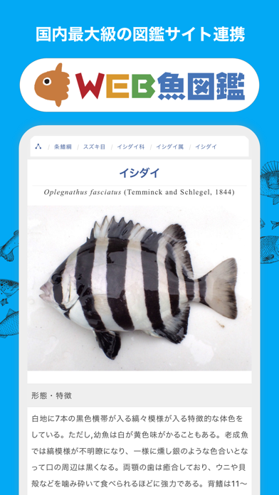
\ ありがとう50万ダウンロード /【写真判定AIによるお魚判定アプリ】 「魚みっけ」は、「この魚なんだろう?」という時に役立つ、写真判定AIによるお魚判定アプリです。 「この魚、なんだろう?」と思ったら、撮影して写真判定AIに送信。すぐに「これですか?」と候補の魚種を返してくれます。釣りや水遊びはもちろん、夏休みの自由研究にも役立ちます。 写真判定AIは「種」と「科」のレベルで結果を表示します。「種」で見つからない場合は、「科」もチェックしてみてください。日本近海の魚類を対象としています(甲殻類・イカ・タコなど魚類以外の生き物には対応しておりません)。 【魚名Q&Aについて】 魚名Q&Aは閉鎖しました。これまでのQ&Aは、アプリ内のインフォからご覧いただけます。 【写真判定AIの判定率を高めるコツは】 こんな写真だと判定率がアップします。 ●魚は1尾だけ撮影します ●カレイ科をのぞいて、原則、頭を左側にして横から撮影してください ●頭と尾が収まるように全体を撮影してください ●なるべくすっきりした背景で ●なるべく鮮明に こんな写…
App details
What you can learn from 魚みっけ
Every shipping app on the App Store has gone through the same decisions you're working through right now: which screenshot goes first, what caption sits over it, which device frame to show, what color the background should be. The 7 screenshots above are 魚みっけ's answers to those questions — they're public, they're real, and they made it through Apple's review.
What the numbers say: 魚みっけ runs a light set where the background shifts from screenshot to screenshot (first shot #04ACF4) — each image has to stand on its own, so the captions carry more of the story. The accent colour we picked up, #8CDCFC, is the one to reuse for badges, arrows and highlighted words if you borrow this look. Hit Use this style to open the editor with these exact colours and drop your own screenshot in.
Notice the first screenshot in particular. It's the one users see in search results and on the product page, and it's where most apps spend their best caption and tightest design. Look at the proportion of background to phone, where the text sits, what one thing the image is trying to communicate.
Want to see how other Reference apps approach the same problem? Browse more Reference apps in the showcase.
Take what works into your own screenshots
Open LaunchShots and design your App Store & Google Play screenshots — pick a device frame, drop captions, ship in minutes. Free, in your browser.
Open the screenshot editor →Apps with a similar look
Closest background + accent colours among the listings we've analysed — useful when you want to see the same palette handled by a different team.