Screenshot style breakdown
Sampled from 5 of Smart Driver - Антирадар ГИБДД's App Store screenshots — background, accent and theme, measured by LaunchShots (not something Apple publishes).
#FCFCFC bg
#DDDDDD
#A41404 accent
#111111 text
Reading the caption text from the screenshots in your browser…
Screenshots
Icon palette
About this app
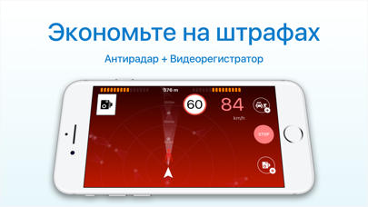
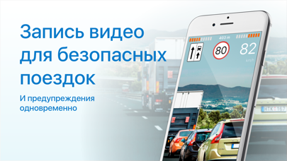
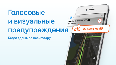
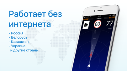
Smart Driver – незаменимое приложение для водителей, которое объединяет в себе видеорегистратор и антирадар - предупреждения об опасностях на дороге (камеры контроля скорости - Стрелки, стационарные радары, посты ДПС и другие опасные места). Основные функции приложения: - Предупреждение о камерах контроля скорости и постах ДПС - Работа в фоне вместе с навигатором - Поддержка парных камер, которые измеряют среднюю скорость на участке - Функция видео регистрации Если при приближении к опасному участку Ваша скорость будет выше разрешенной более чем на 19 км/ч, то приложение будет подавать предупреждающие сигналы. Это важно, т.к. теперь штраф за превышение на >20 км/ч уже начинается с 500 рублей. Скачайте приложение сейчас и экономьте на штрафах уже сегодня! Вам больше не нужен отдельный видеорегистратор для снижения риска неправомерных действий со стороны других водителей или сотрудни…
App details
What you can learn from Smart Driver - Антирадар ГИБДД
Every shipping app on the App Store has gone through the same decisions you're working through right now: which screenshot goes first, what caption sits over it, which device frame to show, what color the background should be. The 5 screenshots above are Smart Driver - Антирадар ГИБДД's answers to those questions — they're public, they're real, and they made it through Apple's review.
What the numbers say: Smart Driver - Антирадар ГИБДД runs a light set with one background colour (#FCFCFC) carried across every screenshot — the listing reads as a single poster when the shots sit side by side in search results. The accent colour we picked up, #A41404, is the one to reuse for badges, arrows and highlighted words if you borrow this look. Hit Use this style to open the editor with these exact colours and drop your own screenshot in.
Notice the first screenshot in particular. It's the one users see in search results and on the product page, and it's where most apps spend their best caption and tightest design. Look at the proportion of background to phone, where the text sits, what one thing the image is trying to communicate.
Want to see how other Navigation apps approach the same problem? Browse more Navigation apps in the showcase.
Take what works into your own screenshots
Open LaunchShots and design your App Store & Google Play screenshots — pick a device frame, drop captions, ship in minutes. Free, in your browser.
Open the screenshot editor →Apps with a similar look
Closest background + accent colours among the listings we've analysed — useful when you want to see the same palette handled by a different team.