Chart position — tracked daily by LaunchShots
Screenshot style breakdown
Sampled from 4 of COCOAR - ココアル's App Store screenshots — background, accent and theme, measured by LaunchShots (not something Apple publishes).
#F4E4FC bg
#D6C8DD
#E4BC94 accent
#111111 text
Screenshots
iPad screenshots

Icon palette
About this app
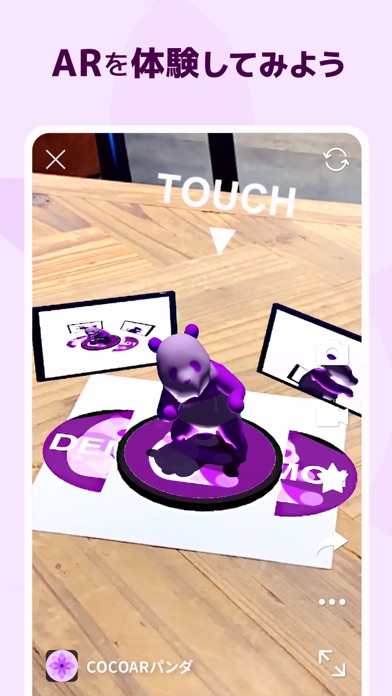
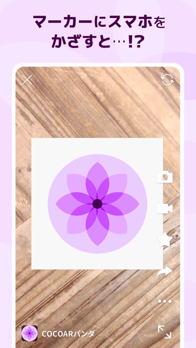
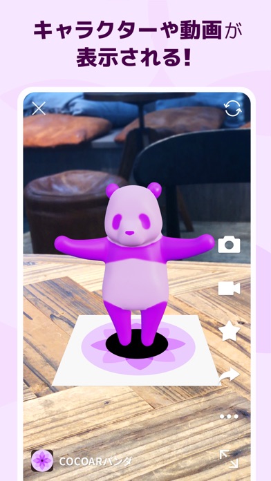
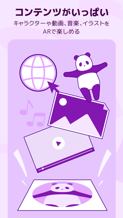
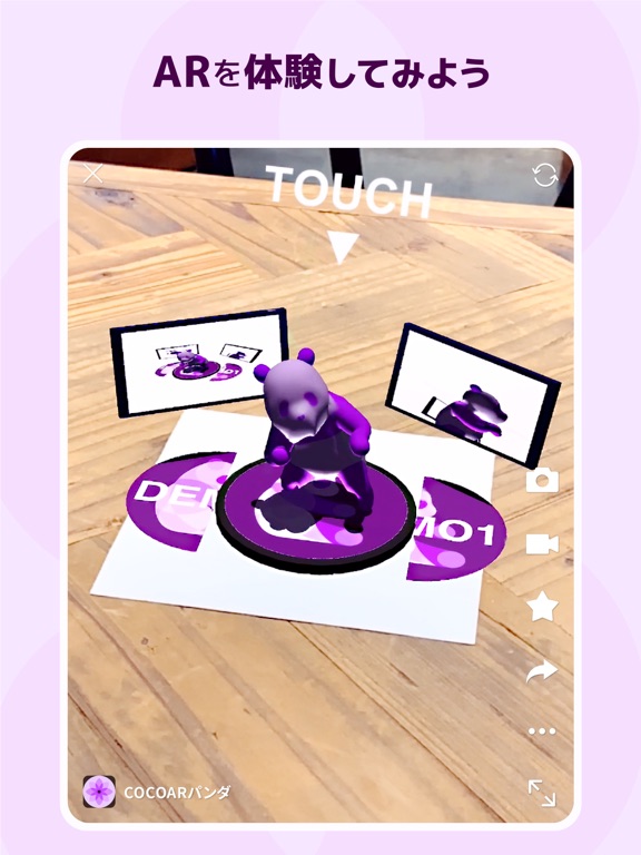
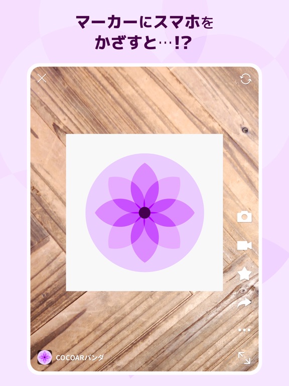
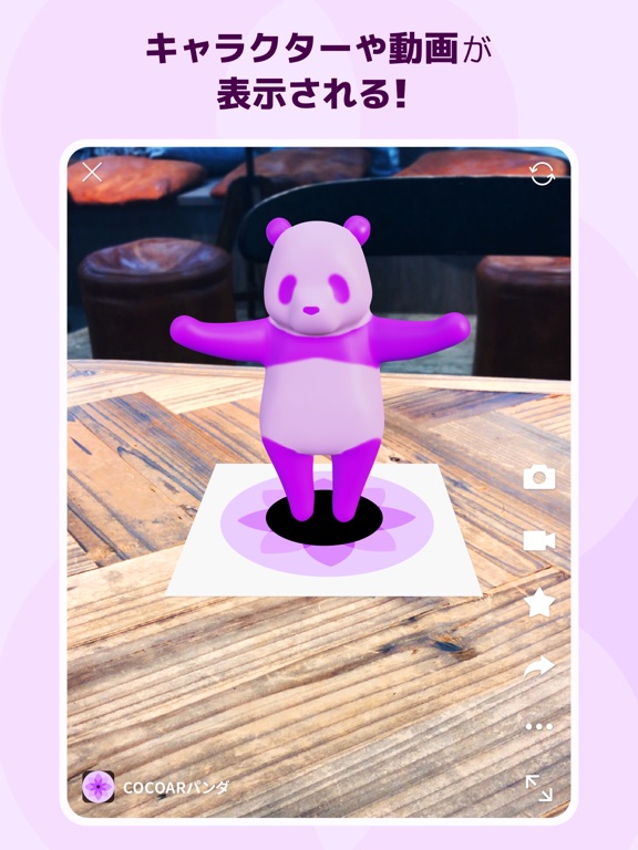
COCOARは、不思議な体験が出来るアプリです。 COCOAR対応のマーカーを見つけたら カメラを動かして かざしてみましょう! イベントやスタンプラリー、パンフレットや商品パッケージなど色んな場所で、キャラクターや音楽、動画、おみくじなどの様々なコンテンツを体験出来ます。 ● 動作確認端末 リリース時点の最新OSバージョンで動作確認しています。 OSおよびアプリが最新でない場合は、最新バージョンにアップデートしてご利用ください。 ● 利用上の注意 - マーカーの検出に失敗する場合は、明るい環境にてご利用頂くかマーカーに損傷が無いことをご確認ください。 - ネットワークの接続が不安定な場合は、認識やコンテンツのダウンロードに時間がかかる可能性があります。 - QRコードの読み込みアプリではありません。イベント企画元が指定した写真や画像などをマーカーとして読み込んでください。 ● お問い合わせ先 利用上の注意に該当しない事象により不具合を検知された場合は、以下のお問い合わせ窓口からご連絡お願い致します。 https://bit.ly/3pQvd9f
App details
What you can learn from COCOAR - ココアル
Every shipping app on the App Store has gone through the same decisions you're working through right now: which screenshot goes first, what caption sits over it, which device frame to show, what color the background should be. The 8 screenshots above are COCOAR - ココアル's answers to those questions — they're public, they're real, and they made it through Apple's review.
What the numbers say: COCOAR - ココアル runs a light set with one background colour (#F4E4FC) carried across every screenshot — the listing reads as a single poster when the shots sit side by side in search results. The accent colour we picked up, #E4BC94, is the one to reuse for badges, arrows and highlighted words if you borrow this look. Hit Use this style to open the editor with these exact colours and drop your own screenshot in.
Notice the first screenshot in particular. It's the one users see in search results and on the product page, and it's where most apps spend their best caption and tightest design. Look at the proportion of background to phone, where the text sits, what one thing the image is trying to communicate.
Want to see how other Entertainment apps approach the same problem? Browse more Entertainment apps in the showcase.
Take what works into your own screenshots
Open LaunchShots and design your App Store & Google Play screenshots — pick a device frame, drop captions, ship in minutes. Free, in your browser.
Open the screenshot editor →Apps with a similar look
Closest background + accent colours among the listings we've analysed — useful when you want to see the same palette handled by a different team.