Screenshot style breakdown
Sampled from 6 of flick(フリック)'s App Store screenshots — background, accent and theme, measured by LaunchShots (not something Apple publishes).
#24A4D4 bg
#1F90BA
#FCCC04 accent
#111111 text
Screenshots
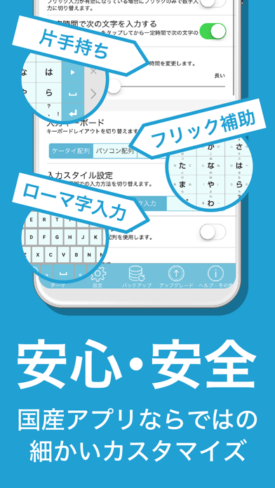
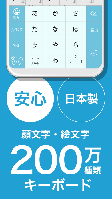
iPad screenshots
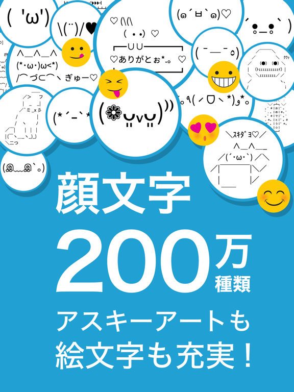
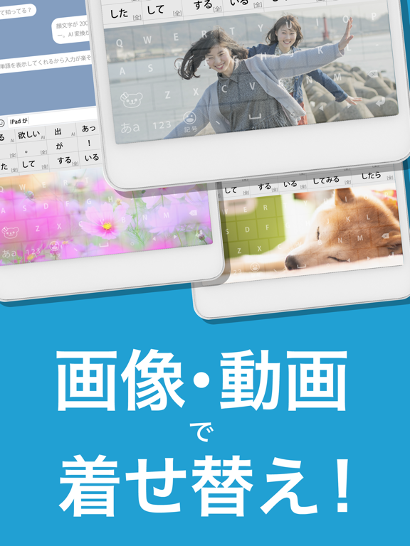
Icon palette
About this app
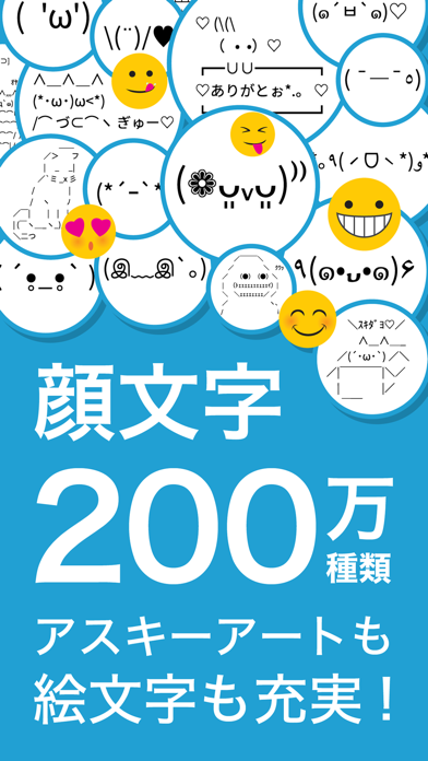
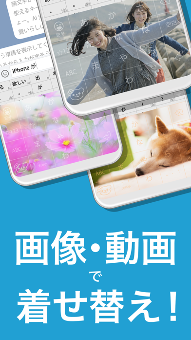
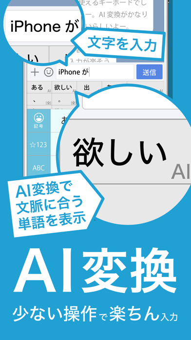
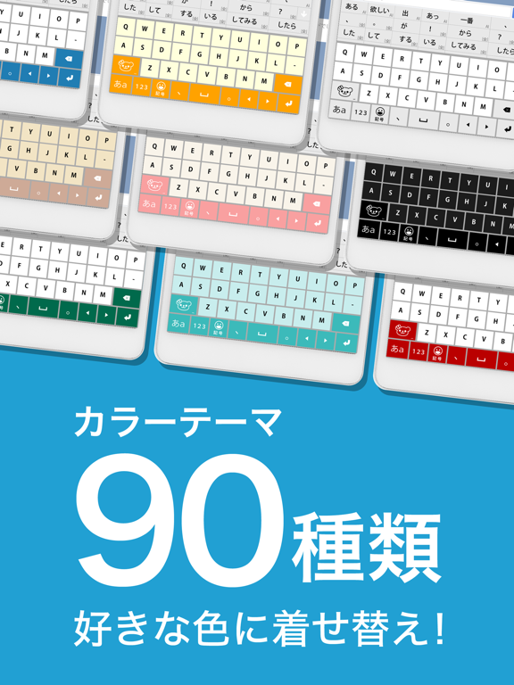
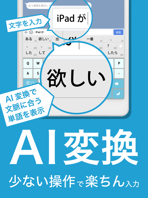
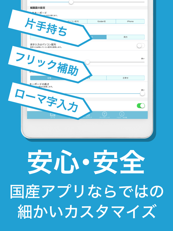
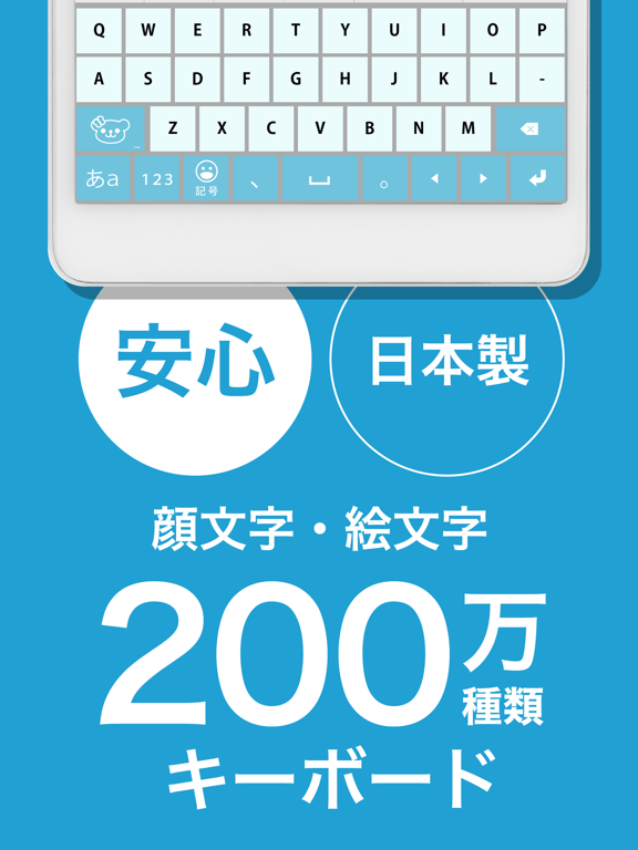
AI変換機能が生まれてアプリ名が「みんなの顔文字キーボード」から「flick(フリック)」に変わりました! 【flick(フリック)の3つの特徴】 AI変換:友達との会話からビジネス用途まで、文脈に合わせて賢く日本語の文字入力ができます 顔文字機能:100万種の顔文字やアスキーアートから気持ちにあったものを検索して使えます(みんなの顔文字辞典の顔文字がそのまま使えます) テーマ機能:画像や動画を使って自分だけのキーボードを作れます 半角カタカナやハート・スマイルマーク等の絵文字も簡単に入力できます。 【使い方】 1. ダウンロードします 2. 本体の設定を開いて「一般>キーボード>キーボード>新しいキーボードを追加」の順にタッチし「flick」を選択します 3. 画面が切り替わったら「flick」をタッチし「フルアクセスを許可」します 【AI変換について】 従来の漢字変換・日本語入力では難しかった文脈を考慮した予測変換を行う機能です。この処理はスマートフォンでは重いため、IO株式会社が日本国内のサーバーで運用するAIを利用して変換します。…
App details
What you can learn from flick(フリック)
Every shipping app on the App Store has gone through the same decisions you're working through right now: which screenshot goes first, what caption sits over it, which device frame to show, what color the background should be. The 12 screenshots above are flick(フリック)'s answers to those questions — they're public, they're real, and they made it through Apple's review.
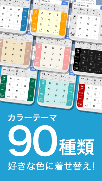
What the numbers say: flick(フリック) runs a light set with one background colour (#24A4D4) carried across every screenshot — the listing reads as a single poster when the shots sit side by side in search results. The accent colour we picked up, #FCCC04, is the one to reuse for badges, arrows and highlighted words if you borrow this look. Hit Use this style to open the editor with these exact colours and drop your own screenshot in.
Notice the first screenshot in particular. It's the one users see in search results and on the product page, and it's where most apps spend their best caption and tightest design. Look at the proportion of background to phone, where the text sits, what one thing the image is trying to communicate.
Want to see how other Utilities apps approach the same problem? Browse more Utilities apps in the showcase.
Take what works into your own screenshots
Open LaunchShots and design your App Store & Google Play screenshots — pick a device frame, drop captions, ship in minutes. Free, in your browser.
Open the screenshot editor →Apps with a similar look
Closest background + accent colours among the listings we've analysed — useful when you want to see the same palette handled by a different team.