Chart position — tracked daily by LaunchShots
Screenshot changes — detected by LaunchShots
Screenshot style breakdown
Sampled from 5 of 钉钉's App Store screenshots — background, accent and theme, measured by LaunchShots (not something Apple publishes).
#FCFCFC bg
#DDDDDD
#5CCC8C accent
#111111 text
Reading the caption text from the screenshots in your browser…
Screenshots


iPad screenshots




Icon palette
About this app
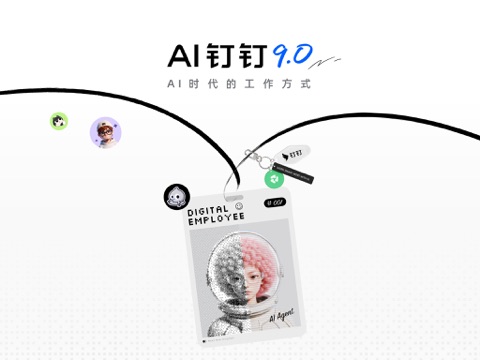
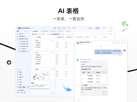
钉钉·让工作简单一点 工作要处理很多事务,工具让工作更简单。钉钉把AI放进你每天的工作流——回消息、写文档、开会、搭业务表…不用为了工作学习新产品;打开钉钉,AI已经等着接活了! 【千问办公·与钉钉协同共生的AI办公平台】 钉钉管协作,千问办公管你的活。回复消息、处理文件、做调研、做设计、搭建网页,一句话它就开工! 【AI听记·AI时代的记录方式】 会议结束,讨论完毕,记录也好了——开完会不用回听录音补笔记,纪要已经整好等你拿:发言人自动呈现,长录音拆好章节,重点和待办自动标记。 【AI表格·一张表,一套业务】 AI帮你写公式、做分析、出图表,同一份数据还能切成看板、日历、甘特图,还能根据条件自动提醒、自动通知。入门是智能表格,用深了,不会代码也能搭业务系统! 【会议AI·实时捕捉每一个关键决策】 AI降噪,嘈杂环境也听得清;实时字幕多语言翻译、分得清谁在说,中途入会一键回看前面讲了什么;听不懂当场问AI,会后纪要、待办自动生成,开会不用记笔记~ 【钉钉文档·写东西不用盯着空白页发呆】 方案、创意、信息整理,带着思路起点,钉钉文…
App details
What you can learn from 钉钉
Every shipping app on the App Store has gone through the same decisions you're working through right now: which screenshot goes first, what caption sits over it, which device frame to show, what color the background should be. The 11 screenshots above are 钉钉's answers to those questions — they're public, they're real, and they made it through Apple's review.
What the numbers say: 钉钉 runs a light set with one background colour (#FCFCFC) carried across every screenshot — the listing reads as a single poster when the shots sit side by side in search results. The accent colour we picked up, #5CCC8C, is the one to reuse for badges, arrows and highlighted words if you borrow this look. Hit Use this style to open the editor with these exact colours and drop your own screenshot in.
Notice the first screenshot in particular. It's the one users see in search results and on the product page, and it's where most apps spend their best caption and tightest design. Look at the proportion of background to phone, where the text sits, what one thing the image is trying to communicate.
Want to see how other Business apps approach the same problem? Browse more Business apps in the showcase.
Take what works into your own screenshots
Open LaunchShots and design your App Store & Google Play screenshots — pick a device frame, drop captions, ship in minutes. Free, in your browser.
Open the screenshot editor →Apps with a similar look
Closest background + accent colours among the listings we've analysed — useful when you want to see the same palette handled by a different team.