Screenshot style breakdown
Sampled from 6 of Dr.JOY's App Store screenshots — background, accent and theme, measured by LaunchShots (not something Apple publishes).
#FC842C bg
#DD7426
#3CACF4 accent
#111111 text
Screenshots
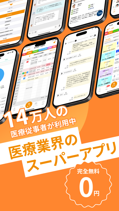
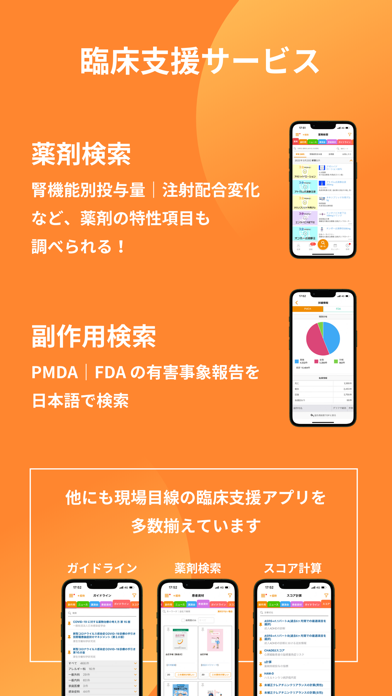

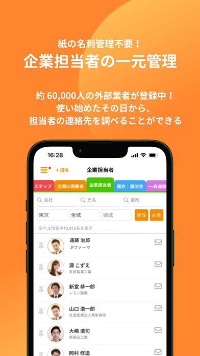

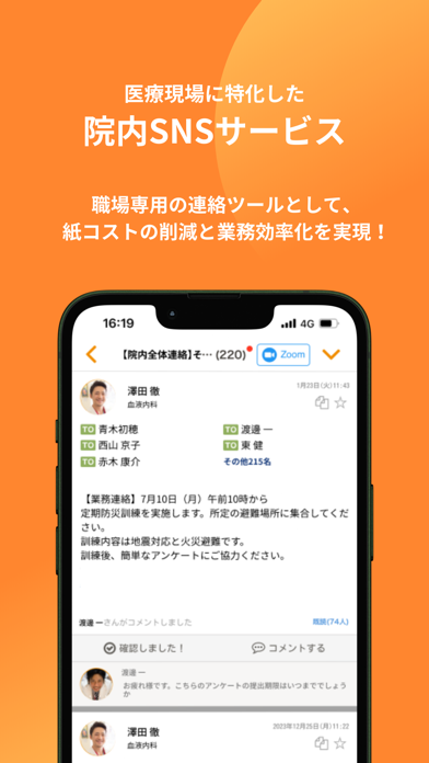
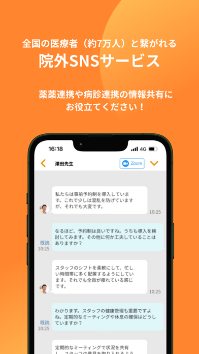
iPad screenshots
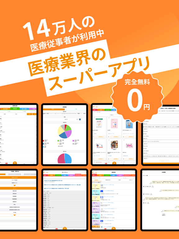
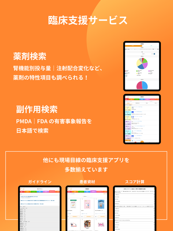
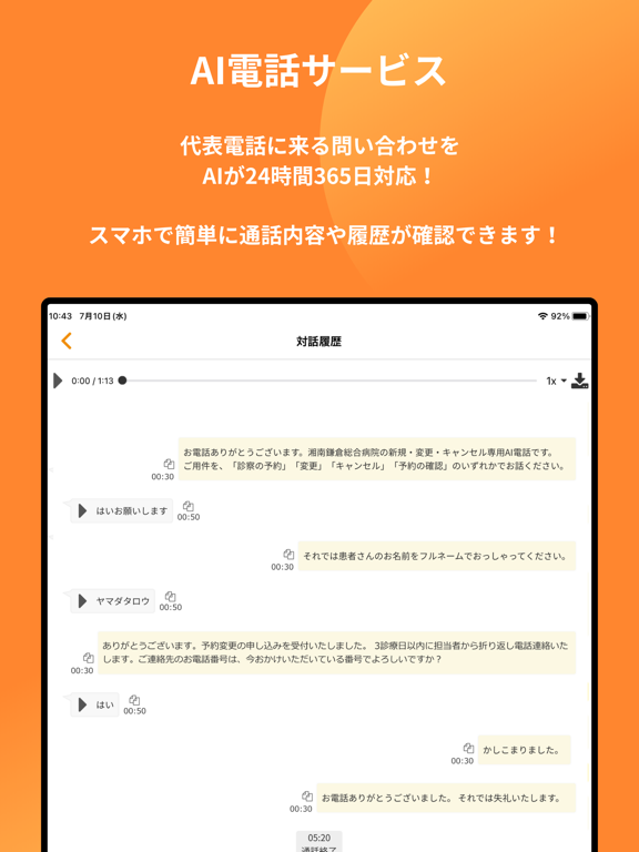

Icon palette
About this app
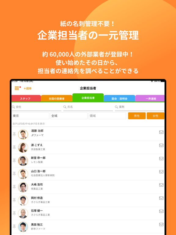
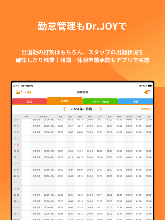
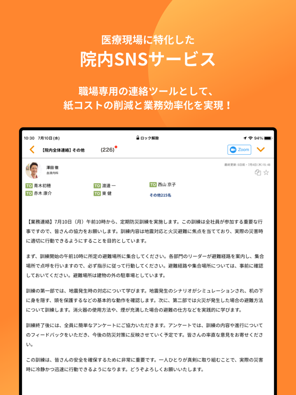
Dr.JOYは現役医師が考えた「働き方改革ソリューション」 12万人の医療者が使っている業務を効率化するツール 完全非公開型 医療機関専用 のグループウェアです 【特徴】 -医師向けの勤怠管理システム等、医療機関向け「働き方改革」の実現を支援するソリューションです -講演会や学会、ガイドラインにスコア計算、薬剤情報に副作用など業務で調べたい内容がアプリ1つで検索可能です -一般的なSNSの感覚で簡単にコミュニケーションができる医療現場専用のサービスです -診療科や委員会、同門会ごとにグループを作って、関係メンバーとのやり取りも充実します -みんなが病院のどこにいても、同じタイミングで一斉に連絡を届けることができます -ホワイトボードで共有されている内容も、ちょっとした気づきも、簡単に共有できます -FAXやUSBメモリの受け渡しでやり取りしていた書類や画像も、手軽に共有できます -外勤先や出張先でも確認できます -取引業者とのスケジュール調整やメッセージがとても楽になります 【主な機能】 1.勤務管理 自分の出勤/退勤の履歴…
App details
What you can learn from Dr.JOY
Every shipping app on the App Store has gone through the same decisions you're working through right now: which screenshot goes first, what caption sits over it, which device frame to show, what color the background should be. The 14 screenshots above are Dr.JOY's answers to those questions — they're public, they're real, and they made it through Apple's review.
What the numbers say: Dr.JOY runs a light set with one background colour (#FC842C) carried across every screenshot — the listing reads as a single poster when the shots sit side by side in search results. The accent colour we picked up, #3CACF4, is the one to reuse for badges, arrows and highlighted words if you borrow this look. Hit Use this style to open the editor with these exact colours and drop your own screenshot in.
Notice the first screenshot in particular. It's the one users see in search results and on the product page, and it's where most apps spend their best caption and tightest design. Look at the proportion of background to phone, where the text sits, what one thing the image is trying to communicate.
Want to see how other Medical apps approach the same problem? Browse more Medical apps in the showcase.
Take what works into your own screenshots
Open LaunchShots and design your App Store & Google Play screenshots — pick a device frame, drop captions, ship in minutes. Free, in your browser.
Open the screenshot editor →Apps with a similar look
Closest background + accent colours among the listings we've analysed — useful when you want to see the same palette handled by a different team.