Screenshot changes — detected by LaunchShots
Screenshot style breakdown
Sampled from 6 of 文字数カウントメモ's App Store screenshots — background, accent and theme, measured by LaunchShots (not something Apple publishes).
#DCECFC bg
#C1CFDD
#CCBC84 accent
#111111 text
Screenshots




iPad screenshots




Icon palette
About this app
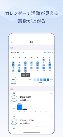
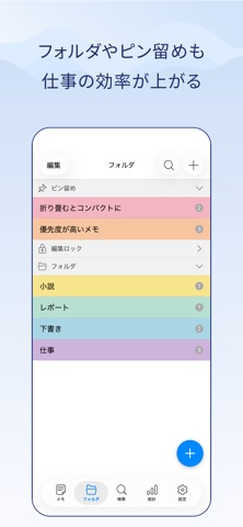
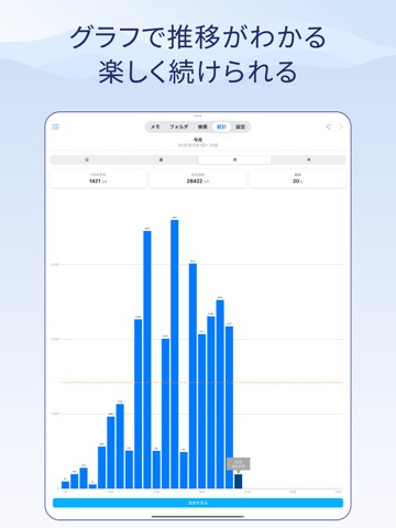
・*。*:。・*。・*:。・*。*・*。*。* 10周年突破!長く愛されるメモアプリ 累計300万ダウンロード達成! ・*。*:。・*。・*:。・*。*・*。*。* メモ帳の中で評価No.1 「書く習慣」が続くメモアプリ 書いた文字数が成果になる。 グラフ・カレンダー・目標管理・ランキング すべてが、あなたの書く習慣を支える。 書く人の毎日を支える、文字数カウントメモ。 ■書く習慣が自然と身につく ・リアルタイムで文字数・単語数・行数をカウント ・グラフで書いた量の推移を可視化。目標達成が見えるから、続けやすい ・カレンダー連動の進捗サポート機能で、毎日の記録が習慣に ・レポート、原稿、論文、小説、執筆、創作、Xの下書きにも最適 ■整理と検索がサクサク ・フォルダ管理&色分けでメモが見やすい ・タグ機能でメモを分類・整理。複数タグで横断的に管理できます ・メモのピン留め、編集不可設定、個別パスロックも可 ・検索や置換で誤字修正もラクラク ・一覧長押しで複製・コピー・PDF出力・読み上げも一瞬 ■安心・安全・共有も便利 ・保存ボタン不要…
App details
What you can learn from 文字数カウントメモ
Every shipping app on the App Store has gone through the same decisions you're working through right now: which screenshot goes first, what caption sits over it, which device frame to show, what color the background should be. The 14 screenshots above are 文字数カウントメモ's answers to those questions — they're public, they're real, and they made it through Apple's review.
What the numbers say: 文字数カウントメモ runs a light set with one background colour (#DCECFC) carried across every screenshot — the listing reads as a single poster when the shots sit side by side in search results. The accent colour we picked up, #CCBC84, is the one to reuse for badges, arrows and highlighted words if you borrow this look. Hit Use this style to open the editor with these exact colours and drop your own screenshot in.
Notice the first screenshot in particular. It's the one users see in search results and on the product page, and it's where most apps spend their best caption and tightest design. Look at the proportion of background to phone, where the text sits, what one thing the image is trying to communicate.
Want to see how other Business apps approach the same problem? Browse more Business apps in the showcase.
Take what works into your own screenshots
Open LaunchShots and design your App Store & Google Play screenshots — pick a device frame, drop captions, ship in minutes. Free, in your browser.
Open the screenshot editor →Apps with a similar look
Closest background + accent colours among the listings we've analysed — useful when you want to see the same palette handled by a different team.