Screenshot style breakdown
Sampled from 4 of JALカードアプリ's App Store screenshots — background, accent and theme, measured by LaunchShots (not something Apple publishes).
#04649C bg
#2779A9
#BC0404 accent
#FFFFFF text
Screenshots


Icon palette
About this app
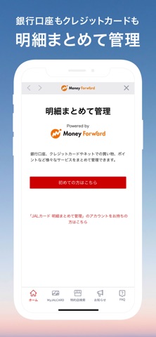
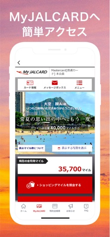
このアプリは、株式会社JALカードが運営する「JALカード」の公式アプリです。 JALカードアプリはJALカードショッピングマイルの確認、キャンペーン登録、住所変更・資料請求などの手続きができるJALカード会員専用オンラインサービス「MyJALCARD」への簡単アクセスや、JALカードアプリオリジナルのマイルが当たるゲームに挑戦いただけます! また、JALカード特約店の検索やJALカードからのおトクな最新情報を受け取ることができます。 アプリの主な機能は下記です。 【主な機能】 ・MyJALCARDへの簡単アクセス ・JALカード特約店店舗をらくらく検索 ・毎日挑戦できるマイルが当たるJALカードアプリオリジナルゲーム ・JALカードからのおトクな情報のプッシュ配信 ・JALカードからの最新のお知らせを掲載 【ご留意事項】 ・このアプリはiPod Touch、iPadでは動作保証していません。 ●このアプリについて このアプリケーションは、株式会社JALカードと、株式会社DearOneが共同で企画・開発しました。 ※本アプリのキャンペーン・プレゼントはApple Inc.とは無関係です…
App details
What you can learn from JALカードアプリ
Every shipping app on the App Store has gone through the same decisions you're working through right now: which screenshot goes first, what caption sits over it, which device frame to show, what color the background should be. The 4 screenshots above are JALカードアプリ's answers to those questions — they're public, they're real, and they made it through Apple's review.
What the numbers say: JALカードアプリ runs a mixed light-and-dark set where the background shifts from screenshot to screenshot (first shot #04649C) — each image has to stand on its own, so the captions carry more of the story. The accent colour we picked up, #BC0404, is the one to reuse for badges, arrows and highlighted words if you borrow this look. Hit Use this style to open the editor with these exact colours and drop your own screenshot in.
Notice the first screenshot in particular. It's the one users see in search results and on the product page, and it's where most apps spend their best caption and tightest design. Look at the proportion of background to phone, where the text sits, what one thing the image is trying to communicate.
Want to see how other Finance apps approach the same problem? Browse more Finance apps in the showcase.
Take what works into your own screenshots
Open LaunchShots and design your App Store & Google Play screenshots — pick a device frame, drop captions, ship in minutes. Free, in your browser.
Open the screenshot editor →Apps with a similar look
Closest background + accent colours among the listings we've analysed — useful when you want to see the same palette handled by a different team.