Chart position — tracked daily by LaunchShots
Screenshot changes — detected by LaunchShots
Screenshot style breakdown
Sampled from 5 of 古文・漢文(古文単語、古典文法、漢文)'s App Store screenshots — background, accent and theme, measured by LaunchShots (not something Apple publishes).
#D40404 bg
#DA2727
#046C14 accent
#FFFFFF text
Screenshots

iPad screenshots


Icon palette
About this app
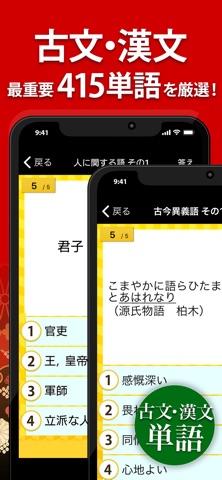
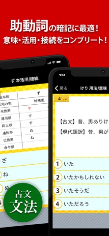
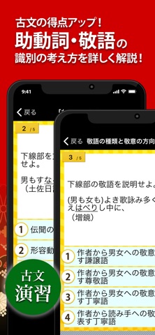
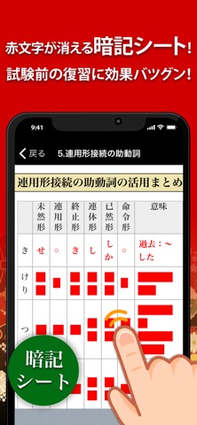
古文・漢文を学習中の中学生、高校生必見!定期試験や入試、共通テストに頻出の「古文単語」「古典文法」「漢文(句法)」「漢文(単語)」を無料で学べるアプリが登場!! ◆古文単語 最重要の272単語を厳選!「まず覚える必修古文単語95」「ここで差が付く頻出古文単語88」「知って得する上級古文単語89」の3段階に分類されています! 古文単語の意味を覚えたら、古文の例文を用いた演習問題にも挑戦しよう! ◆古典文法 古文読解の鍵となる、助動詞の「意味と用法」「接続」「活用形」を学習。助動詞が分かれば、文章の主語や意味を推測する手がかりになります!助動詞の他に、用言(動詞・形容詞・形容動詞)の活用形も収録。 さらに実力を高めたい人は「敬語の識別」「助動詞の識別」の演習問題にも挑戦しよう! ◆漢文(句法) 試験では定番の、再読文字と句法を収録。問題文は訓読形式で出題され、漢文を読んでいるだけで得点力アップ間違いなし!問題文には、教科書にも登場する有名な文章を多数採用しました。 ◆漢文(単語) 漢文の試験でよく出る重要語、…
App details
What you can learn from 古文・漢文(古文単語、古典文法、漢文)
Every shipping app on the App Store has gone through the same decisions you're working through right now: which screenshot goes first, what caption sits over it, which device frame to show, what color the background should be. The 10 screenshots above are 古文・漢文(古文単語、古典文法、漢文)'s answers to those questions — they're public, they're real, and they made it through Apple's review.
What the numbers say: 古文・漢文(古文単語、古典文法、漢文) runs a dark set with one background colour (#D40404) carried across every screenshot — the listing reads as a single poster when the shots sit side by side in search results. The accent colour we picked up, #046C14, is the one to reuse for badges, arrows and highlighted words if you borrow this look. Hit Use this style to open the editor with these exact colours and drop your own screenshot in.
Notice the first screenshot in particular. It's the one users see in search results and on the product page, and it's where most apps spend their best caption and tightest design. Look at the proportion of background to phone, where the text sits, what one thing the image is trying to communicate.
Want to see how other Education apps approach the same problem? Browse more Education apps in the showcase.
Take what works into your own screenshots
Open LaunchShots and design your App Store & Google Play screenshots — pick a device frame, drop captions, ship in minutes. Free, in your browser.
Open the screenshot editor →Apps with a similar look
Closest background + accent colours among the listings we've analysed — useful when you want to see the same palette handled by a different team.