Chart position — tracked daily by LaunchShots
Screenshot style breakdown
Sampled from 5 of La Ban Phong Thuy Pro's App Store screenshots — background, accent and theme, measured by LaunchShots (not something Apple publishes).
#FCFCF4 bg
#DDDDD6
#BC5454 accent
#111111 text
Screenshots
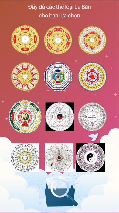
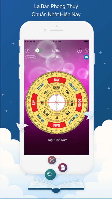


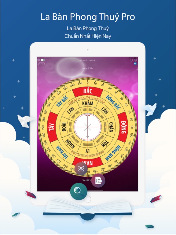
iPad screenshots

Icon palette
About this app
Cảm ơn bạn đã sử dụng phần mềm Việt, Hãy đánh giá 5 sao để khích lệ tác giả. Có bất cứ lỗi gì xin các bạn gửi lại ý kiếm để chúng tôi có thể cập nhật sửa lỗi nhằm đem lại trải nghiệm tốt nhất, Cảm ơn! **********************La ban Phong Thuy************************** Phong thủy (chữ Hán:風水) là học thuyết chuyên nghiên cứu sự ảnh hưởng của hướng gió, hướng khí, mạch nước đến đời sống hoạ phúc của con người. Về mặt từ nguyên, 風 phong có nghĩa là "gió", là hiện tượng không khí chuyển động và 水 thủy có nghĩa là "nước", là dòng nước, tượng trưng cho địa thế. Phong thủy không phải là yếu tố đơn lẻ mà là tổng hợp hàng loạt yếu tố về địa hình địa thế xung quanh nhà ở, thôn xóm, thành phố hoặc mồ mả, hướng gió, dòng nước cùng tọa hướng, hình dạng, bố cục mặt bằng không gian xây dựng. Phong thủy liên quan đến cát hung, họa phúc, thọ yểu, sự cùng thông của nhân sự. Cát ắt là phong thủy hợp, hu…
App details
What you can learn from La Ban Phong Thuy Pro
Every shipping app on the App Store has gone through the same decisions you're working through right now: which screenshot goes first, what caption sits over it, which device frame to show, what color the background should be. The 7 screenshots above are La Ban Phong Thuy Pro's answers to those questions — they're public, they're real, and they made it through Apple's review.
What the numbers say: La Ban Phong Thuy Pro runs a light set with one background colour (#FCFCF4) carried across every screenshot — the listing reads as a single poster when the shots sit side by side in search results. The accent colour we picked up, #BC5454, is the one to reuse for badges, arrows and highlighted words if you borrow this look. Hit Use this style to open the editor with these exact colours and drop your own screenshot in.
Notice the first screenshot in particular. It's the one users see in search results and on the product page, and it's where most apps spend their best caption and tightest design. Look at the proportion of background to phone, where the text sits, what one thing the image is trying to communicate.
Want to see how other Reference apps approach the same problem? Browse more Reference apps in the showcase.
Take what works into your own screenshots
Open LaunchShots and design your App Store & Google Play screenshots — pick a device frame, drop captions, ship in minutes. Free, in your browser.
Open the screenshot editor →Apps with a similar look
Closest background + accent colours among the listings we've analysed — useful when you want to see the same palette handled by a different team.