Chart position — tracked daily by LaunchShots
Screenshot style breakdown
Sampled from 6 of Аудиокниги от Patephone's App Store screenshots — background, accent and theme, measured by LaunchShots (not something Apple publishes).
#646C84 bg
#798095
#B49C6C accent
#FFFFFF text
Screenshots
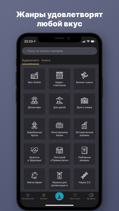
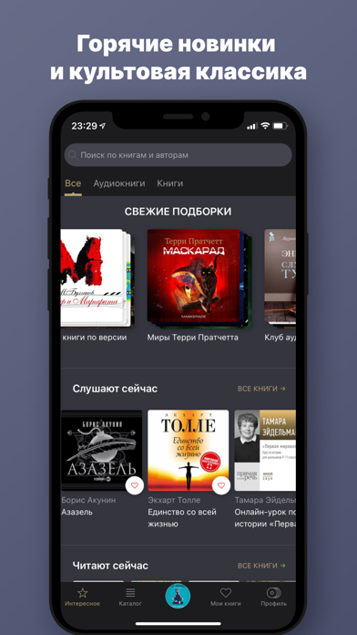
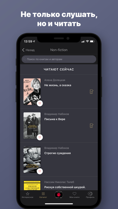
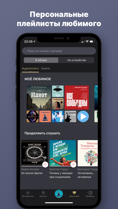
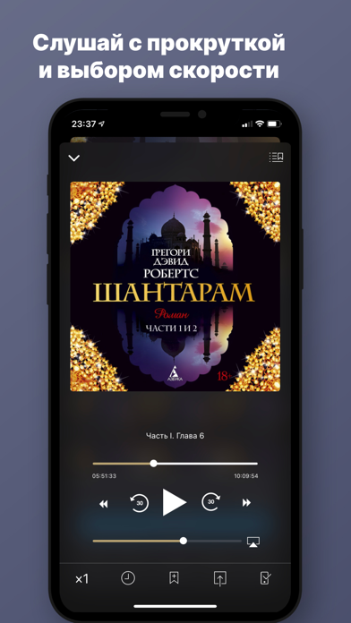
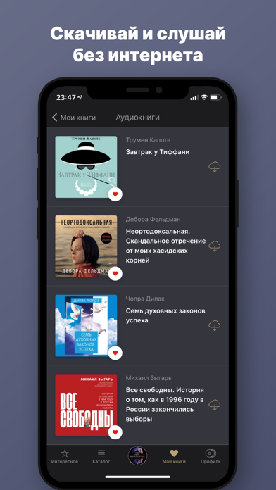
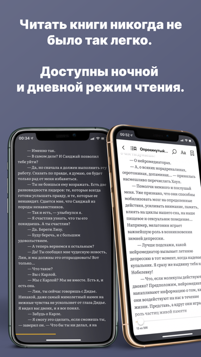
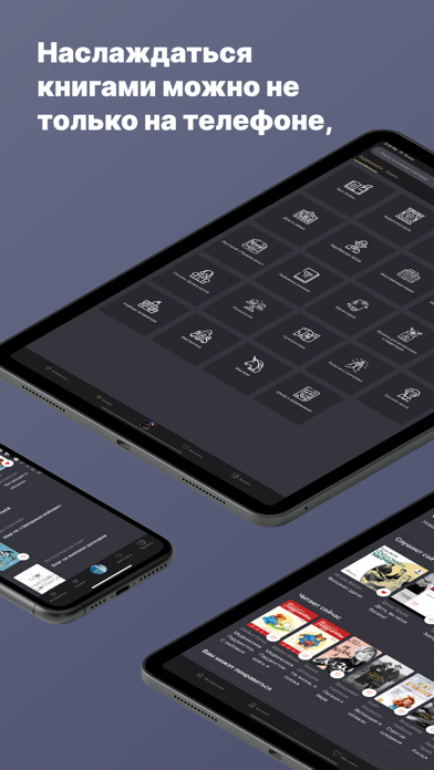

iPad screenshots
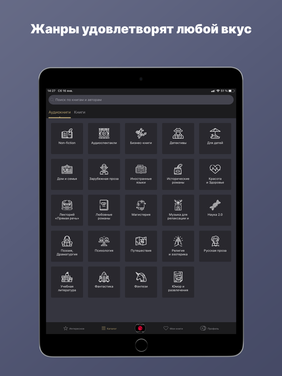
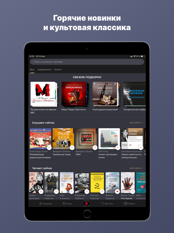
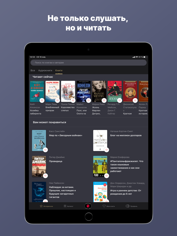


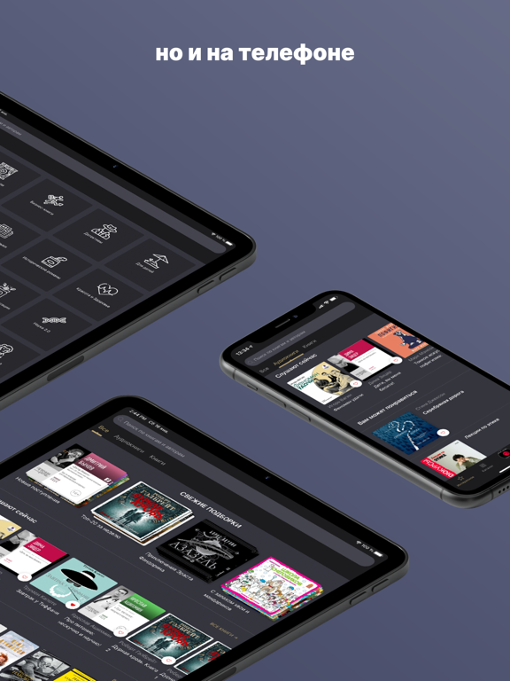
Icon palette
About this app
Аудиокниги для iPhone — тысячи лучших книг в аудио формате по подписке и бесплатно 7 дней. Патефон — слушай и читай лучшие книги онлайн. Послушать сказку на ночь. Наверстать школьную программу по литературе, стоя в пробках. Тренироваться в спортзале под Акунина и ехать в полутёмном плацкартном вагоне под Ерофеева. Патефон — это ваше всё в мире звучащей литературы, самое красивое, быстрое и тактильно безупречное приложение для покупки и воспроизведения аудиокниг. Вы без труда найдёте желаемое в обширном и удобно структурированном каталоге, откроете для себя новые горизонты, изучая любовно собранные нами тематические коллекции, узнаете, что слушают другие, и что рекомендуем послушать мы. Выбирайте осознанно: в каждой аудиокниге предусмотрен фрагмент для предварительного прослушивания. Вы оцените быструю загрузку, разбивку на главы и прочие незаметные, но очень приятные мелочи. Установ…
App details
What you can learn from Аудиокниги от Patephone
Every shipping app on the App Store has gone through the same decisions you're working through right now: which screenshot goes first, what caption sits over it, which device frame to show, what color the background should be. The 18 screenshots above are Аудиокниги от Patephone's answers to those questions — they're public, they're real, and they made it through Apple's review.
What the numbers say: Аудиокниги от Patephone runs a dark set with one background colour (#646C84) carried across every screenshot — the listing reads as a single poster when the shots sit side by side in search results. The accent colour we picked up, #B49C6C, is the one to reuse for badges, arrows and highlighted words if you borrow this look. Hit Use this style to open the editor with these exact colours and drop your own screenshot in.
Notice the first screenshot in particular. It's the one users see in search results and on the product page, and it's where most apps spend their best caption and tightest design. Look at the proportion of background to phone, where the text sits, what one thing the image is trying to communicate.
Want to see how other Book apps approach the same problem? Browse more Book apps in the showcase.
Take what works into your own screenshots
Open LaunchShots and design your App Store & Google Play screenshots — pick a device frame, drop captions, ship in minutes. Free, in your browser.
Open the screenshot editor →Apps with a similar look
Closest background + accent colours among the listings we've analysed — useful when you want to see the same palette handled by a different team.