Chart position — tracked daily by LaunchShots
Screenshot style breakdown
Sampled from 5 of RADIONL's App Store screenshots — background, accent and theme, measured by LaunchShots (not something Apple publishes).
#EC1434 bg
#EE3450
#740414 accent
#FFFFFF text
Screenshots
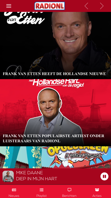
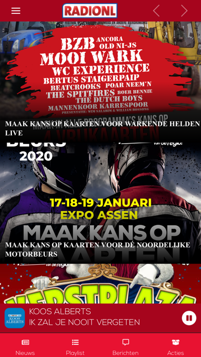
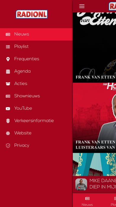

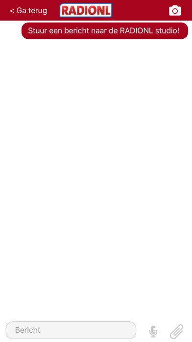
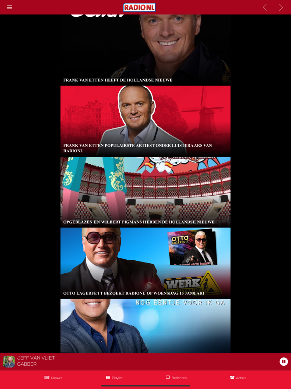
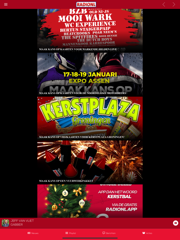
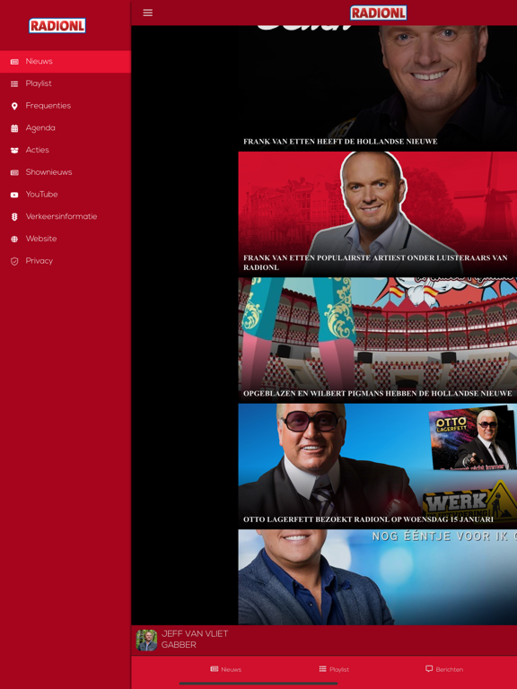
iPad screenshots


Icon palette
About this app
RADIONL is Altijd AAN en dé grootste radiozender in Nederlandstalige muziek. 24 uur per dag hoor je bij ons de grootste meezingers van vroeger én de nieuwste hits van eigen bodem. Luister live via de officiële RADIONL app en beleef het station waar Nederland samenkomt voor de mooiste Nederlandstalige muziek. Met de app kun je: • 24/7 live luisteren • Meedoen met acties en radiospelletjes • Direct appen met de DJ in de studio • Altijd en overal verbonden zijn met jouw favoriete muziek RADIONL is het station van onder andere Marco Schuitmaker, Yves Berendse, Jan Smit, Jannes, Frans Duijts, Django Wagner, Henk Dissel, Emma Heesters, Jeroen van Zelst, John de Bever, Mart Hoogkamer, Quido van de Graaf, Raymon Hermans, Tino Martin, Stef Ekkel, Vinzzent, André Hazes, Samantha Steenwijk, René Schuurmans, Henk Wijngaard, Frank van Etten, Wolter Kroes, Rob de Nijs, Sven Versteeg en vele andere…
App details
What you can learn from RADIONL
Every shipping app on the App Store has gone through the same decisions you're working through right now: which screenshot goes first, what caption sits over it, which device frame to show, what color the background should be. The 10 screenshots above are RADIONL's answers to those questions — they're public, they're real, and they made it through Apple's review.
What the numbers say: RADIONL runs a mixed light-and-dark set where the background shifts from screenshot to screenshot (first shot #EC1434) — each image has to stand on its own, so the captions carry more of the story. The accent colour we picked up, #740414, is the one to reuse for badges, arrows and highlighted words if you borrow this look. Hit Use this style to open the editor with these exact colours and drop your own screenshot in.
Notice the first screenshot in particular. It's the one users see in search results and on the product page, and it's where most apps spend their best caption and tightest design. Look at the proportion of background to phone, where the text sits, what one thing the image is trying to communicate.
Want to see how other Music apps approach the same problem? Browse more Music apps in the showcase.
Take what works into your own screenshots
Open LaunchShots and design your App Store & Google Play screenshots — pick a device frame, drop captions, ship in minutes. Free, in your browser.
Open the screenshot editor →Apps with a similar look
Closest background + accent colours among the listings we've analysed — useful when you want to see the same palette handled by a different team.