Chart position — tracked daily by LaunchShots
Screenshot style breakdown
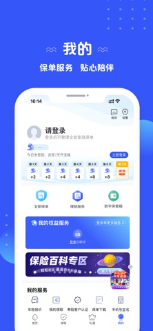
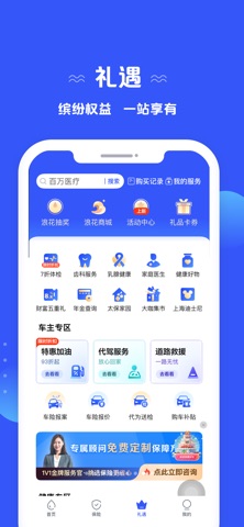
Sampled from 4 of 太平洋保险's App Store screenshots — background, accent and theme, measured by LaunchShots (not something Apple publishes).
#345CFC bg
#5072FC
#8CA4FC accent
#FFFFFF text
Screenshots


Icon palette
About this app
太平洋保险APP是太平洋保险集团打造的以保险+服务为核心的服务平台。致力于提供一站式保险查询、购买、理赔、续保等功能,同时提供个性化保障方案推荐及各子公司权益服务一站式查询等相关增值服务。 主要功能 【三十五周年】为庆祝太平洋保险成立三十五周年,APP全面焕新UI界面,布局更清晰,操作更顺手 【保单服务】向太平洋保险客户提供一站式查询集团保单、电子保单下载、申请理赔、续保续期等保单相关服务,为客户提供贴心保单管理服务 【一站式权益服务】整合太平洋保险集团旗下太平洋产险、太平洋寿险、太平洋健康险、长江养老等子公司权益服务,用户可在 APP享受高效便捷的一站式服务 【保险产品解读】保险知识普及,提供与用户保单相关的知识解读,每天学习一点保险知识,保障更安稳 【保险百科】大家都在看,追踪实时热点,为用户提供优质、精选保险资讯 【保险购买】用户可在保险页中选购精选保险 【专属顾问】1V1金牌服务官免费定制保障方案,挑选保险更省心 【打卡签到】用户每日登录后完成自动签到,每天的签到可累积奖励浪花,连续签到7天可获得额外奖…
App details
What you can learn from 太平洋保险
Every shipping app on the App Store has gone through the same decisions you're working through right now: which screenshot goes first, what caption sits over it, which device frame to show, what color the background should be. The 4 screenshots above are 太平洋保险's answers to those questions — they're public, they're real, and they made it through Apple's review.
What the numbers say: 太平洋保险 runs a dark set with one background colour (#345CFC) carried across every screenshot — the listing reads as a single poster when the shots sit side by side in search results. The accent colour we picked up, #8CA4FC, is the one to reuse for badges, arrows and highlighted words if you borrow this look. Hit Use this style to open the editor with these exact colours and drop your own screenshot in.
Notice the first screenshot in particular. It's the one users see in search results and on the product page, and it's where most apps spend their best caption and tightest design. Look at the proportion of background to phone, where the text sits, what one thing the image is trying to communicate.
Want to see how other Finance apps approach the same problem? Browse more Finance apps in the showcase.
Take what works into your own screenshots
Open LaunchShots and design your App Store & Google Play screenshots — pick a device frame, drop captions, ship in minutes. Free, in your browser.
Open the screenshot editor →Apps with a similar look
Closest background + accent colours among the listings we've analysed — useful when you want to see the same palette handled by a different team.