Chart position — tracked daily by LaunchShots
Screenshot changes — detected by LaunchShots
Screenshot style breakdown
Sampled from 4 of 鱼跃健康管家's App Store screenshots — background, accent and theme, measured by LaunchShots (not something Apple publishes).
#FCFCFC bg
#DDDDDD
#8CDCE4 accent
#111111 text
Screenshots


Icon palette
About this app
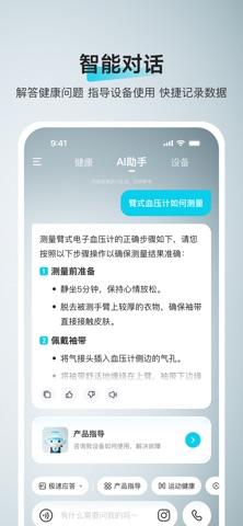
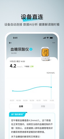
鱼跃健康管家是一款基于大模型技术的健康管理 AI 应用,致力于为用户提供更多信息、更专业、精准的健康管理服务。通过智能对话、健康指标记录与 AI 分析报告功能,用户可以轻松实现健康数据的采集、分析和管理。同时,APP 支持连接鱼跃家用医疗设备,自动同步数据,结合用户个性化需求生成健康计划推荐,帮助用户实现科学健康管理闭环。 【免责声明】 为了让您获取到丰富的医学科普类信息资源,鱼跃软件会为您展示第三方提供的资讯页面,相关服务的责任均由第三方向您承担。鱼跃软件无法对其做出承诺,亦不承担任何责任。 同时,该医学科普信息资源中的观点不应当被视作任何诊疗性质的服务和建议,并不能替代医生的临床诊断;您不能单独凭借或依据该医疗健康类信息资源中观点进行疾病诊治。同时,鉴于医学的技术复杂性、快速更新迭代性、个体特异性等,不排除医学科普类信息资源中观点存在遗漏、错误、歧义等情形,请您谨慎参考。 鱼跃不做任何用药及治疗方法推荐,如需治疗,还需谨遵医嘱。如不谨遵医嘱造成的不良后果,鱼跃不负担任何责任
App details
What you can learn from 鱼跃健康管家
Every shipping app on the App Store has gone through the same decisions you're working through right now: which screenshot goes first, what caption sits over it, which device frame to show, what color the background should be. The 4 screenshots above are 鱼跃健康管家's answers to those questions — they're public, they're real, and they made it through Apple's review.
What the numbers say: 鱼跃健康管家 runs a light set where the background shifts from screenshot to screenshot (first shot #FCFCFC) — each image has to stand on its own, so the captions carry more of the story. The accent colour we picked up, #8CDCE4, is the one to reuse for badges, arrows and highlighted words if you borrow this look. Hit Use this style to open the editor with these exact colours and drop your own screenshot in.
Notice the first screenshot in particular. It's the one users see in search results and on the product page, and it's where most apps spend their best caption and tightest design. Look at the proportion of background to phone, where the text sits, what one thing the image is trying to communicate.
Want to see how other Medical apps approach the same problem? Browse more Medical apps in the showcase.
Take what works into your own screenshots
Open LaunchShots and design your App Store & Google Play screenshots — pick a device frame, drop captions, ship in minutes. Free, in your browser.
Open the screenshot editor →Apps with a similar look
Closest background + accent colours among the listings we've analysed — useful when you want to see the same palette handled by a different team.