Chart position — tracked daily by LaunchShots
Screenshot changes — detected by LaunchShots
Screenshot style breakdown
Sampled from 5 of Яндекс ID – аутентификатор 2FA's App Store screenshots — background, accent and theme, measured by LaunchShots (not something Apple publishes).
#1C0404 bg
#3B2727
#7C543C accent
#FFFFFF text
Screenshots


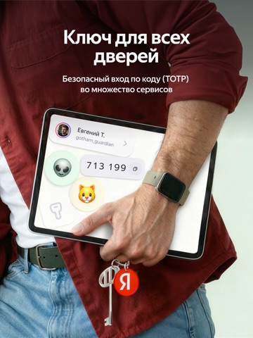
iPad screenshots


Icon palette
About this app
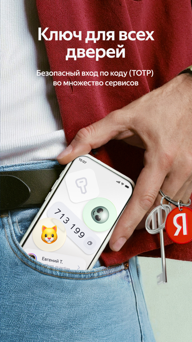
Яндекс ID — обновлённое приложение, созданное на основе Яндекс Ключа. Оно поможет быстрее входить в сервисы Яндекса и легко управлять всеми настройками аккаунтов. Приложение автоматически показывает код или картинку для входа — теперь не нужно вспоминать пароль или ждать смс. На любых устройствах вход в аккаунт выполняется мгновенно. Добавьте в приложение все свои аккаунты в Яндексе, чтобы в пару кликов менять данные, управлять устройствами и доступами, просматривать подписки и настраивать семейную группу. Теперь всё под контролем. Поддерживается генерация одноразовых TOTP-кодов для сервисов, использующих двухэтапную аутентификацию, включая Госуслуги. Эти аккаунты теперь собраны на отдельной вкладке и дополнительно защищены входом по лицу или отпечатку. Если раньше было установлено приложение Яндекс Ключ, после обновления все добавленные аккаунты и данные переносятся автоматически.
App details
What you can learn from Яндекс ID – аутентификатор 2FA
Every shipping app on the App Store has gone through the same decisions you're working through right now: which screenshot goes first, what caption sits over it, which device frame to show, what color the background should be. The 10 screenshots above are Яндекс ID – аутентификатор 2FA's answers to those questions — they're public, they're real, and they made it through Apple's review.
What the numbers say: Яндекс ID – аутентификатор 2FA runs a mixed light-and-dark set where the background shifts from screenshot to screenshot (first shot #1C0404) — each image has to stand on its own, so the captions carry more of the story. The accent colour we picked up, #7C543C, is the one to reuse for badges, arrows and highlighted words if you borrow this look. Hit Use this style to open the editor with these exact colours and drop your own screenshot in.
Notice the first screenshot in particular. It's the one users see in search results and on the product page, and it's where most apps spend their best caption and tightest design. Look at the proportion of background to phone, where the text sits, what one thing the image is trying to communicate.
Want to see how other Utilities apps approach the same problem? Browse more Utilities apps in the showcase.
Take what works into your own screenshots
Open LaunchShots and design your App Store & Google Play screenshots — pick a device frame, drop captions, ship in minutes. Free, in your browser.
Open the screenshot editor →Apps with a similar look
Closest background + accent colours among the listings we've analysed — useful when you want to see the same palette handled by a different team.