Chart position — tracked daily by LaunchShots
Screenshot changes — detected by LaunchShots
Screenshot style breakdown
Sampled from 6 of ツーリングサポーター 原付バイク〜大型バイクまで使えるナビ's App Store screenshots — background, accent and theme, measured by LaunchShots (not something Apple publishes).
#F4FCFC bg
#D6DDDD
#045CDC accent
#111111 text
Screenshots




Icon palette
About this app
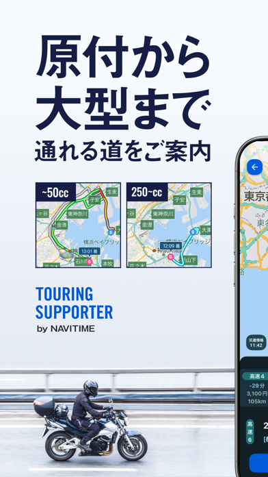
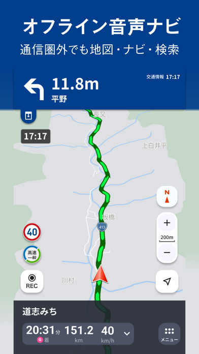
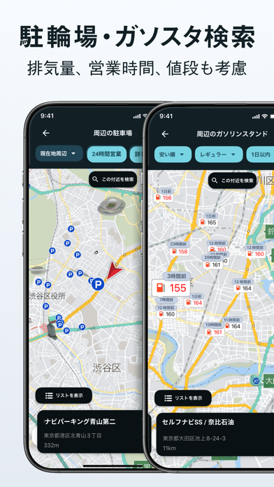
「ツーリングをもっと楽しむために」 本アプリは『走りを楽しむ』事を徹底的に追求したバイク専用ナビゲーションアプリです。 最短ルートの検索はもちろん、景色の良い『ツーリングロード』など走って楽しい道のナビゲーションをすることも可能です。 進化したルート検索ロジックにより、バイクに最適なルートをよりスムーズにご提案。ナビ中もバイクでの走行を考慮した『大きく』『シンプル』で直感的に操作できる視認性の良いUI、交差点名称の発話などきめ細やかな音声ガイダンス、二輪規制を考慮して排気量にあったルートを検索できるなど、バイクでの走行に最適なナビゲーションで安全・快適な走りをサポートします。 さらにツーリングは走って終わりではありません。ツーリングやカスタムの記録を残せる『バイオグラフィー』機能では、バイクとの思い出を振り返ることができます。 計画から思い出管理まで、ツーリングを楽しむための機能が充実しています。 == ツーリングサポーターならではの機能 == ●ルート検索 ・「推奨」「高速道優先」「一般道優先」…
App details
What you can learn from ツーリングサポーター 原付バイク〜大型バイクまで使えるナビ
Every shipping app on the App Store has gone through the same decisions you're working through right now: which screenshot goes first, what caption sits over it, which device frame to show, what color the background should be. The 10 screenshots above are ツーリングサポーター 原付バイク〜大型バイクまで使えるナビ's answers to those questions — they're public, they're real, and they made it through Apple's review.
What the numbers say: ツーリングサポーター 原付バイク〜大型バイクまで使えるナビ runs a mixed light-and-dark set where the background shifts from screenshot to screenshot (first shot #F4FCFC) — each image has to stand on its own, so the captions carry more of the story. The accent colour we picked up, #045CDC, is the one to reuse for badges, arrows and highlighted words if you borrow this look. Hit Use this style to open the editor with these exact colours and drop your own screenshot in.
Notice the first screenshot in particular. It's the one users see in search results and on the product page, and it's where most apps spend their best caption and tightest design. Look at the proportion of background to phone, where the text sits, what one thing the image is trying to communicate.
Want to see how other Navigation apps approach the same problem? Browse more Navigation apps in the showcase.
Take what works into your own screenshots
Open LaunchShots and design your App Store & Google Play screenshots — pick a device frame, drop captions, ship in minutes. Free, in your browser.
Open the screenshot editor →Apps with a similar look
Closest background + accent colours among the listings we've analysed — useful when you want to see the same palette handled by a different team.