Screenshot style breakdown
Sampled from 6 of Harmonize 音感トレーニング 耳コピ 絶対音感's App Store screenshots — background, accent and theme, measured by LaunchShots (not something Apple publishes).
#FCFCFC bg
#DDDDDD
#7CB4E4 accent
#111111 text
Screenshots


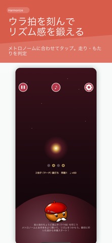

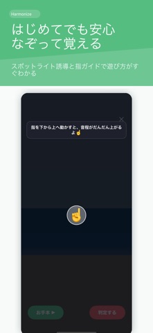
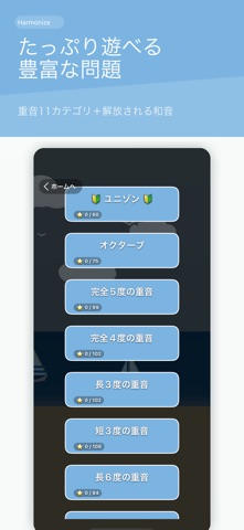
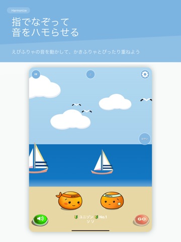
iPad screenshots



Icon palette
About this app
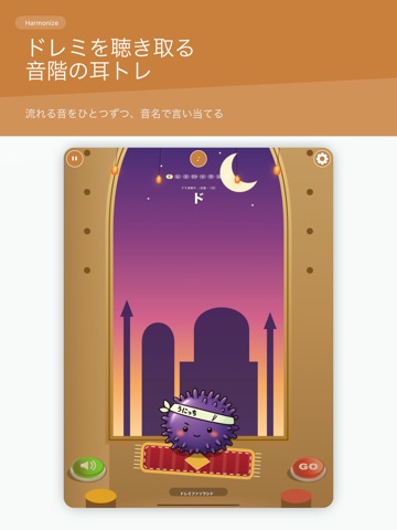
音感トレーニング/耳コピ/音程・和音・リズムの聴音を、15のゲームで。 歌・吹奏楽・オーケストラ・合唱・ギター・ピアノの練習前に、耳を整えるアプリです。 Harmonize は「聴いた音を、自分でもう一度つくる」ことで音の距離を体に入れる音感トレーニングアプリです。マイクが声や楽器の音を拾い、ズレをセント単位で表示します。音楽用語がわからなくても、かわいい「えびふりゃ」がお手本を鳴らしてくれるので、まねするだけで始められます。 ■ 音程をつくる ・重音 — 基準音に重ねてもう1音をつくる。オクターブ、完全五度、長三度など ・和音 — 3つの音の中で、自分が担当する役割の音を出す ・月面 — 重力の弱い世界でゆっくり合わせる、上級の重音ステージ ・低音 — コントラバスなどベースの実音域。スピーカーでは基音が鳴りきらないほど低く、倍音から音程を聴き取る ・トリル — 指を1本置いたまま、もう1本で押す・離すをくり返す。6通りの運指×36問 ■ 楽譜を読む ・譜読み — 五線譜に出た音符を読んで、2段の鍵盤で弾いて答える。白鍵に音名が書い…
App details
What you can learn from Harmonize 音感トレーニング 耳コピ 絶対音感
Every shipping app on the App Store has gone through the same decisions you're working through right now: which screenshot goes first, what caption sits over it, which device frame to show, what color the background should be. The 20 screenshots above are Harmonize 音感トレーニング 耳コピ 絶対音感's answers to those questions — they're public, they're real, and they made it through Apple's review.
What the numbers say: Harmonize 音感トレーニング 耳コピ 絶対音感 runs a light set with one background colour (#FCFCFC) carried across every screenshot — the listing reads as a single poster when the shots sit side by side in search results. The accent colour we picked up, #7CB4E4, is the one to reuse for badges, arrows and highlighted words if you borrow this look. Hit Use this style to open the editor with these exact colours and drop your own screenshot in.
Notice the first screenshot in particular. It's the one users see in search results and on the product page, and it's where most apps spend their best caption and tightest design. Look at the proportion of background to phone, where the text sits, what one thing the image is trying to communicate.
Want to see how other Music apps approach the same problem? Browse more Music apps in the showcase.
Take what works into your own screenshots
Open LaunchShots and design your App Store & Google Play screenshots — pick a device frame, drop captions, ship in minutes. Free, in your browser.
Open the screenshot editor →Apps with a similar look
Closest background + accent colours among the listings we've analysed — useful when you want to see the same palette handled by a different team.