Chart position — tracked daily by LaunchShots
Screenshot style breakdown
Sampled from 4 of respon -レスポン-'s App Store screenshots — background, accent and theme, measured by LaunchShots (not something Apple publishes).
#FCCC24 bg
#DDB31F
#1C3454 accent
#111111 text
Screenshots
Icon palette
About this app
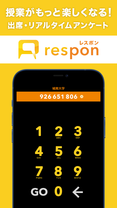
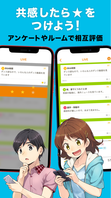
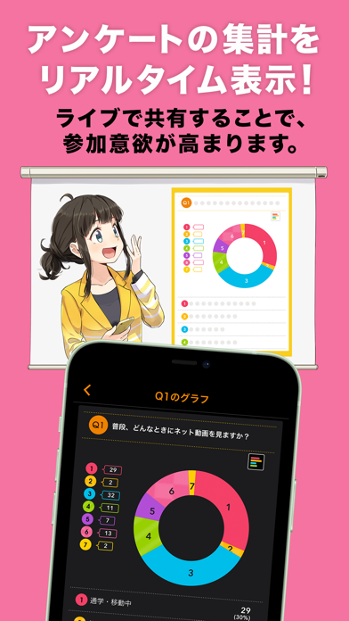
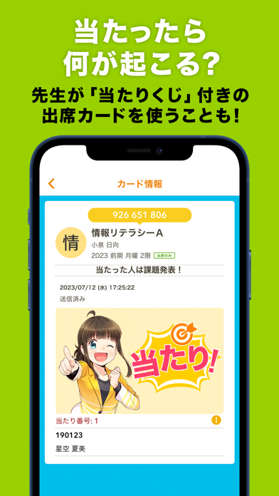
respon(レスポン)は、リアルタイムに出席カードやアンケートなどを提出・共有できる無料アプリです。 対面授業はもちろん、一方通行になりがちなオンライン授業やハイブリッド授業を、双方向の参加型に変えるツールとして、60校を超える大学・教育機関で利用されています。 <アプリでできること> ● 出席カードやアンケートの提出 教員から提示される受付番号を入力し、回答を提出します。提出は4ステップで完了します。 ● アンケートの集計結果をリアルタイムに確認 アプリのプレイヤー画面でアンケートの集計結果を見たり、相互に評価しあうこともできます (この設定は先生が行います)。 一緒に授業を受けている仲間たちから新たな気づきを得られるかもしれません。 ● 提出物の振り返り 提出した出席カードやアンケートはアプリに保存されます。提出内容をいつでも振り返ることができます。 ● 教員と学生が自由にコミュニケーションできるルーム機能 授業中だけでなく授業時間以外にも先生にチャットで質問ができるルーム機能も。 学生の氏名は表示されま…
App details
What you can learn from respon -レスポン-
Every shipping app on the App Store has gone through the same decisions you're working through right now: which screenshot goes first, what caption sits over it, which device frame to show, what color the background should be. The 4 screenshots above are respon -レスポン-'s answers to those questions — they're public, they're real, and they made it through Apple's review.
What the numbers say: respon -レスポン- runs a light set where the background shifts from screenshot to screenshot (first shot #FCCC24) — each image has to stand on its own, so the captions carry more of the story. The accent colour we picked up, #1C3454, is the one to reuse for badges, arrows and highlighted words if you borrow this look. Hit Use this style to open the editor with these exact colours and drop your own screenshot in.
Notice the first screenshot in particular. It's the one users see in search results and on the product page, and it's where most apps spend their best caption and tightest design. Look at the proportion of background to phone, where the text sits, what one thing the image is trying to communicate.
Want to see how other Education apps approach the same problem? Browse more Education apps in the showcase.
Take what works into your own screenshots
Open LaunchShots and design your App Store & Google Play screenshots — pick a device frame, drop captions, ship in minutes. Free, in your browser.
Open the screenshot editor →Apps with a similar look
Closest background + accent colours among the listings we've analysed — useful when you want to see the same palette handled by a different team.