Chart position — tracked daily by LaunchShots
Screenshot style breakdown
Sampled from 5 of GIANTS APP's App Store screenshots — background, accent and theme, measured by LaunchShots (not something Apple publishes).
#3C3434 bg
#575050
#54BC3C accent
#FFFFFF text
Screenshots

iPad screenshots


Icon palette
About this app
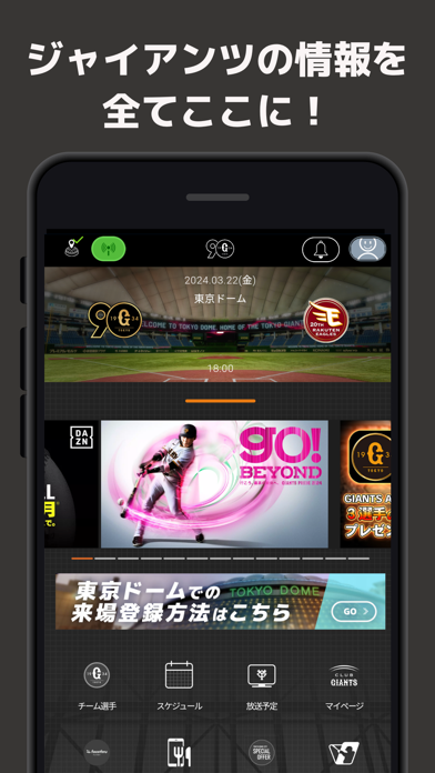
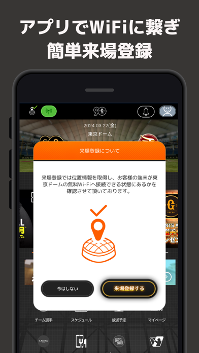
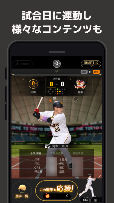
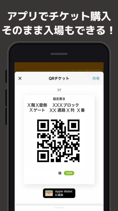
ジャイアンツ公式アプリ「GIANTS APP」 ■様々な機能が盛りだくさん! 【アプリでチケットの購入やチケットQR表示も!】 21年シーズンから、アプリ内でチケットを購入できるようになりました! アプリで購入した場合は、発券手数料が無料になります。 さらに、アプリ上に表示されるチケットQRコードで、球場内への入場も可能に。 購入したチケットのQRコードは、お連れ様に共有することができます! 【球場観戦がより便利に!もっと楽しく!!】 東京ドーム内のWi-Fiへの接続や、アプリでの来場登録は引き続きご利用いただけます。 さらに、東京ドーム専用ページを新しく追加! 来場者プレゼントといったお楽しみ機能や、場内のおすすめ情報をご案内します。 【試合観戦のお供に!】 試合開始30分前になると、試合観戦にあわせた専用画面が立ち上がります。 試合に連動して選手やスコアが表示されたり、選手の成績が閲覧できたりします! 【応援して、デジタルピンズをゲット!】 アプリを使うと獲得できる「エール」を、応援したい選手に送れます。 その選手の活…
App details
What you can learn from GIANTS APP
Every shipping app on the App Store has gone through the same decisions you're working through right now: which screenshot goes first, what caption sits over it, which device frame to show, what color the background should be. The 10 screenshots above are GIANTS APP's answers to those questions — they're public, they're real, and they made it through Apple's review.
What the numbers say: GIANTS APP runs a dark set with one background colour (#3C3434) carried across every screenshot — the listing reads as a single poster when the shots sit side by side in search results. The accent colour we picked up, #54BC3C, is the one to reuse for badges, arrows and highlighted words if you borrow this look. Hit Use this style to open the editor with these exact colours and drop your own screenshot in.
Notice the first screenshot in particular. It's the one users see in search results and on the product page, and it's where most apps spend their best caption and tightest design. Look at the proportion of background to phone, where the text sits, what one thing the image is trying to communicate.
Want to see how other Sports apps approach the same problem? Browse more Sports apps in the showcase.
Take what works into your own screenshots
Open LaunchShots and design your App Store & Google Play screenshots — pick a device frame, drop captions, ship in minutes. Free, in your browser.
Open the screenshot editor →Apps with a similar look
Closest background + accent colours among the listings we've analysed — useful when you want to see the same palette handled by a different team.