Chart position — tracked daily by LaunchShots
Screenshot changes — detected by LaunchShots
Screenshot style breakdown
Sampled from 5 of 地铁跑酷 - 寻灵山海古都归来's App Store screenshots — background, accent and theme, measured by LaunchShots (not something Apple publishes).
#3CBCEC bg
#34A5CF
#94441C accent
#111111 text
Screenshots
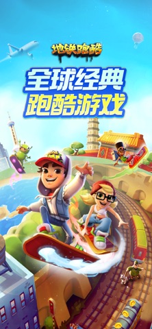
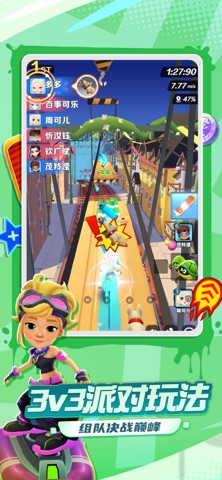


iPad screenshots


Icon palette
About this app
【游戏特色】 《地铁跑酷》洛阳神游版本开启!重返千年神都洛阳,穿行古朴城楼、恢弘宫阙与传统街巷,在古都风光与山海奇境交织的赛道中,开启一场跨越千年的东方奇幻之旅。烛龙、绾璃、白泽、精卫四位全新角色登场,携专属装备带你探寻山海神话。版本活动同步开启,参与烛映神都、山河同庆签到,领取限定奖励;爱玛电动车集字抽奖二期回归,快影联动角色惊喜登场。赛季秘典、山海绘卷、累计消费、主题盲盒等丰富玩法同步上线,经典角色盲盒限时返场。来到洛阳,穿越古今山海,邂逅神话传说,开启属于你的神都奇旅! --3D酷跑、环游世界 地铁跑酷每一个版本都会带你观赏一个城市的风采,全世界所有城市,在游戏中都有可能遇见,特色的地铁、特色的城市美景,在你眼中大方光彩,以绚烂美丽的一面刻印在你的脑海中! --风靡全球、广受好评 大家都在玩!聚会、下课、坐公交、坐地铁、休闲在家,随时随地来一局,轻松挑战历史纪录,体验突破自我的快感。 【游戏介绍】 游戏的背景设定在地铁铁轨上,玩家要帮助杰克和淘气的小伙伴们逃离警察的追捕,闪避前方障碍物与往来…
App details
What you can learn from 地铁跑酷 - 寻灵山海古都归来
Every shipping app on the App Store has gone through the same decisions you're working through right now: which screenshot goes first, what caption sits over it, which device frame to show, what color the background should be. The 10 screenshots above are 地铁跑酷 - 寻灵山海古都归来's answers to those questions — they're public, they're real, and they made it through Apple's review.
What the numbers say: 地铁跑酷 - 寻灵山海古都归来 runs a light set where the background shifts from screenshot to screenshot (first shot #3CBCEC) — each image has to stand on its own, so the captions carry more of the story. The accent colour we picked up, #94441C, is the one to reuse for badges, arrows and highlighted words if you borrow this look. Hit Use this style to open the editor with these exact colours and drop your own screenshot in.
Notice the first screenshot in particular. It's the one users see in search results and on the product page, and it's where most apps spend their best caption and tightest design. Look at the proportion of background to phone, where the text sits, what one thing the image is trying to communicate.
Want to see how other Games apps approach the same problem? Browse more Games apps in the showcase.
Take what works into your own screenshots
Open LaunchShots and design your App Store & Google Play screenshots — pick a device frame, drop captions, ship in minutes. Free, in your browser.
Open the screenshot editor →Apps with a similar look
Closest background + accent colours among the listings we've analysed — useful when you want to see the same palette handled by a different team.