Chart position — tracked daily by LaunchShots
Screenshot changes — detected by LaunchShots
Screenshot style breakdown
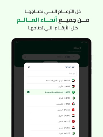
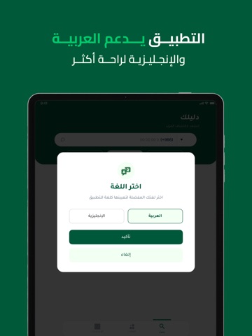
Sampled from 6 of دليلك - اظهار اسم و رقم متصل's App Store screenshots — background, accent and theme, measured by LaunchShots (not something Apple publishes).
#045C3C bg
#277257
#BC8C1C accent
#FFFFFF text
Screenshots
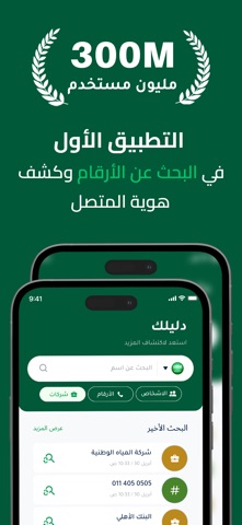
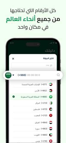


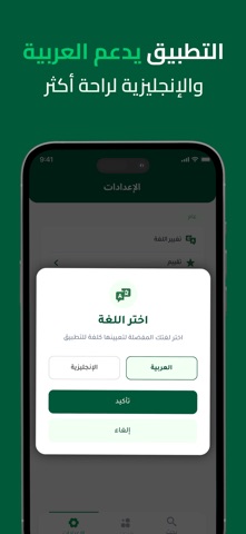
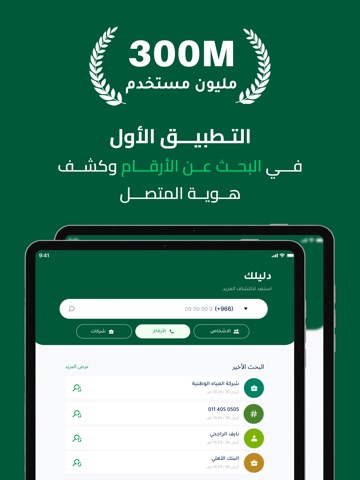
iPad screenshots


Icon palette
About this app
تطبيق دليلك هو أداة ذكية ومبتكرة تهدف إلى تسهيل عملية التعرف على هوية المتصلين والبحث عن الأرقام والأسماء في العالم العربي حيث يقدم تجربة فريدة للمستخدمين الذين يسعون إلى معرفة من يتصل بهم أو الوصول إلى معلومات دقيقة حول جهات الاتصال سواء كانت شخصية أو تجارية يتميز التطبيق بواجهة استخدام بسيطة وسلسة تتيح لأي شخص التنقل بين أقسامه بسهولة والبحث عن الأرقام أو الأسماء أو حتى الشركات والمحلات التجارية في مختلف المناطق العربية يعتمد التطبيق على قاعدة بيانات ضخمة ومتجددة تحتوي على ملايين الأرقام المسجلة مما يمنح المستخدم فرصة كبيرة للوصول إلى نتائج دقيقة وسريعة عند البحث كما يتيح للمستخدمين إمكانية توثيق حساباتهم وإضافة معلوماتهم الشخصية أو التجارية مما يعزز من مصداقية البيانات ويساهم في بناء مجتمع رقمي موثوق وآمن واحدة من أبرز ميزات التطبيق هي خاصية كشف هوية المتصل حيث يمكن للمستخدم معرفة اسم المتصل حتى وإن لم يكن مسجلًا في جهات الاتصال الخاصة به وهذه الميزة تساعد في تجنب المكالمات المزعجة…
App details
What you can learn from دليلك - اظهار اسم و رقم متصل
Every shipping app on the App Store has gone through the same decisions you're working through right now: which screenshot goes first, what caption sits over it, which device frame to show, what color the background should be. The 14 screenshots above are دليلك - اظهار اسم و رقم متصل's answers to those questions — they're public, they're real, and they made it through Apple's review.
What the numbers say: دليلك - اظهار اسم و رقم متصل runs a mixed light-and-dark set where the background shifts from screenshot to screenshot (first shot #045C3C) — each image has to stand on its own, so the captions carry more of the story. The accent colour we picked up, #BC8C1C, is the one to reuse for badges, arrows and highlighted words if you borrow this look. Hit Use this style to open the editor with these exact colours and drop your own screenshot in.
Notice the first screenshot in particular. It's the one users see in search results and on the product page, and it's where most apps spend their best caption and tightest design. Look at the proportion of background to phone, where the text sits, what one thing the image is trying to communicate.
Want to see how other Utilities apps approach the same problem? Browse more Utilities apps in the showcase.
Take what works into your own screenshots
Open LaunchShots and design your App Store & Google Play screenshots — pick a device frame, drop captions, ship in minutes. Free, in your browser.
Open the screenshot editor →Apps with a similar look
Closest background + accent colours among the listings we've analysed — useful when you want to see the same palette handled by a different team.