Chart position — tracked daily by LaunchShots
Screenshot changes — detected by LaunchShots
Screenshot style breakdown
Sampled from 5 of Мессенджер Gem Space-Сообщения's App Store screenshots — background, accent and theme, measured by LaunchShots (not something Apple publishes).
#845CB4 bg
#9572BE
#D484C4 accent
#FFFFFF text
Screenshots


iPad screenshots
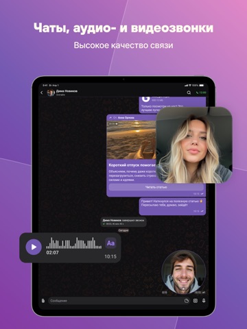
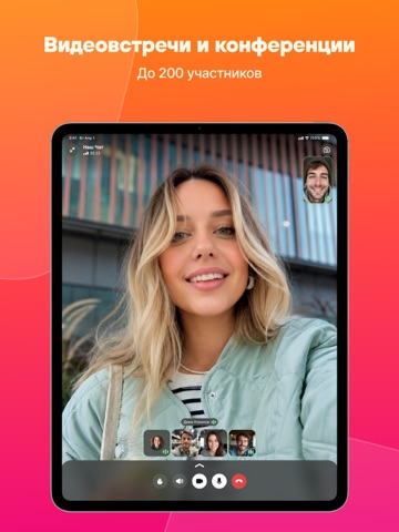
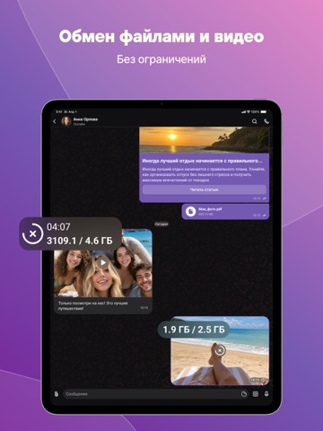

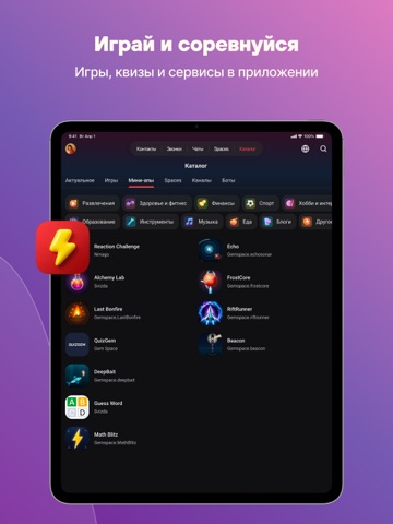
Icon palette
About this app
Gem Space - это новые друзья и единомышленники, новости и блоги, чаты и звонки, бизнес-сообщество и платформа для обмена идеями, творчеством и интересами. Мы заботимся о том, чтобы все наши пользователи чувствовали себя в безопасности: наши чаты зашифрованы, звонки - защищены, а пространства для общения приватны или публичны по желанию. ДЛЯ ТЕБЯ И ДРУЗЕЙ Выбирай, что любишь, подписывайся на самых классных блогеров, развлекайся, учись, становись лучшей версией себя. Умная лента новостей Выбирай интересы, подписывайся на тематические каналы, обсуждай с друзьями, а ИИ проанализирует твою активность и предложит бесконечно обновляемый контент в удобных форматах от коротких видео до лонгридов Быстрый поиск новых источников вдохновения Воспользуйся встроенным каталогом каналов и мгновенно находи нужный контент благодаря умному поиску Общие и приватные чаты Общайся без ограничений в любых …
App details
What you can learn from Мессенджер Gem Space-Сообщения
Every shipping app on the App Store has gone through the same decisions you're working through right now: which screenshot goes first, what caption sits over it, which device frame to show, what color the background should be. The 10 screenshots above are Мессенджер Gem Space-Сообщения's answers to those questions — they're public, they're real, and they made it through Apple's review.
What the numbers say: Мессенджер Gem Space-Сообщения runs a mixed light-and-dark set where the background shifts from screenshot to screenshot (first shot #845CB4) — each image has to stand on its own, so the captions carry more of the story. The accent colour we picked up, #D484C4, is the one to reuse for badges, arrows and highlighted words if you borrow this look. Hit Use this style to open the editor with these exact colours and drop your own screenshot in.
Notice the first screenshot in particular. It's the one users see in search results and on the product page, and it's where most apps spend their best caption and tightest design. Look at the proportion of background to phone, where the text sits, what one thing the image is trying to communicate.
Want to see how other Social Networking apps approach the same problem? Browse more Social Networking apps in the showcase.
Take what works into your own screenshots
Open LaunchShots and design your App Store & Google Play screenshots — pick a device frame, drop captions, ship in minutes. Free, in your browser.
Open the screenshot editor →Apps with a similar look
Closest background + accent colours among the listings we've analysed — useful when you want to see the same palette handled by a different team.