Chart position — tracked daily by LaunchShots
Screenshot style breakdown
Sampled from 6 of kencom(ケンコム)'s App Store screenshots — background, accent and theme, measured by LaunchShots (not something Apple publishes).
#F4ECDC bg
#D6CFC1
#FC7C44 accent
#111111 text
Screenshots


Icon palette
About this app
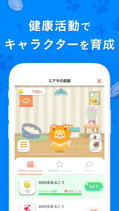
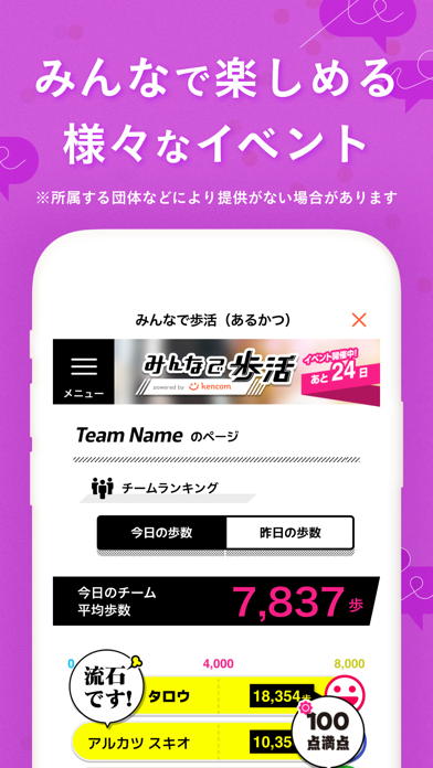
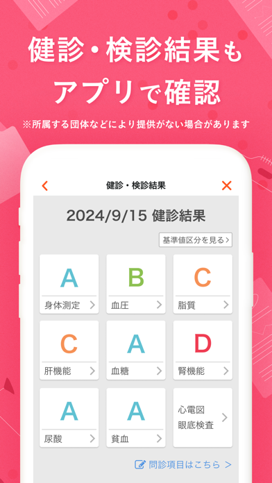
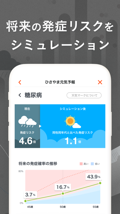
kencom(ケンコム)は、日常の中で無理なくできる運動や記録を あなたらしく、楽しみながら続けられる ヘルスケアエンターテインメントアプリ。 ■ ご注意 本アプリは kencom(ケンコム)を導入している団体(健康保険組合、共済組合/支部、国民健康保険組合、地方自治体、その他)が定める利用条件を満たす方のみ利用・登録が可能です。 ■ kencomの想い あなたの健康に役立つ情報が毎日届く。 日々の健康状態をグラフで確認できる。 アプリを使うたびにコインが貯まり、 そのコインで育成ゲームが楽しめる。 kencom(ケンコム)は、 日常の中で無理なくできる運動や記録を あなたらしく、楽しみながら続けられる ヘルスケアエンターテインメントアプリ。 カラダの変化を感じ始めている方も。 自分はまだ大丈夫と考えている方も。 健康になりたい、すべての方へ。 楽しみながら、健康に。 ■ 特徴 1. 今日のやることで気軽に健康活動 ミッションをクリアするように知識・記録・行動それぞれの健康活動にバランスよく取り組めます。 達成するとギフト…
App details
What you can learn from kencom(ケンコム)
Every shipping app on the App Store has gone through the same decisions you're working through right now: which screenshot goes first, what caption sits over it, which device frame to show, what color the background should be. The 8 screenshots above are kencom(ケンコム)'s answers to those questions — they're public, they're real, and they made it through Apple's review.
What the numbers say: kencom(ケンコム) runs a mixed light-and-dark set where the background shifts from screenshot to screenshot (first shot #F4ECDC) — each image has to stand on its own, so the captions carry more of the story. The accent colour we picked up, #FC7C44, is the one to reuse for badges, arrows and highlighted words if you borrow this look. Hit Use this style to open the editor with these exact colours and drop your own screenshot in.
Notice the first screenshot in particular. It's the one users see in search results and on the product page, and it's where most apps spend their best caption and tightest design. Look at the proportion of background to phone, where the text sits, what one thing the image is trying to communicate.
Want to see how other Health & Fitness apps approach the same problem? Browse more Health & Fitness apps in the showcase.
Take what works into your own screenshots
Open LaunchShots and design your App Store & Google Play screenshots — pick a device frame, drop captions, ship in minutes. Free, in your browser.
Open the screenshot editor →Apps with a similar look
Closest background + accent colours among the listings we've analysed — useful when you want to see the same palette handled by a different team.