Chart position — tracked daily by LaunchShots
Screenshot style breakdown
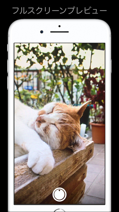
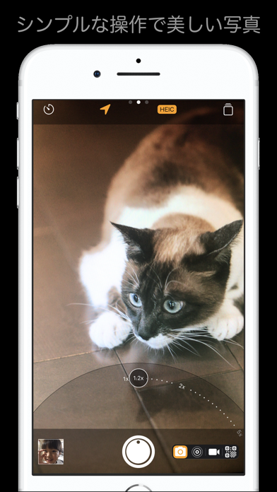
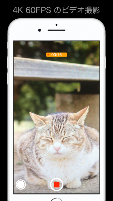
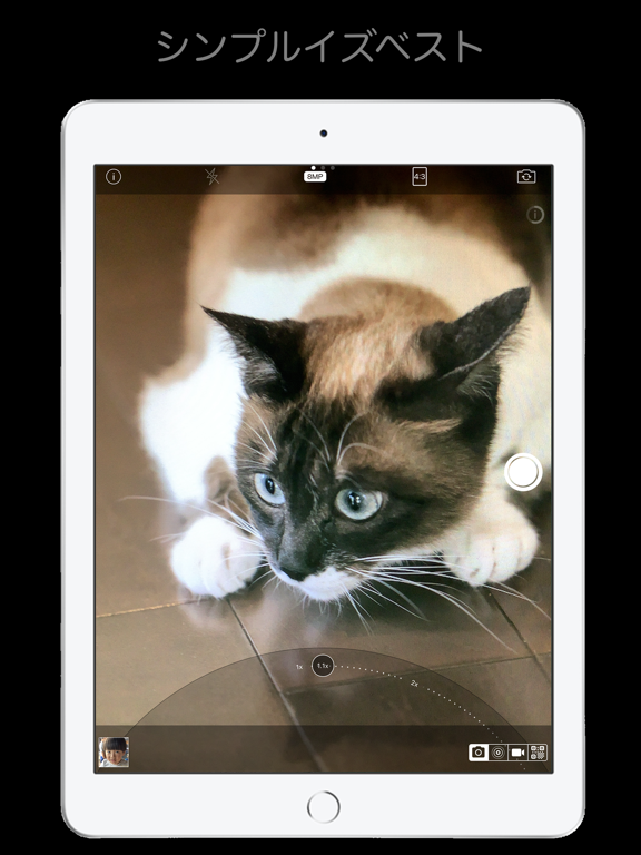
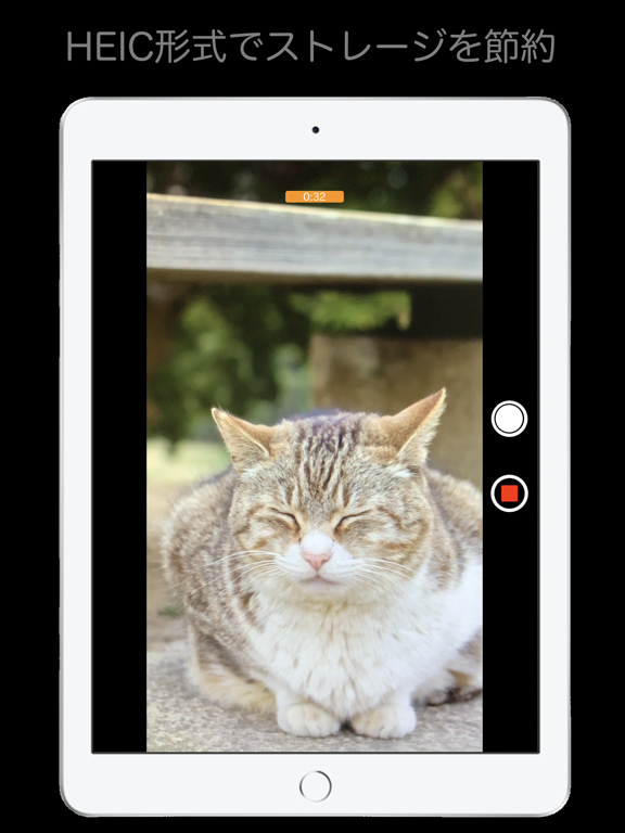
Sampled from 3 of シンプルカメラ's App Store screenshots — background, accent and theme, measured by LaunchShots (not something Apple publishes).
#040404 bg
#272727
#6C4C34 accent
#FFFFFF text
Screenshots
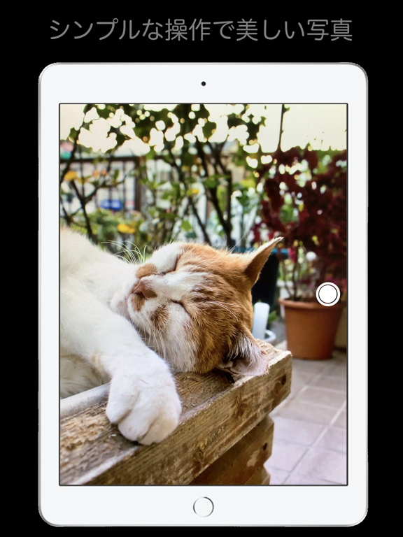
iPad screenshots
Icon palette
About this app
シンプル過ぎる高画質カメラアプリです。 48メガピクセル対応(対応デバイスのみ) 高機能でありながら使いやすさを維持することに気を遣いました。 ◯アプリの特徴 - ミニマルなデザインで気持ち良い操作感 - 撮影集中モード(ほとんどのコントロールを隠して撮影に集中できます) - ボリュームキーやカメラコントロールでの撮影 - メニューの項目を自分好みにカスタマイズできます - HEIC対応で写真の容量をJPEGと比較して約半分に圧縮できます - 静かだから飲食店・ペット撮影・板書に最適 - マルチカメラ搭載端末では、超広角/広角/望遠に固定が可能 - 16:9, 4:3, 3:2, 1:1 他のアスペクト比に写真を自動トリム - QRコードリーダー - 書籍のバーコードの読取り(本と雑誌以外は読み取らないように制御しています) - 画面タッチでフォーカスと露出を合わせます。 - 画面長押しでフォーカスと露出をロックします - ボリュームキーやカメラコントロールを使用して撮影できます - インカメラのRetina Flashに対応 - ライブフォトの撮影 - 動画の撮影(HEVCエンコード…
App details
What you can learn from シンプルカメラ
Every shipping app on the App Store has gone through the same decisions you're working through right now: which screenshot goes first, what caption sits over it, which device frame to show, what color the background should be. The 6 screenshots above are シンプルカメラ's answers to those questions — they're public, they're real, and they made it through Apple's review.
What the numbers say: シンプルカメラ runs a dark set with one background colour (#040404) carried across every screenshot — the listing reads as a single poster when the shots sit side by side in search results. The accent colour we picked up, #6C4C34, is the one to reuse for badges, arrows and highlighted words if you borrow this look. Hit Use this style to open the editor with these exact colours and drop your own screenshot in.
Notice the first screenshot in particular. It's the one users see in search results and on the product page, and it's where most apps spend their best caption and tightest design. Look at the proportion of background to phone, where the text sits, what one thing the image is trying to communicate.
Want to see how other Photo & Video apps approach the same problem? Browse more Photo & Video apps in the showcase.
Take what works into your own screenshots
Open LaunchShots and design your App Store & Google Play screenshots — pick a device frame, drop captions, ship in minutes. Free, in your browser.
Open the screenshot editor →Apps with a similar look
Closest background + accent colours among the listings we've analysed — useful when you want to see the same palette handled by a different team.