Chart position — tracked daily by LaunchShots
Screenshot style breakdown
Sampled from 6 of トイレ情報共有マップくん's App Store screenshots — background, accent and theme, measured by LaunchShots (not something Apple publishes).
#FCFCFC bg
#DDDDDD
#0494FC accent
#111111 text
Reading the caption text from the screenshots in your browser…
Screenshots


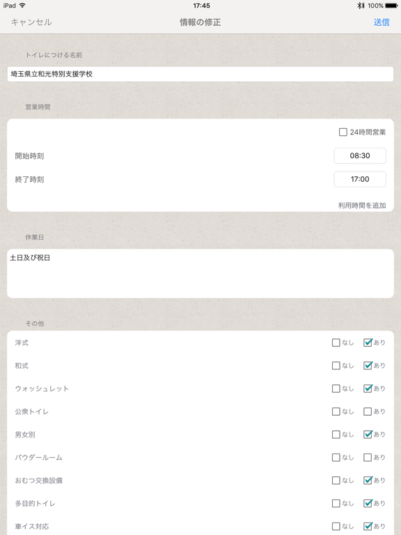
iPad screenshots
Icon palette
About this app
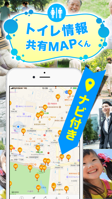
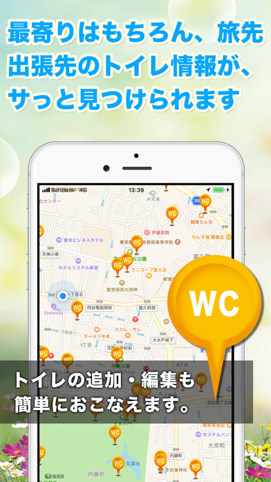
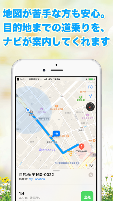
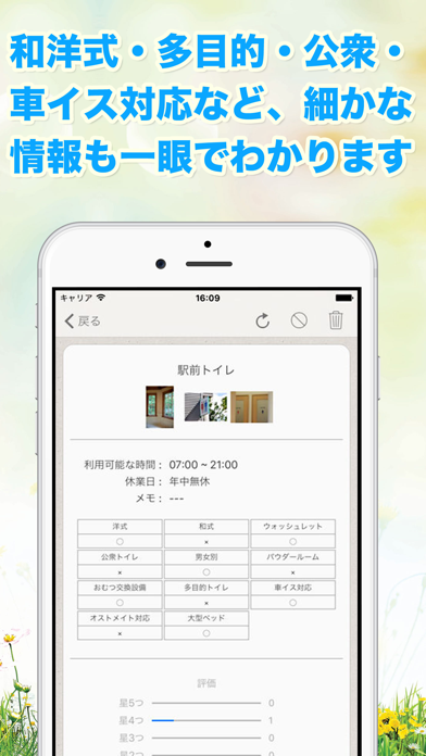
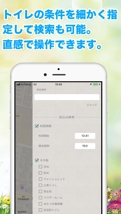
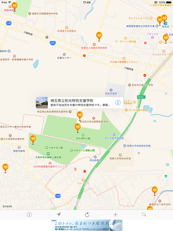
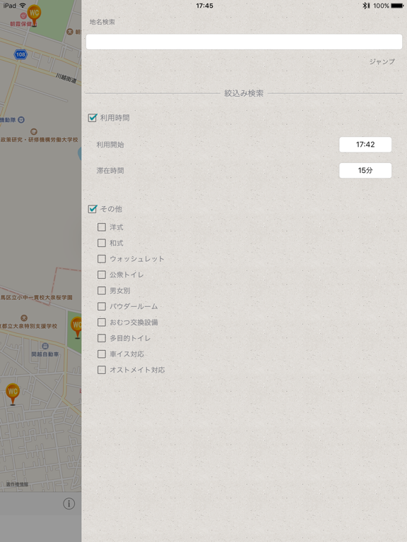
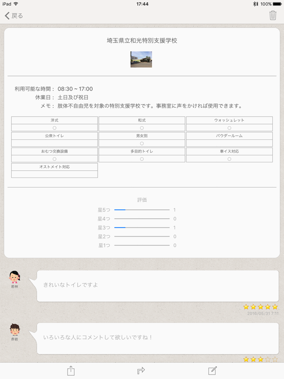
急な腹痛で、冷や汗をかいた経験はありませんか? いつ、なんどきに訪れるか分からない、OPP その時に絶対に必要なのが『トイレ』 腹痛なのに、『トイレ』の場所が分からない、でも今すぐに行きたい!! 誰にでも1度や2は経験がある事ですよね。 そんな腹痛さんの為に、どこにトイレがあるのか? すぐに探せるようにマップと連動して、緊急時に使える『トイレ』を 簡単に、すぐに探せるマップ型ナビゲーションアプリです。 ユーザー同士で情報共有をすることがコンセプトのアプリです。 これだと思う場所があったらすぐに登録して情報共有しちゃおう 救われる人がきっといるはずですよ。 【緊急トイレ検索とトイレピン機能】 ◎ GPSナビゲーション! マップのGPS機能を使って、トイレの場所を確認したり、 そこまでのルートを調べる事ができます。 し・か・も!ナビゲーション機能もしっかり搭載しているからワンタッチで音声案内です! 曲がり角を探してとか画面とにらめっこして…なんて必要ありません! ◎ 詳細な情報量!! MAP上にささっている『トイ…
App details
What you can learn from トイレ情報共有マップくん
Every shipping app on the App Store has gone through the same decisions you're working through right now: which screenshot goes first, what caption sits over it, which device frame to show, what color the background should be. The 11 screenshots above are トイレ情報共有マップくん's answers to those questions — they're public, they're real, and they made it through Apple's review.
What the numbers say: トイレ情報共有マップくん runs a light set where the background shifts from screenshot to screenshot (first shot #FCFCFC) — each image has to stand on its own, so the captions carry more of the story. The accent colour we picked up, #0494FC, is the one to reuse for badges, arrows and highlighted words if you borrow this look. Hit Use this style to open the editor with these exact colours and drop your own screenshot in.
Notice the first screenshot in particular. It's the one users see in search results and on the product page, and it's where most apps spend their best caption and tightest design. Look at the proportion of background to phone, where the text sits, what one thing the image is trying to communicate.
Want to see how other Navigation apps approach the same problem? Browse more Navigation apps in the showcase.
Take what works into your own screenshots
Open LaunchShots and design your App Store & Google Play screenshots — pick a device frame, drop captions, ship in minutes. Free, in your browser.
Open the screenshot editor →Apps with a similar look
Closest background + accent colours among the listings we've analysed — useful when you want to see the same palette handled by a different team.