Chart position — tracked daily by LaunchShots
Screenshot style breakdown
Sampled from 5 of コズレ's App Store screenshots — background, accent and theme, measured by LaunchShots (not something Apple publishes).
#FCFCFC bg
#DDDDDD
#74C4F4 accent
#111111 text
Screenshots
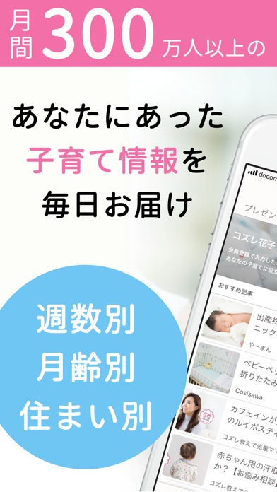
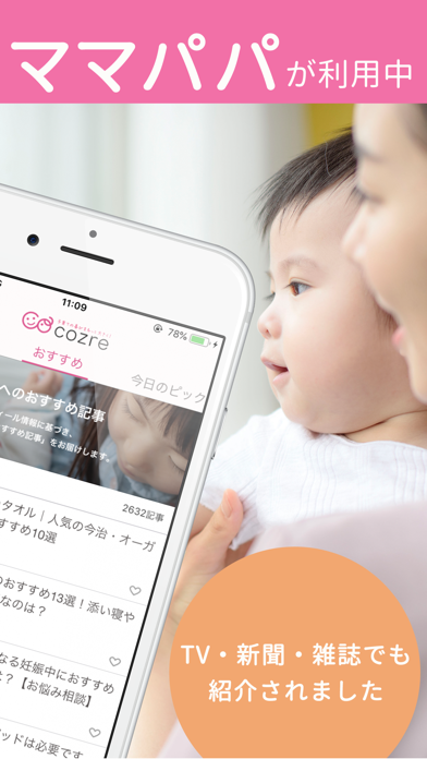
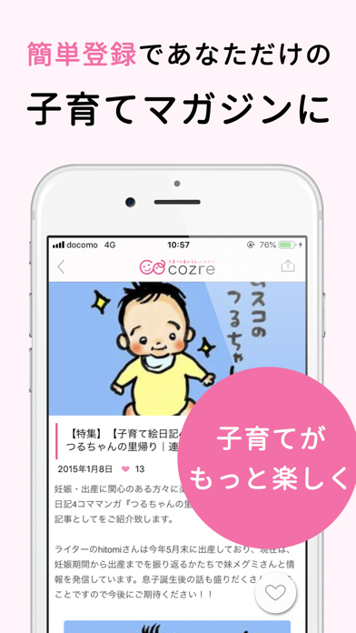
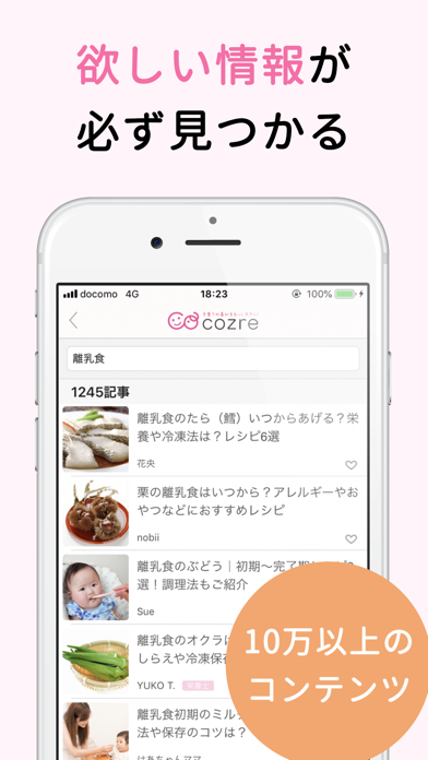
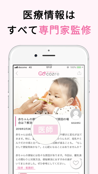
iPad screenshots
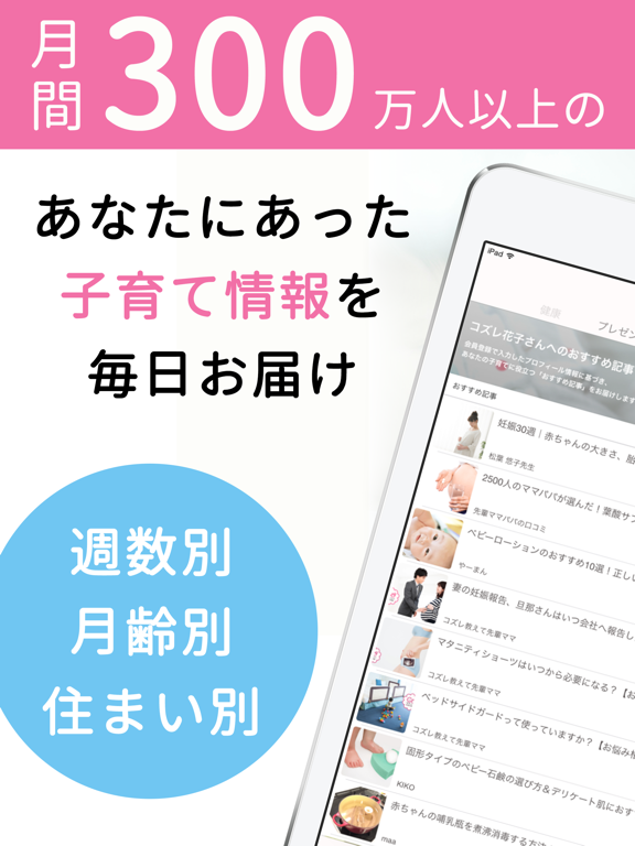

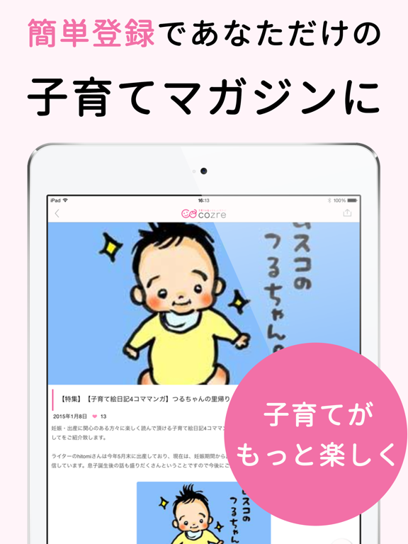

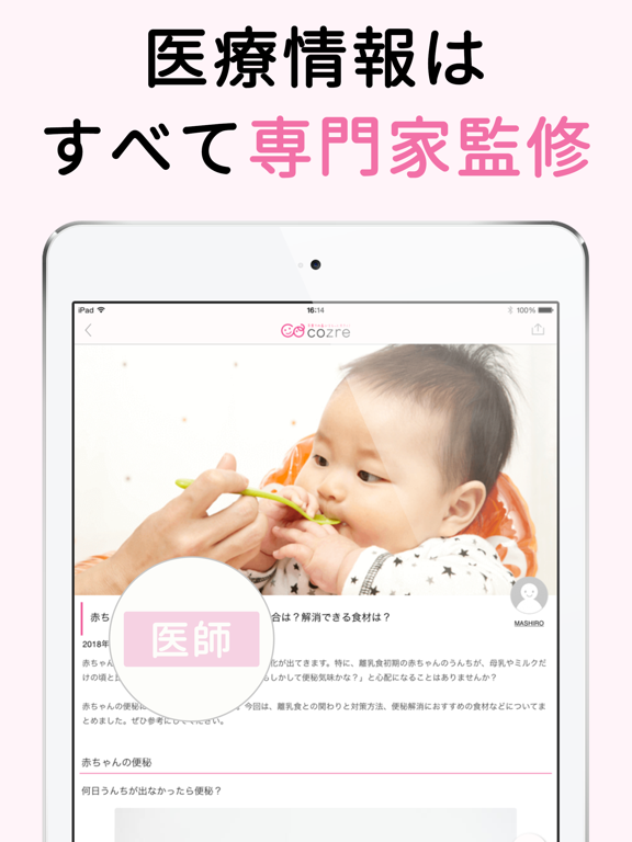
Icon palette
About this app
\毎日頑張るパパママを応援する子育て応援お役立ちアプリ/ ■100万人以上のパパママが利用し、TV番組でも紹介された子育てメディアの新定番! ■親子のプロフィール情報を登録すると、あなたにぴったりの子育て情報をピックアップしてお届け! ■ベビーカーや抱っこ紐、おもちゃ等、ママや子どもに嬉しい商品がプレゼントされるキャンペーンを随時実施中 ■例えば、るるぶやまっぷるでは知り得ない、面白い子連れおでかけスポットなどの情報が得られます。 ■共感を呼ぶ育児マンガ、人気の一人遊び動画、便利な育児グッズ、忙しい朝に役立つ時短レシピなど、簡単にチェックできます! ◆◆cozre(コズレ)はこんな方におすすめ◆◆ ■子育てをもっと楽しみたいママ ■パパにイクメンになって欲しいママ ■子育て大好きなイクメンやイクメンを目指すパパ ■子育ての悩みを抱えるパパ、ママ ◆◆cozre(コズレ)はこんなときにおすすめ◆◆ 【子連れおでかけ】 ・年末年始や、お盆、ゴールデンウィークなど家族で行きたい遊園地・テーマパーク・温泉等の、おでかけ先選びに! ・公園…
App details
What you can learn from コズレ
Every shipping app on the App Store has gone through the same decisions you're working through right now: which screenshot goes first, what caption sits over it, which device frame to show, what color the background should be. The 10 screenshots above are コズレ's answers to those questions — they're public, they're real, and they made it through Apple's review.
What the numbers say: コズレ runs a light set where the background shifts from screenshot to screenshot (first shot #FCFCFC) — each image has to stand on its own, so the captions carry more of the story. The accent colour we picked up, #74C4F4, is the one to reuse for badges, arrows and highlighted words if you borrow this look. Hit Use this style to open the editor with these exact colours and drop your own screenshot in.
Notice the first screenshot in particular. It's the one users see in search results and on the product page, and it's where most apps spend their best caption and tightest design. Look at the proportion of background to phone, where the text sits, what one thing the image is trying to communicate.
Want to see how other News apps approach the same problem? Browse more News apps in the showcase.
Take what works into your own screenshots
Open LaunchShots and design your App Store & Google Play screenshots — pick a device frame, drop captions, ship in minutes. Free, in your browser.
Open the screenshot editor →Apps with a similar look
Closest background + accent colours among the listings we've analysed — useful when you want to see the same palette handled by a different team.