Chart position — tracked daily by LaunchShots
Screenshot style breakdown
Sampled from 5 of BCBSM's App Store screenshots — background, accent and theme, measured by LaunchShots (not something Apple publishes).
#1C5CAC bg
#3B72B7
#84BC2C accent
#FFFFFF text
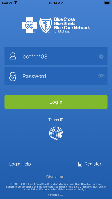
- #1Login Help Register Disclaimer ©1996 - 2023 Blue Cross Blue Shield of Michigan and Blue Ca
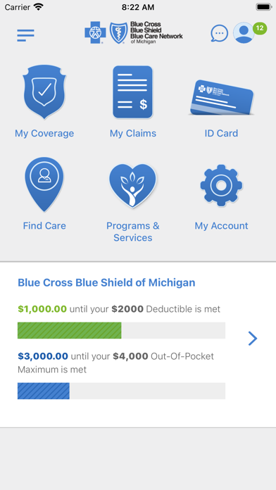
- #2$3,000.00 until your $4,000 Out-Of-Pocket Maximum is met
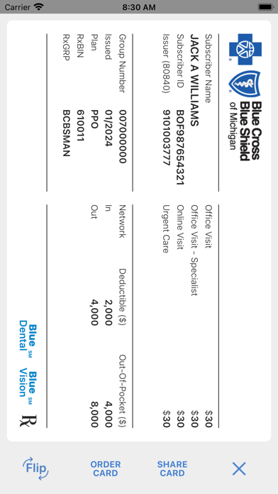
- #3= 3835 2888 Bi ORDER SHARE X '® CARD CARD
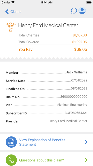
- #4Provider ..................HenryFord Medical Center & View Explanation of Benefits > State
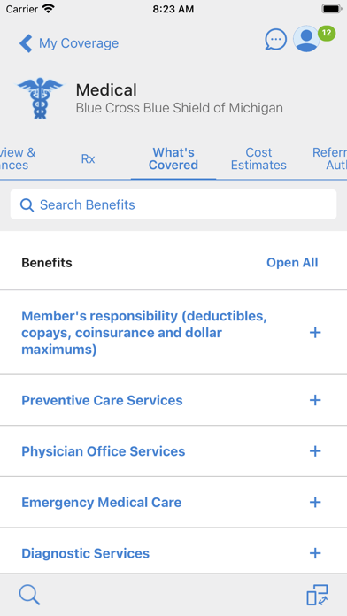
- #5Physician Office Services + Emergency Medical Care + Diagnostic Services +
Captions read from the screenshots (OCR, may contain small errors): 5 headlines, 11.2 words on average (longest 16).
Screenshots
iPad screenshots


Icon palette
About this app
Thanks for making us #1 Blue Cross Blue Shield of Michigan ranked highest in Member Satisfaction among Commercial and Medicare Advantage health plans in Michigan. Commercial members also rated us highest in Trust, Digital Channels and Helping Save Time or Money. For 2026 J.D. Power award information, visit jdpower.com/awards. Enjoy convenient access on the go: • View your member ID card and add it to your digital wallet • Find in network doctors and hospitals • See covered services and plan balances (deductible, out of pocket, etc.) • Get virtual care with our 24 hour nurse line and telehealth options • Review claims and EOBs • Make bill payments (for non employer coverage) • Compare provider quality ratings and estimated procedure costs • Check your HSA/FSA balances via HealthEquity • Choose and view your Primary Care Physician • Look up prescription drug prices and coverage rules •…
App details
What you can learn from BCBSM
Every shipping app on the App Store has gone through the same decisions you're working through right now: which screenshot goes first, what caption sits over it, which device frame to show, what color the background should be. The 10 screenshots above are BCBSM's answers to those questions — they're public, they're real, and they made it through Apple's review.
What the numbers say: BCBSM runs a mixed light-and-dark set where the background shifts from screenshot to screenshot (first shot #1C5CAC) — each image has to stand on its own, so the captions carry more of the story. The accent colour we picked up, #84BC2C, is the one to reuse for badges, arrows and highlighted words if you borrow this look. Hit Use this style to open the editor with these exact colours and drop your own screenshot in.
Notice the first screenshot in particular. It's the one users see in search results and on the product page, and it's where most apps spend their best caption and tightest design. Look at the proportion of background to phone, where the text sits, what one thing the image is trying to communicate.
Want to see how other Medical apps approach the same problem? Browse more Medical apps in the showcase.
Take what works into your own screenshots
Open LaunchShots and design your App Store & Google Play screenshots — pick a device frame, drop captions, ship in minutes. Free, in your browser.
Open the screenshot editor →Apps with a similar look
Closest background + accent colours among the listings we've analysed — useful when you want to see the same palette handled by a different team.