Screenshot style breakdown
Sampled from 5 of BCM波情報アプリ's App Store screenshots — background, accent and theme, measured by LaunchShots (not something Apple publishes).
#B4B4B4 bg
#9E9E9E
#5C94CC accent
#111111 text
Screenshots


iPad screenshots


Icon palette
About this app
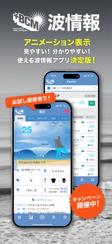
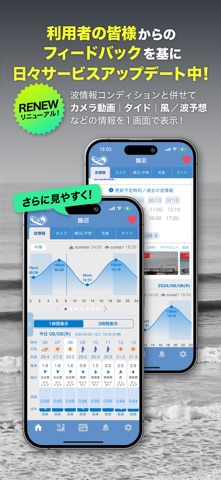
◆直感的に分かりやすい波情報◆ 波、風向き、天候まで、分かりやすいイラストアニメーションで表示。 (イラストOFFなどの設定も可能) ◆波予想も分かりやすい◆ 今日〜翌日の予想/概況はもちろん、1週間の波予測についてもビジュアル多く分かりやすく解説。 11日先までの予想天気図や16日先までの波浪予想図も交えてチェックが可能。 ◆LIVEカメラ/波動画が充実(強化中)◆ ライブ映像は閲覧制限なく全て視聴可能!定点、広範囲ワイドビュー、スタッフの手撮り動画なども。 ◆画像解析AIによる波浪計測[NEW!!] 独自のAIモデルによりライブ映像に映し出された波やライディングを解析。波高や波数、ライディング本数、ライド秒数などを数値化して表示し、1日の波の大きさやコンディションの推移をレポート。 ◆お気に入り登録◆ よく見るサーフスポットをお気に入り登録して一覧表示される「Myスポット」。 (並び順もカスタマイズ可能) ◆気象情報も網羅◆ Waveシミュレーターは16日先までの波高の予測を画像&数値で表示。 風向風速も1時間毎の時系列で予測。 天気図…
App details
What you can learn from BCM波情報アプリ
Every shipping app on the App Store has gone through the same decisions you're working through right now: which screenshot goes first, what caption sits over it, which device frame to show, what color the background should be. The 10 screenshots above are BCM波情報アプリ's answers to those questions — they're public, they're real, and they made it through Apple's review.
What the numbers say: BCM波情報アプリ runs a light set with one background colour (#B4B4B4) carried across every screenshot — the listing reads as a single poster when the shots sit side by side in search results. The accent colour we picked up, #5C94CC, is the one to reuse for badges, arrows and highlighted words if you borrow this look. Hit Use this style to open the editor with these exact colours and drop your own screenshot in.
Notice the first screenshot in particular. It's the one users see in search results and on the product page, and it's where most apps spend their best caption and tightest design. Look at the proportion of background to phone, where the text sits, what one thing the image is trying to communicate.
Want to see how other Sports apps approach the same problem? Browse more Sports apps in the showcase.
Take what works into your own screenshots
Open LaunchShots and design your App Store & Google Play screenshots — pick a device frame, drop captions, ship in minutes. Free, in your browser.
Open the screenshot editor →Apps with a similar look
Closest background + accent colours among the listings we've analysed — useful when you want to see the same palette handled by a different team.