Chart position — tracked daily by LaunchShots
Screenshot style breakdown
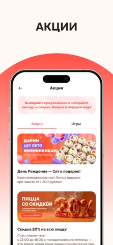
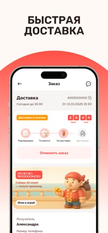
Sampled from 6 of Farfor - доставка суши и пиццы's App Store screenshots — background, accent and theme, measured by LaunchShots (not something Apple publishes).
#FCFCF4 bg
#DDDDD6
#FC5C54 accent
#111111 text
Screenshots



Icon palette
About this app
Фарфор - это доставка суши, пиццы и лапши-wok в более чем в 80 городах России. Наше приложение полностью интегрировано с нашей внутренней системой управления заказами. Благодаря этому все меню, акции и ваши данные всегда доступны аналогично сайту и звонку в наш федеральный Call-центр. Все акции/подарки и скидки применяются автоматически при наличии подключения к интернету! С помощью данного приложения вы сможете легко и быстро заказать роллы и пиццу в несколько шагов. Установите приложение и вам станет доступны функции: - просмотр каталога блюд и актуальных акций - оформление заказа - оплата бонусами - применение промокодов - специальные акции для пользователей приложения - отслеживание статуса своего заказа - работа с личным кабинетом (управлением данными о телефонах, адресах и т.д.) - история всех заказов, которые когда вы либо делали в Фарфоре - неназойливые уведомления об акциях…
App details
What you can learn from Farfor - доставка суши и пиццы
Every shipping app on the App Store has gone through the same decisions you're working through right now: which screenshot goes first, what caption sits over it, which device frame to show, what color the background should be. The 6 screenshots above are Farfor - доставка суши и пиццы's answers to those questions — they're public, they're real, and they made it through Apple's review.
What the numbers say: Farfor - доставка суши и пиццы runs a light set with one background colour (#FCFCF4) carried across every screenshot — the listing reads as a single poster when the shots sit side by side in search results. The accent colour we picked up, #FC5C54, is the one to reuse for badges, arrows and highlighted words if you borrow this look. Hit Use this style to open the editor with these exact colours and drop your own screenshot in.
Notice the first screenshot in particular. It's the one users see in search results and on the product page, and it's where most apps spend their best caption and tightest design. Look at the proportion of background to phone, where the text sits, what one thing the image is trying to communicate.
Want to see how other Food & Drink apps approach the same problem? Browse more Food & Drink apps in the showcase.
Take what works into your own screenshots
Open LaunchShots and design your App Store & Google Play screenshots — pick a device frame, drop captions, ship in minutes. Free, in your browser.
Open the screenshot editor →Apps with a similar look
Closest background + accent colours among the listings we've analysed — useful when you want to see the same palette handled by a different team.