Chart position — tracked daily by LaunchShots
Screenshot changes — detected by LaunchShots
Screenshot style breakdown
Sampled from 6 of Thánh Ca Tin Lành (có hợp âm)'s App Store screenshots — background, accent and theme, measured by LaunchShots (not something Apple publishes).
#FCFCFC bg
#DDDDDD
#FC2404 accent
#111111 text
- #1Q Nhập tên bài nhạc 001 ĐẤNG TẠO HOA 9” 002 DIEU RAN CUA ĐỨC CHÚA TRỜI QQ
- #2CUI XIN VUA THÁNH NGỰ LAI Felice de Giardini, 1769-Charles Wesley, 1757 G D
- #3Lời bài hat 001 Cúi xin Vua Thánh ngự lai 1. Cúi xin Vua Thánh ngự lai.
- #4< SÁCH DƯỠNG LINH Gồm nhiều cuốn sách dưỡng linh, sưu tập từ nhiều nguồn...
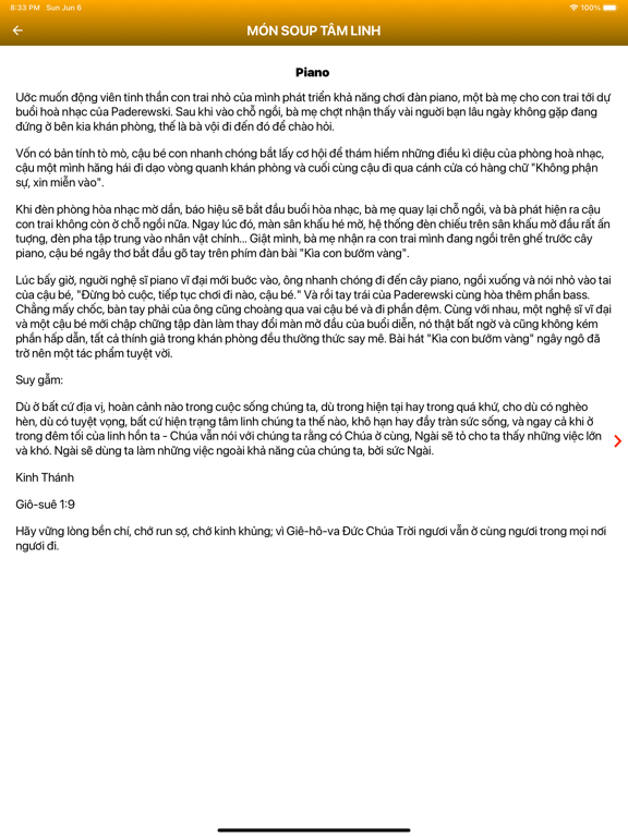
- #5Piano Uớc muốn động viên tinh thần con trai nhỏ của mình phát triển khả năng chơi đàn
- #6< THÁNH CA TIN LÀNH KARAOKE SAC | 2 _ MIEN ĐÔNG CHO NHÂN LOẠI -.
Captions read from the screenshots (OCR, may contain small errors): 6 headlines, 16.3 words on average (longest 18).
Screenshots


iPad screenshots


Icon palette
About this app
Thưa quý tôi con Chúa, vì thấy được nhu cầu thiết yếu của con cái Chúa trong việc sử dụng ứng dụng Thánh Ca nói chung và đặc biệt là sử dụng Smartphone để hầu việc Chúa thông qua việc đàn cho các Hội Thánh nói riêng, chúng tôi – những con cái Chúa – đã cùng nhau thực hiện ứng dụng "Thánh Ca Tin Lành (có hợp âm)" này để chúng ta có cơ hội được hầu việc Chúa một cách tốt hơn. Tại ứng dụng "Thánh Ca Tin Lành (có hợp âm)" này, các tôi con Chúa có thể truy cập các dữ liệu như: Thánh Ca Mới, Kinh Thánh Đối Đáp, Tôn Vinh Chúa Hằng Hữu và các file nhạc Thánh ca dạng mp3… với các tính năng: - Nghe online và download nhạc Thánh (dạng mp3). - Quản lý sheet nhạc. - Và các chức năng khác… Với ứng dụng này, tôi con chúa sẽ được sử dụng hoàn toàn MIỄN PHÍ các nội dung hữu ích trong sinh hoạt thuộc linh ngay trên chính điện thoại của mình. Trong ứng dụng này, chúng tôi có sử dụng các nguồn tư liệ…
App details
What you can learn from Thánh Ca Tin Lành (có hợp âm)
Every shipping app on the App Store has gone through the same decisions you're working through right now: which screenshot goes first, what caption sits over it, which device frame to show, what color the background should be. The 12 screenshots above are Thánh Ca Tin Lành (có hợp âm)'s answers to those questions — they're public, they're real, and they made it through Apple's review.
What the numbers say: Thánh Ca Tin Lành (có hợp âm) runs a light set with one background colour (#FCFCFC) carried across every screenshot — the listing reads as a single poster when the shots sit side by side in search results. The accent colour we picked up, #FC2404, is the one to reuse for badges, arrows and highlighted words if you borrow this look. Hit Use this style to open the editor with these exact colours and drop your own screenshot in.
Notice the first screenshot in particular. It's the one users see in search results and on the product page, and it's where most apps spend their best caption and tightest design. Look at the proportion of background to phone, where the text sits, what one thing the image is trying to communicate.
Want to see how other Book apps approach the same problem? Browse more Book apps in the showcase.
Take what works into your own screenshots
Open LaunchShots and design your App Store & Google Play screenshots — pick a device frame, drop captions, ship in minutes. Free, in your browser.
Open the screenshot editor →Apps with a similar look
Closest background + accent colours among the listings we've analysed — useful when you want to see the same palette handled by a different team.